Visualisations of Realtime City Transport Data

Over the last few weeks I’ve been building systems to collect realtime city data including tubes, buses, trains, air pollution, weather data and airport arrivals/departures. Initially this is all transport related, but the idea is to build up our knowledge of how a city evolves over the course of a day, or even a week, with a view to mining the data in realtime and “now-casting”, or predicting problems just before they happen.

An integral part of this is visualisation of the vast amount of data that we’re now collecting and how to distil this down to only what is important. One of the first visualisations I looked at was the tube numbers count, which I posted previously under Transport During the Olympics as it was a very effective visualisation of how the number of running tubes varies throughout the day and during the weekend.

The challenge now is to produce an effective visualisation based on realtime data, and for this I started looking at the stream graph implementation in D3. It’s well worth reading Lee Byron’s paper on “Stacked Graphs – Geometry and Aesthetics” which goes into the mathematics behind how each type of stream graph works and a mathematical proof of how this applies to 5 design issues.

In all the following four diagrams, the total number of tubes running on each line is shown by a stream filled in the tube line’s normal colour. Going from top to bottom, the colours are as follows: Waterloo and City (cyan), Victoria (light blue), Piccadilly (dark blue), Northern (black), Metropolitan (magenta), Jubilee (grey), Hammersmith and City and Circle (yellow), District (green), Central (red), Bakerloo (brown).

Tube Numbers: D3 Silhouette Streamgraph

Figure 1, Tube Numbers: D3 Streamgraph, Silhouette style

The first type of stream graph is symmetrical in the vertical axis and shows how the total number of tubes varies over the course of the day by the size of the coloured area. A fatter stream means more tube trains, which is reflected in the trace of all 10 tube lines displayed. What is potentially misleading is when, for example, the number of Bakerloo trains (brown) falls, then the Central line (red) trace immediately above it also falls even if the number of Central line trains remains the same. We would generally expect the vertical position of the trace to be indicative of the count, rather than the vertical width.

tfl-wiggle

Figure 2, Tube Numbers: D3 Streamgraph, Wiggle style

The “Wiggle” style is similar to the “silhouette” style, but uses a modified baseline formula (g0 in the paper by Lee Byron and Martin Wattenberg). This attempts to minimise the deviation by minimising the sum of the squares of the slopes at each value of x. This minimises both the distance from the x-axis and the variation in the slope of the curves. Visually, figures 1 and 2 are very similar apart from the loss of symmetry.

tfl-expand

Figure 3, Tube Numbers: D3 Streamgraph, Expand style

This type of stream graph is the easiest to explain, but is just plain wrong for this type of data. The Y axis shows that the sum of the counts for each tube line have been added and then normalised to 1 (so all tubes running on all lines=1). Then the whole graph fits into the box perfectly, but what gets lost in the normalisation is the absolute numbers of trains running. In this situation that is the most important data as the tube shut down between 1am and 5am can only be seen by the sudden jump in the data at that point. Also, the fact that the curves all jump up at the point where there are no trains is very misleading.

tfl-zero

Figure 4, Tube Numbers: D3 Streamgraph, Zero style

The final type of stream graph in Figure 4 is more similar to the classic stacked area chart. Here, the overnight shut down is immediately apparent and the daily variation can be seen clearly in the 9AM rush hour peak.

In conclusion, all the stream graphs work well except for the normalised “expansion” stream graph (figure 3). The “wiggle” formula (figure 2) seems to be an improvement over both figure 1 and figure 4, although aesthetically, figure 4 shows the daily variation a lot better. It all depends on what information we’re trying to extract from the visualisation, which in the case of the real-time city data is any line where the number of trains suddenly drops. In other words, failures correspond to discontinuities in the counts rather than the absolute numbers of running trains. The main criticism I have about the stream graphs is that the rise and fall in the height of a trace doesn’t necessarily correspond to a rise or fall in the number of tubes on that line, which is counter-intuitive. It’s the width of the trace that is important, but the width of the overall trace for all lines does give a good impression of how the number of tubes varies throughout the day.

This work is still in the early stages, but with running data covering almost a year, plus other sources of data available (i.e. the TfL Tube Status feed), there is a lot of potential for mining this information.

Snow Day

We had the first snow of the Winter in London this morning, around 07:30 and lasting no more than half an hour. I’ve been building the data layer for the iPad video wall, so switched the National Rail data collection on once I got to work around 09:50. The idea was to collect data to measure how the rail system recovered from its early morning shock. The results are shown below:

Total number of minutes late for all trains divided by the number of trains for South West Trains


The graph shows a plot of the number of minutes late for every train running, divided by the total number of trains. In other words, the average number of late minutes per train. It’s evident from the graph that trains initially started out over 30 minutes late, then dropped to 20 and then to 10 minutes late, before reaching a minimum around 4pm in the afternoon. Then the rush hour starts to kick in again and the additional load causes the average late time to creep up again. The official line on the way home was, “due to adverse weather conditions…”.

Count of the total number of SW Trains running throughout the day.

The second graph shows the total number of trains running throughout the day. The data collection system was switched on at around 09:57 and it appears to take about an hour before the number of running trains approaches normal levels.

The aim of this work is to collect as much data about the city as possible, which will allow us to mine the information for significant events. This includes all tube, bus and heavy rail movements, weather and air quality, plus any other data we can obtain in the areas of finance, hydrology, population or telecommunications.

Three Days and Two Nights at the Museum

As part of the ESRC Festival of Social Science, CASA and Leeds University held a three day event at Leeds City museum called “Smart Cities: Bridging the Physical and Digital”. This took place on the 8th, 9th and 10th of November.

The London Table and City Dashboard on the main overhead screen, plus tweetometer on the side screens

The museum’s central arena venue for the exhibition was a fantastic choice because of the domed roof and suspended overhead screens (see picture). There was also a map of the Leeds area set into the floor and a gallery on the first floor where people could look down on the exhibits and take pictures.

The timing of the event also coincided with a market in the square outside and a number of children’s events taking place in the museum on the Saturday, so we had plenty of visitors.

Although this was a follow-up to the Smart Cities event which we did in London in April, there were a number of additions and changes to exhibits. Firstly, we added a second pigeon sim which was centred on Leeds City museum, in addition to the London version centred on City Hall. Although we expected the Leeds one to be popular, people seemed to be fascinated by the London version and the fact that you could fly around all the famous landmarks. I spent a lot of time giving people directions to the Olympics site and pointing out famous places. Having watched a lot of people flying around London it might be interesting to see how it changes their spatial perception as a lot of people don’t realise how small some things are and how densely packed London is.

Leeds Pigeon Sim and Riots Table
The Leeds Pigeon Sim on the left, with the image on the projector showing Leeds City museum

Both the pigeon sims use Google Earth, controlled via an XBox Kinect and its skeleton tracking. This has always worked very well in practice, but did require some height adjustment for the under fives. The image on the right also shows the riots table which uses another Kinect camera to sense Lego Police cars on the surface of the table. A model of the London riots runs on the computer and displays a map on the table which players use the Police cars to control. The Lego cars survived fairly well intact, despite being continually broken into pieces and lots of children enjoyed rebuilding them for us.

Another change to the London “Smart Cities” exhibition was the addition of the HexBug spiders to the Roving Eye exhibit. Previous posts have covered how a HexBug spider was modified to be controlled from a computer.

The Roving Eye and HexBug Spiders table showing the computers that control both parts with a spider on the table in the middle

The original “Roving Eye” projected “eyeball” agents onto the table and used a Kinect camera to sense objects placed on the table which formed barriers. The addition of the HexBug spider adds a physical robot which moves around the table and can be detected by the Kinect camera, causing the eyeballs to avoid it. This exhibit is built from two totally separate systems, with the iMac, Kinect and projector running the Roving Eye processing sketch (left computer), while the Windows 7 machine (right) uses a cheap webcam, Arduino, OpenCV and modified HexBug transmitter to control the spider. This is an interesting mix of the “Bridging the Physical and Digital”, and there were a lot of discussions with visitors during the three days of the exhibition about crowd modelling in general.

Also new for the Leeds exhibition was the Survey Mapper Live exhibit, which allows people to vote in a Survey Mapper survey by standing in front of the screen and waving their hand over one of the four answers.

Survey Mapper Live

The question asked was about increased Leeds independence and over the course of the three days we received a good number of responses. The results will follow in another post once they have been analysed, but, for a first test of the system, this worked really well. The aim is to put something like this into a public space in the future.

Finally, the view from the gallery on the first floor shows the scale of the event and the size of the suspended screens.

Looking down from the gallery
Five Screens

When MonteCarlo envelopes are too narrow to show!

1% k-spatial entropy (k=3) envelopes at collocation distance 4km

Here is a pretty picture of envelopes which are overlaid each with their maximum range (including the observed curve) … to allow multiple variables to be looked at simultaneously even when the range of each curve is very different! For example in year 2011 health, social grade, and transport to work are well below their 1% envelope, so are significantly describing a spatial pattern (as measured by the k-spatial entropy) which is not happening by chance (random permutations of the spatial units). see more on the NARSC 2012 abstract/paper ” Entropic variations of urban dynamics at different spatio-temporal scales:  geocomputational perspectives” Didier G. Leibovici & Mark H. Birkin (http://www.meetingsavvy.com/abstractsearch/). Nonetheless the level of non-uniformity is very different, respectively 0.2, 0.4 and 0.1, but are all quite low compared to a maximum under uniformity of 1.

(click on the picture to see it bigger)

Hex Bug Spiders with Computer Vision

Following on from my previous post about controlling the Hex Bug spiders from a computer, I’ve added a computer vision system using a cheap web cam to allow them to be tracked. The web cam that I’m using is a Logitech C270, but mainly because it was the cheapest one in the shop (£10).

I’ve added a red cardboard marker to the top of the spider and used the OpenCV library in Java through the JavaCV port. The reason for using Java was to allow for linking to agent based modelling software like NetLogo at a later date. You can’t see the web cam in the picture because it is suspended on the aluminium pole to the left, along with the projector and a Kinect. The picture shows the Hex Bug spider combined with Martin Austwick‘s Roving Eye exhibit from the CASA Smart Cities conference in April.

The Roving Eye exhibit is a Processing sketch running on the iMac which projects ‘eyeballs’ onto the table. It uses a Kinect camera so that the eyeballs avoid any physical objects placed on the table, for example a brown paper parcel or a Hex Bug spider.

Because of time constraints I’ve used a very simple computer vision algorithm using moments to calculate the centre of red in the image (spider) and the centre of blue in the image (target). This is done by transforming the RGB image into HSV space and thresholding to get a red only image and a blue only image. Then the moments calculation is used to find the centres of the red and blue markers in camera space. In the image above you can see the laptop running the spider control software with the camera representation on the screen showing the spider and target locations.

Once the coordinates of the spider and target are known, a simple algorithm is used to make the spider home in on the blue marker. This is complicated by the fact that the orientation of the spider can’t be determined just from the image (as it’s a round dot), so I retain the track of the spider as it moves to determine its heading. The spider track and direction to target vectors are used to tell whether a left or right rotation command is required to head towards the target, but, as you can see from the following videos, the direction control is very crude.

The following videos show the system in action:


Links:

Martin Austwick’s Sociable Physics Blog: http://sociablephysics.wordpress.com/

Smart Cities Event at Leeds City Museum: http://www.geog.leeds.ac.uk/research/events/conferences/smart-cities-bridging-the-physical-digital/

Hacking Hex Bug Spiders

For the Smart Cities exhibition in Leeds in a couple of weeks, we’ve been building a physical representation of an agent based simulation. Hex Bug Spiders are relatively cheap hexapod robots that are controlled via an infra-red transmitter which has an A or B code so that you can control two simultaneously. The way it walks is referred to as the Jamius walking mechanism after its inventor (see: http://www.youtube.com/watch?v=is7x_atNl94 ).

After taking the Hex Bug apart the construction is actually really good for a cheap toy. Both the hand held transmitter and the receiver in the robot are based around the AT8EB one chip microcontroller  (Alpha Microelectronics Corp), with the robot itself also containing an ST1155A H Bridge driver. I’ve seen a lot of blog posts about hacking these spiders, but after trying to modify the robot’s control PCB to attach wires to the H Bridge driver directly (as in this blog post: http://www.instructables.com/id/Arduino-Controlled-Hexbug-Spider/), I’ve decided that it’s easier to replace all the electronics rather than hack the surface mount board. Out of the three spiders that I have, I’ve left two robots untouched while the third one has been disassembled. The logic behind this is to modify the IR transmitter and control two via an Arduino attached to a computer, while adding a ZigBee radio to the third for wireless control.

After examining the transmitter PCB, I noticed that there are exposed test points which can be used to attach wires for the forward, backward, left and right switches. I then discovered the following blog post doing almost exactly the same thing:

http://buildsmartrobots.ning.com/profiles/blogs/hack-a-hexbug-spider-for-serial-control-with-a-ti-launchpad

The following image shows the location of the test points on the front of the transmitter board:

The four test points for the forward, backward, left and right buttons are exposed, so it’s easy to solder on to them. I did have to very carefully remove some of the tape covering the button clickers first though. The A/B switch is very easy to solder to, but the + and – terminals from the battery are covered in hot melt glue which was very difficult to cut away. Then I had seven wires attached to the PCB which I routed through the A/B switch hole on the front case and re-assembled the transmitter. Reading from left to right, the white arrows identify the functions as follows: GND, Forward, +3.3V, Backward, (A/B code bottom with left above it), Right.

I have seen people connect Arduinos directly to the inputs of these transmitters, but, as I wasn’t happy connecting the 5v logic of the Arduino to the 3.3v logic of the AM8EB microprocessor, I used potential dividers on all the inputs. It’s never a good idea in microelectronics to have an input pin higher than Vss even if there are protection Zeners on the inputs.

The schematic of the final circuit is as follows:

(R1 to R5 are all 10K while R6 to R10 are all 15K. Apologies for the non-standard electronic symbols)

I have built this into an Arduino shield with the modified transmitter stuck onto the strip board using hot melt glue. This allows me to control two spiders via an Arduino connected via USB to a laptop. The laptop is running a Java program which uses the USB connection as a serial port to send single character commands to the Arduino which set the robot state as forward, backward, rotate left, rotate right or stop for two spiders (via the A/B code).

What I’ve found is that there needs to be about a 1 second delay after bringing up the serial port before you start sending commands to the robots, otherwise you lose the commands. While this does work to control two spiders from one transmitter using multiplexing on the Arduino to flip between the A and B codes, I think you really need two HexBug Arduino shields for it to work. By trial and error I found that holding the TX pins in spider A’s state for 80 ms, followed by the same for spider B, gave fairly reliable control of both simultaneously. Now that the project has progressed beyond the initial stages and we’re using a webcam to position the spider, this A/B code multiplexing is causing a lot of problems. The next phase involves getting the spider to follow a coloured marker and the only way I could get this to work reliably was to disable the A/B code multiplexing on the Arduino.

Transport Data During the Olympics

Having collected large amounts of data on tubes, trains and buses over the Olympics period using the ANTS library, the first thing I’ve looked at is to plot the total number of tubes running every day. The two graphs below show the number of tubes by line and the total number of tubes running for all lines.

Numbers of tubes running on each line from 25 July 2012 until 16 August 2012.


Total number of tubes running on all lines from 25 July 2012 to 16 August 2012. Weekend periods are highlighted with red bars.

Looking at this data it becomes apparent that the weekend has a very different characteristic compared to during the week. Also, there is a definite daily variation during the week with a distinct morning and evening rush hour. One interesting thing left to look at is whether the lines serving the Olympics venues show any variation before and during the Olympics period.

GRIT: ‘geospatial restructuring of industrial trade’

Alison Heppenstall, Gordon Mitchell, Malcolm Sawyer (LUBS) and I have been awarded an 18 month grant by the ESRC through their secondary data analysis initiative. Titled ‘Geospatial Restructuring of Industrial Trade’ (GRIT), the motivation for the grant came from a deceptively simple question: what happens to the spatial economy when the costs of moving goods and people change?

That’s a good old fashioned location theory question, but 21st century challenges are breathing new life into it. During the next few decades an energy revolution must take place if we’re to stand any chance of avoiding the worst effects of climate change. What price must carbon be to keep within a given global temperature? How long will any switch to new infrastructure take? (Kramer and Haigh 2009; Jefferson 2008) In fact, will peak oil get us before climate change does? (Wilkinson 2008; Bridge 2010) In a time when we’re discovering costs may go up as well as down, do we have a good handle on the spatial impact this may have? Can we use new data sources and techniques to answer that, in a way relevant to people and organisations being asked to rapidly adapt?

GRIT will focus on two jobs. First, creating a higher-resolution picture of the current spatial structure of the UK economy. Second, thinking about how possible fuel costs changes could affect it. We’ll examine the web of connections between businesses in the UK, looking to identify what sectors and locations may be put under particular pressure if costs change. There is a direct connection with climate change policy: the most carbon-intensive industries (also very water intensive) are also those with the lowest value density, and so most vulnerable to spatial cost changes.

Most economics still works in what Isard called a “wonderland of no dimension” (Isard 1956, 26) where distance plays no role except as another basic input, in principle substitutable for any other. Some economic geographers believe that because energy and fuel are such a small part of total production costs, “it is better to assume that moving goods is essentially costless than to assume [it] is an important component of the production process” (Glaeser and Kohlhase 2004, 199). At the other extreme, social movements like the transition network privilege the cost of distance above all else. They make the intuitive assumption that if the cost of moving goods goes up, they can’t be moved as far – so localisation is the only possible outcome. They are making a virtue of what they see as economic necessity imposed by climate change and peak oil. At the extreme, some even argue that “to avoid famine and food conflicts‚ we need to plan to re-localise our food economy”.

Reality lies somewhere between those two extremes of ignoring spatial costs altogether or assuming a future of radical relocalisation. GRIT is taking a two-pronged approach to finding out: producing a data-driven model and talking to businesses and others interested in the problem. Our two main data sources both use the ‘standard industrial classification‘ code system, breaking the UK into 110 sectors. First, the national Supply and Use tables contain an input-output matrix of money flows between all of those sectors. (I’ve created a visualisation of this matrix as a network: click sectors to view the top 5% of its trade links and follow them. Warning: more pretty than useful, but gives a sense of the scale of flows between sectors.) It contains no spatial information, however – we plan to get this from our second source, the ‘Business Structure Database‘ (BSD). As well as location information for individual businesses, each is SIC-coded and also provides fields for turnover and staff number. It also has information on firms’ structure: “such as a factory, shop, branch, etc”. (There’s a PDF presentation here outlining how we’re linking them, though I’ll write more about that in a later post.)

By linking these two (and adding a dollop of spatial economic theory) we have a chance to create a quite fine-grained picture of the UK’s spatial economy. From that base, questions of cost change and restructuring can then be asked. The ‘dollop of theory’ is obviously central to that; we’ve tested a synthetic version that produces plausible outputs (see that presentation for more info) but ‘plausible’ doesn’t equal ‘genuinely useful or accurate’. I’ll save those problems for another post also. This sub-regional picture of the UK economy is a central output from the project in its own right and it is hoped it can be used in other ways – for instance, for thinking about how industrial water demand may change over time.

Even before that, two big challenges come with those datasets. First, BSD data is highly sensitive. It is managed by the Secure Data Service (SDS) and can only be accessed under strict conditions (PDF). Work has to take place on their remote server, and anything produced needs to get through their disclosure vetting before they’ll release it, to make sure no firm’s privacy is threatened. These conditions include things like: “SDS data and unauthorised outputs must not be printed or be seen on the user’s computer screen by unauthorised individuals.” So, no-one without authorisation is actually allowed to look at the screen being worked on. Crikey. The main challenge from the BSD, however, is getting any of the geographical information we want through their vetting procedure. The process of working this out is going to be interesting. To their credit, the SDS have so far been very patient and helpful. While genuinely keen to help researchers, they also have to keep to draconian conditions – it can’t be an easy tension to manage.

The second challenge is really getting under the skin of the input-output data. On the surface, it appears to very neatly describe trade networks within the UK, but its money flows can’t all be translated simply to spatial flows. For a start, as the visualisation clearly shows, the largest UK sector, ‘financial services’, gets the UK’s biggest single money flow from ‘imputed rent’ – which doesn’t actually exist as exchanged goods or services. This comes down to the purpose of the Supply and Use table – a way to measure GDP. Imputed rent is a derived quantity used to account for the value to GDP of owned property. That’s only one small example, but it illustrates a point: care is needed when trying to repurpose a dataset to something it wasn’t intended for – in this case, to help investigate the structure of the UK’s spatial economy. It is hoped that less problems exist for more physical sectors, but that can’t be assumed.

The second ‘prong’ is to talk to businesses and other interested parties to find out how they deal with changing costs and to see if the work of the project makes sense from their point of view. We plan to hold two seminars to dig into the affect of changing spatial costs on businesses. Anecdotal evidence suggests suppliers have been citing fuel costs as a reason for price increases for a while now.

A whole range of other groups are keenly interested in spatial economics, though it might not always be labelled thus. An example already mentioned, the ‘transition movement’ is taking action at the local level. It has, in recent years, developed strong links with academic researchers. A vibrant knowledge exchange has developed between locally acting groups and researchers, with the aim of making sure that “transition and research form a symbiotic relationship” (Brangwyn 2012). It isn’t just about spatial economics: it’s imbued with a sense that people can play a part in shaping their own economic destiny. It’s hoped that GRIT will be of interest here also.

So that’s GRIT in a nutshell. There are clear gaps in the project’s current remit. Trade doesn’t stop at the UK’s borders and any change in costs will have international effects (an issue I’ve been pestering Anne Owen from Leeds School of Environment about). Many of the costs most essential to business decisions are either hard to quantify or to do with people, not goods. (Think about how much it costs a hairdresser to get a person’s head under the scissors from some distance away, e.g. in the rent they pay; this hints at the reason data appears to show the service sector may be the most vulnerable to fuel cost changes.)

Aside from the technical aspects of the project, there are two other things to write about I’ll save for later: the nature of distance costs and the place of modelling in research and society. And on that last point, just a bit of brainfood to finish on from Stan Openshaw (1978). In theory, GRIT wants to tread both of these lines, but that’s something far easier said than done. (Hat-tip Andy Turner for lending me the book.)

Without any formal guidance many planners who use models have developed a view of modelling which is the most convenient to their purpose. When judged against academic standards, the results are often misleading, sometimes fraudulent, and occasionally criminal. However, many academic models and perspectives of modelling when assessed against planning realities are often irrelevant. Many of these problems result from widespread, fundamental misunderstandings as to how models are used and should be used in planning. (Openshaw 1978 p.14)

Refs:

Brangwyn, Ben. 2012. “Researching Transition: Making Sure It Benefits Transitioners.” Transition Network. http://www.transitionnetwork.org/news/2012-03-29/researching-transition-making-sure-it-benefits-transitioners.

Bridge, Gavin. 2010. “Geographies of peak oil: The other carbon problem.” Geoforum 41 (4) (July): 523–530. doi:10.1016/j.geoforum.2010.06.002
.
Glaeser, EL, and JE Kohlhase. 2004. “Cities, Regions and the Decline of Transport Costs.” Papers in Regional Science 83 (1) (January): 197–228. doi:10.1007/s10110-003-0183-x.

Isard, Walter. 1956. Location and Space-economy: General Theory Relating to Industrial Location, Market Areas, Land Use, Trade and Urban Structure. MIT Press.

Jefferson, M. 2008. “Accelerating the Transition to Sustainable Energy Systems.” Energy Policy 36 (11): 4116–4125.

Kramer, Gert Jan, and Martin Haigh. 2009. “No Quick Switch to Low-carbon Energy.” Nature 462 (7273) (December 3): 568–569. doi:10.1038/462568a.

Openshaw, Stan. 1978. Using Models in Planning: A Practical Guide.

Webber, Michael J. 1984. Explanation, Prediction and Planning. Research in Planning and Design. London: Pion.

Wilkinson, P. 2008. “Peak Oil: Threat, Opportunity or Phantom?” Public Health 122 (7) (July): 664–666; discussion 669–670. doi:10.1016/j.puhe.2008.04.007.

What’s the difference between a boxplot and an x-ray? Visualisation and Processing

This article is the first of a few I hope to write about visualisation and Processing, a graphics tool created by Ben Fry and Casey Reas back in 2001. In this one I’ll introduce Processing and get into some hard-core navel-gazing about visualisation. Next time I’ll look at ways to use the Processing library as part of larger Java projects, where I’ll assume some knowledge of Java and the Netbeans IDE. We can then move on to some fruitful combination of coding and chin-stroking. I’ll also be attending the Guardian’s data visualisation masterclass and will report back.

Communication and visualisation in research is both absolutely essential and mired in misunderstanding. It’s essential, of course: all research needs to communicate its findings. Ideally, we want that communication to be effective. In some fields, communication is not only vital but fraught: the science of climate change faces concerted attempts to distort its output, and some wonder whether researchers are the best people to deal with this.

So what works? And, maybe more importantly, what doesn’t work – and why not? The misunderstanding is perhaps quite simple: we think all images are equal. They enter the eye the same for everyone, don’t they? Well, no. This post looks at some of these complexities by talking about four different static images: an x-ray, a box-plot, a mind-map and a simple graphic from the Guardian.

I’m writing this very much as a keen learner. I’ve been using Processing for a number of years in research projects, but still feel a long way from achieving the communication goals I’ve aimed for. As with all research, it’s too easy to get stuck in silos where the only feedback is the echo of your own voice. Communication and visualisation are so vital, and its methods changing so rapidly, it seems like an ideal topic for the Talisman blog. Processing is a tool many researchers are dabbling with, and it presents an excellent opportunity to dig into the subject.

The Processing website itself is a wonderful learning resource – there’s no point me duplicating what’s there. Processing is an ideal starting point for learning to code. It can function as “Java with stabilisers on” but also works brilliantly on its own terms. The learning page on their site has everything from a basic introduction for non-programmers through to some working code examples of vector and trig maths and a lesson in object-oriented programming (OOP).

As Ben Fry explains, the philosophy of Processing is built around the ‘sketch’. As he says, “don’t start by trying to build a cathedral”:

Why force students or casual programmers to learn about graphics contexts, threading, and event handling functions before they can show something on the screen that interacts with the mouse?

He also suggests that people new to Processing spend some time in its own editor (this comes with the download) and have a go “sketching” before venturing further.

In the next article where I’ll look at using Processing with Netbeans, we’ll go in exactly the opposite direction: providing foundations for building more elaborate structures. But I’ve found that I still return to writing ‘sketches’ to check out some quick idea – it’s very easy and pleasing to code, and has the advantage that you can get a web-ready applet with one click (and perhaps a little HTML editing if you want to provide more explanation, as I did here).

Exporting from Processing’s own editor automatically includes a link to the source code at the bottom – this is very much part of Processing’s open source, sharing philosophy. openprocessing.org is a nice place to look for new sketches, including code. My current favourites there: this and this Turing pattern visualisation.

Ben and Casey’s creation has taken on a life of its own. A look through the pages of the site’s exhibition gives a sense of the range. For sheer visual genius, here’s a few of my all-time favourites: the commit history of Python, moving from one or two contributors to a quite sudden explosion in popularity, really giving a sense of the scale of input that goes into this kind of project (and how open source underpins that); and three music videos, Music is Math coded by Glenn Marshall and a couple of variations on a theme, visualisations for a Goldfrapp and Radiohead track by ‘Flight404’.

As a colleague said after seeing these, “I didn’t know Java could do that.” Quite. As Steven Johnson discusses in his book, ‘where good ideas come from’, platforms are vital to innovation and development. When first looking at what people have achieved with Processing, I think it’s quite common to look for the fancy functions achieving it. There aren’t any – rather, Processing is a platform that enables these things to be done by empowering people’s coding creativity. Which is not to say there aren’t fancy things Processing can do – there are – as well as many excellent 3rd party libraries, but you’re still required to get in there and code the detail.

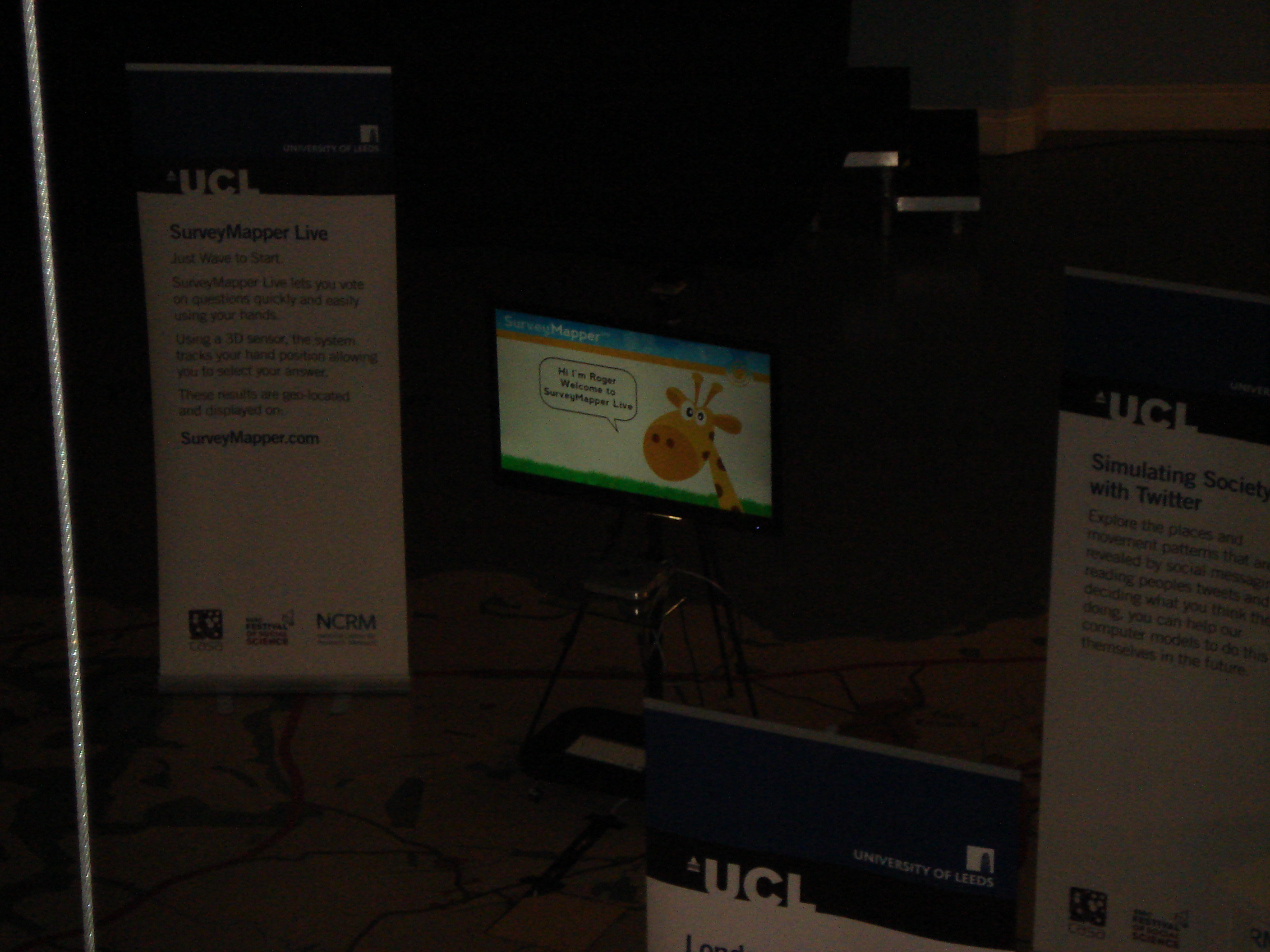
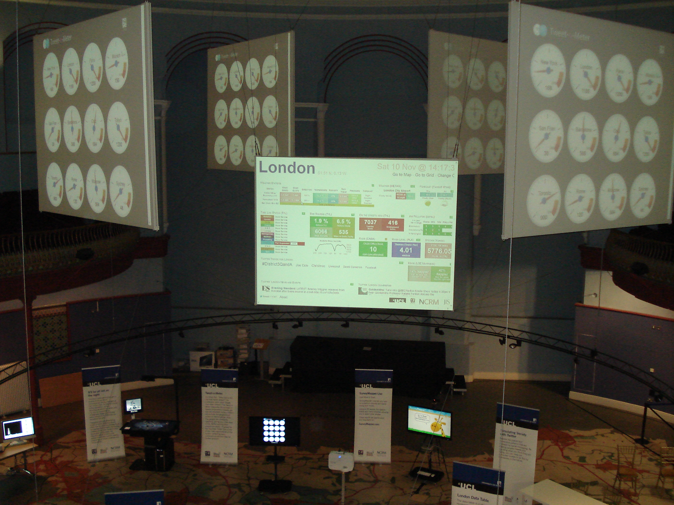
Academic users of Processing (of which there are many) tend to be rather more shy of publicising how they’re using it. I’ve heard reports from conferences of it being used, but you won’t see it directly mentioned very often. However, it certainly is being used by many people, including some at CASA. Processing.org’s exhibition has a few examples, some with an added dash of geography: a tube travel time map that rearranges based on your station of choice; a University of Madrid project visualising sources of air pollution over the city and another Madrid example looking at car use; Max Planck research networks combining collaboration networks and geography; an attempt to communicate the the scale of modern migration; and non-mappy ones including this ‘tool for exploring the dynamics of coastal marine ecosystems’ and a New York Times project visualising social media propagation.

What were the intentions behind these projects? They vary, of course, but I think often even the creators themselves have not been completely clear. Ben Fry makes a very good point in his book, visualising data: it is easy to confuse pleasing-looking graphics with communication. If the goal is to successfully allow the viewer to grasp some dataset in a way they couldn’t otherwise, a profusion of visual complexity may well achieve the opposite.

But communication is a subtle thing: the Python commit video communicates a visceral point that would otherwise have been completely invisible: you can see how a large coding project developed. That’s achieved through quite innocuous-seeming coding choices like allowing ‘file commits’ to fade at a given rate. And the point is clearly not to allow the viewer to access information in a more powerful way (in the sense that one would access information in a database).

In comparison, the marine ecosystem visualisation, while clearly having a great deal of depth, has a communication problem. (I say this as a researcher who, I think, has faced a very similar set of problems, so I’m, um, critically sympathising rather than passing judgement!) Perhaps only the coder is in a position to understand it fully. They developed the code and their perceptual understanding of the output in tandem, finishing up with a default grasp of its workings unavailable to others. This process may actually have made it more difficult for them to know what it’s like for a newcomer looking at the display and controls for the first time.

What’s useful as a researcher/coder, then, can be quite different from what is informative for others. This is an important use of visualisation coding that is rarely talked about, and has been very useful to me: finding new ways to understand your own work.

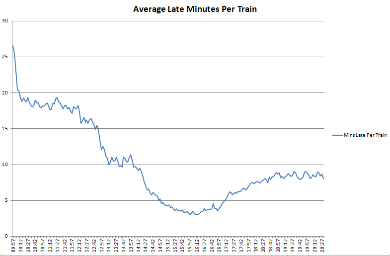
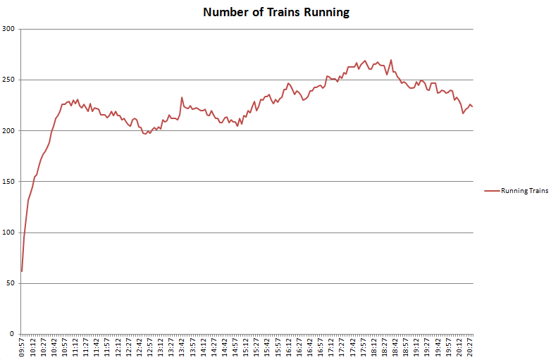
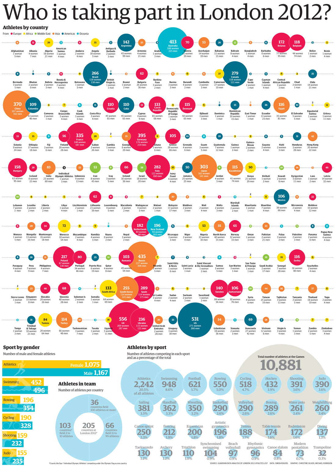
To try and untangle what’s going on here, let’s get onto those four static images – each a different types of visual information. An x-ray, a box plot, a mind-map and this recent graphic from the Guardian showing how many athletes from each country took part in the London 2012 olympics.

Alan Chalmers talks about x-rays in the classic philosophy of science book, ‘what is this thing called science?‘, quoting Michael Polanyi’s description of a medical student getting to grips with them:

At first, the student is completely puzzled. For he can see in the x-ray picture of a chest only the shadows of the heart and ribs, with a few spidery blotches between them. The experts seem to be romancing about figments of their imagination; he can see nothing that they are talking about. Then, as he goes on listening for a few weeks, looking carefully at ever-new pictures of different cases, a tentative understanding will dawn on him. He will gradually forget about the ribs and see the lungs. And eventually, if he perseveres intelligently, a rich panorama of significant details will be revealed to him; of physiological variations and pathological changes, of scars, of chronic infections and signs of acute disease. He has entered a new world. (Polanyi 1973 p.101 in Chalmers p.8)

Chalmers is making two points about scientific observation, but they’re equally applicable to visualisation. First, what people see “is not determined solely by the images on their retinas but depends also on experience, knowledge and expectations.” In the x-ray case, “the experienced and skilled observer does not have perceptual experiences identical to those of the untrained novice when the two confront the same situation.” Quite the reverse: the mind must be guided to a point where previously invisible information begins to become legible.

I’ve picked the box-plot as an archetypal example of a statistical visualisation that makes sense to the initiated. Is the difference between a box-plot and an x-ray only a matter of degree? I’d say it was qualitatively different. Consider someone looking at a box-plot after a long absence from statistics. They could plausibly refresh their understanding with a quick glance over the wikipedia page. Unlocking the meaning of the visualisation is much more accessible to simple reasoning and straightforward study – there’s no need to develop an entirely new perceptual toolbox in your head. That’s not to say that you can’t develop perceptual tools unique to reading statistics – but while it would be possible to learn boxplot interpretation from solitary study, it would take quite a different process to build the structures in your head needed for x-rays. The key phrase is “looking carefully at ever-new pictures of different cases” while an expert explains what they’re seeing. A new ability to see is pieced together though many guided associations over time.

That difference also applies to mind-maps. The article I linked to above included this image of mind-map notes from a lecture. Many people (myself included) probably have old mind-maps that were the culmination of note-taking for exams or essays. They make pretty much zero sense to anyone else. They probably don’t make much sense to the person who made them after enough time has elapsed. But that’s fine – the purpose of the mind-map isn’t direct visual communication, it’s the visual tip of a perception-forming iceberg. The process of making it is at least as crucial as the outcome. It isn’t meant to make sense to anyone else. This is the reason I’d argue projects like debategraph are not really effective. If you want to understand Tim Jackson’s ‘prosperity without growth’ (here’s the debategraph version), we already have a much better, test-hardened interactive communication tool that’s perfect for dealing with complex, interconnected concepts: the book.

So mind-maps are like x-rays: there’s a process of perception formation that must be gone through. But they’re also not like x-rays. You’re not learning to see the information the picture contains, but creating those perceptions in the first place – and there’s something about the active process of making them that’s vital to that. When the person who made the mind-map looks at it, it’s plugging into all the linked concepts developed in the mind, in part by the process of making it. With a mind-map, visualisation and perception development are a feedback system.

In stark contrast to all that, there’s the Guardian’s graph of athlete numbers (here’s a permalink in case it moves…) It’s meant to communicate, as quickly, intuitively and transparently as possible, a large quantity of numbers – and succeeds. It uses a concept we’re already primed to understand: relative size. You don’t even need a key (it’s only just occurred to me what an apt word that is.)

Returning to the marine ecosystem example: I suspect the process of coding it did something to reinforce the perceptions the coder had of the system being modelled. It was – like the mind-map process – a feedback. When they play with the parameters, that keys into their understanding in a way that is very difficult for anyone else. And – as with all the examples I’ve just discussed – that’s an entirely valid and useful role. But it’s also not the same as communicating information to a new audience. It’s not even the same as communicating information to the initiated. That use of visualisation – as with the mind-map – isn’t about communication at all. Its purpose is to develop the understanding of the person creating it.

A box-plot can’t form part of that kind of feedback loop in the same way – but it can do two jobs a mind-map can’t. You can produce box-plots that make sense to you, and can be used to communicate a summary to others who share that common language. This isn’t true of all visualisations, for the obvious reason that if you’ve created it yourself, you are probably not conforming to agreed standards of meaning. You’re making it up as you go along (though hopefully, as with the Guardian graphic, using commonly understood visual cues). But there’s also the added element common to x-rays and mind-maps: the perceptual tools we actively create through a process of development may exist only in our own minds. This doesn’t mean we can’t communicate our findings – it just means communication is a separate job and needs to be given its own consideration.

I’ll come back to this subject in a later post by taking a look at my PhD work that used Processing. Building interactive visualisation tools helped me to develop my own insights – but plugging those visualisations directly into the thesis did not go down very well! The stuff I’ve just discussed is, in part, me working out what went wrong: the feedback process for my own research was one thing, communication should have been another.

But the next article will take a break from all this navel-gazing and explain how to get Processing set up as part of a Netbeans project, as well as looking at ways to turn data into visuals.