Smart Cities, Smart Transport?

I’ve described this as “radar for trains”, but it now also includes a real-time view of bus and tube delays. The idea is to produce a single visualisation highlighting where there are problems with the transport system:

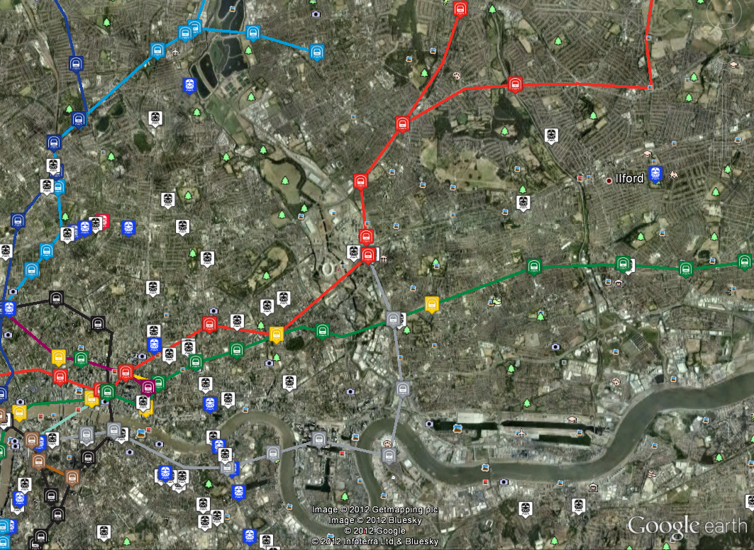
Status of London’s transport system at 13:00 on 8 August 2012. The green squares are bus stops showing delays, while blue is for delays at tube stations.

The map above shows the fusion of all the sources of transport data gained from the ANTS project. Although we know the position of every tube, bus and train in London, simply plotting this information on a map tells you nothing about the current state of the city’s transport network. At any point in time there can be 450 tubes, 7,000 buses and 900 trains, so any real-time view needs to reduce the amount of information to only what is really significant.

London’s transport system at 13:00 on 8 August 2012 showing details about slow running buses on route 242 at the Museum Street stop

The data shown on the map is as follows:

1. National Rail trains more than 5 minutes late shown as red boxes, positioned at their last reported station.

2. Tube Stations where there is a wait of 20% more than normal, shown as blue boxes.

3. Bus Stops where there is a wait of 50% more than normal, shown as green boxes.

4. Segments of tube lines where the TfL status message indicates that there are problems, shown as red lines (there are none on this map).

The first problem with a system like this is that the data comes from three different sources, all of which are fundamentally different. Trains run to a very specific timetable, so you know it’s the 08:46 Waterloo train at Clapham Junction platform 10 and it’s running 6 minutes late. The map above does show the late trains as red boxes, but the Network Rail API is a stream, so it has to run for a period of time to pick up all the train movement messages. On the plus side though, we are getting information for every train in the country, but it quickly becomes apparent that there are a huge number of late trains, so we have to filter only those that are more than 5 minutes late.

When we get to the buses and tubes things get a bit more interesting as the information we get from the APIs isn’t linked to any timetable. In order to work out the delays, I’ve taken several months’ worth of archive data and computed an average wait time for every bus stop, tube station, platform and hour of day. Then what’s plotted on the map is any bus stop showing a wait more than 50% above average, or any tube station 20% above average for the current hour. In addition to this, if a section of tube line is flagged as having problems in the TfL status message, then this section will be highlighted on the map.

Mean wait time for every hour of the day (x-axis 0-23) computed for Oxford Circus, Northbound Platform, Victoria Line using archive data from November 2011 to July 2012

Looking at the mean wait time for Oxford Circus above, it’s possible to see the daily variation in tube frequency for the morning and evening rush hour (07:00-09:00 and 17:00-19:00), along with the overnight shutdown at 03:00 when the wait time is defaulted to zero.

Essentially, this is a data-mining and feature detection system, comparing what we normally expect to see with what’s happening now to highlight any differences. At the moment it’s using the mean wait time to detect problems, but it should probably use number of standard deviations from the mean. Now that we’ve got a working system we can start to look at the best methods for detecting problems and release this to the public once we’re happy with it.

Also see: the PLACR Transport API Website which does a similar thing for tube station wait times.

Flexible Modelling Framework

Work is starting this week at the Centre for Spatial Analysis and Policy (CSAP) in Leeds on preparing the Flexible Modelling Framework (FMF) for release under an open source licence.  The FMF so far includes the following capabilities: microsimulation (using simulated annealing); spatial interaction modelling and agent-based modelling.  The idea behind the framework is to give researchers a tool where common modelling methodologies can be linked together and developed.

The FMF has been developed in the Java programming language.  The FMF has initially been used for generating realistic populations of Leeds (Harland et al., 2012: http://jasss.soc.surrey.ac.uk/15/1/1.html ) and is currently being used to examine trends and processes within retail markets.  Other applications, ranging from modelling health behaviours to influence of autism in early modern human populations are being planned.

The simulation capabilities of the FMF will also be made available under short TALISMAN tutorials and possibly TALISMAN social simulation courses in 2013.

Further information on the release and further functionalities will be added in due course.

The Flexible Modelling Framework

Tube Delays, Mean, Variance and Numerical Precision

This was something I came across while trying to calculate expected waiting times for tubes and buses. I’ve collected several months’ worth of transport data and wanted to calculate the mean and variance of waiting times at every station and platform. This can be achieved in a few hours for the tube, but there are over 600 bus routes in London and many more stops, so I needed something more computationally efficient than the naive algorithm that I was using.

After looking around, I found the following recurrance formulas for mean and variance:

[latex]M_k=M_{k-1}+(x_k-M_{k-1})/k[/latex]

[latex]S_k=S_{k-1}+(x_k-M_{k-1})*(x_k=M_k)[/latex]

See: http://www.jstor.org/stable/2286154 for a comparison of different methods, but the original method dates back to a paper from 1962 by B. P. Welford published in Technometrics: http://www.jstor.org/stable/1266577. It’s also in Donald Knuth’s book, “The Art of Computer Programming, Volume 2: Semi-Numerical Algorithms”, so I probably should have read my own copy a bit more carefully. The section on “Numerical Precision” in floating point maths is essential reading for any kind of data-mining or mathematical modelling. Not just because of the mantissa size and “Very big number minus very small number equals no change” problem, but also because I want to use running mean and variance to build an adaptive system that can detect problems in the transport network as they happen.

At the moment, the real-time problem detection system for the tube uses statistics that I have pre-computed, so when a waiting time at a station exceeds what is normal, then it gets flagged on the map as a potential problem. With the bus data calculations being so computationally intensive, it makes more sense to use the running mean and variance formulas in an online system so that it adapts over time to what is considered to be the normal operating point of the system.

TALISMAN at the Research Methods Festival

Virtual burglar space/time movementsI recently attended the National Centre for Research Methods (NCRM) 5th Research Methods Festival. Researchers from the Talisman project presented in a few different sessions, presenting cutting edge work on methods for collecting data (with a focus on new crowd-sourced data) as well as methods for spatial modelling, simulation and policy analysis. All of the presentations are available on the Research Methods Festival website.

The left image, taken from one of my presentations, shows some of the movement patterns produced by a ‘virtual burglar’ as they move around Leeds. We can use models like this to explore crime patterns at an individual level, and try to predict the effects that crime-reduction initiatives will have. The image was created using a piece of software called GeoTime, which is designed to allow users to explore spatio-temporal patterns of human movement. For more information about the burglary model itself, have a look at my Research page (scroll down to “Agent-Based Modelling of Crime”).

Harnessing Unique Methods of Visualisation

The first time I saw a tube map of London was a long time before I actually ever went there. It was during my one summer living in downtown Toronto with a bunch of crazy girls. One of the saner ones had a poster of the tube on her bedroom wall. It was from the Tate Gallery, where the different tube lines were created with thick lines of paint, which I’ve found again here. At the time, I found this poster really fascinating. If you know anything about the underground in Toronto, it’s pretty uninteresting and wouldn’t make much of a visual object!

Then more recently, I came across a super wacky map of the London Underground made by Franceso Dans, a visitor to UCL from Goldsmiths spending 6 weeks in CASA. You can view his map and his motivation behind this amazing construct on his blog. He’s working on more of these tube maps for different cities as well as an application that will allow you to travel from A to B anywhere in the world without using an airplane. He’s harvesting all the information, e.g. train and bus timetables, from the internet to build the site.

If you’d like to spend some time at CASA working with experts in visualisation, digital media, data harvesting and crowdsourcing, then consider applying for one of our User Fellowships. CASA has developed a number of interesting ways of visualising ‘big data’ that might benefit your organization. Or maybe you have an interest in crowdsourcing and seeing how you can harness the power of the crowd in providing data. Or you’d like to see what analysing twitter feeds might mean for your business. If you are a non-academic and want to work with CASA on a project where you could pick up some visualisation or data analysis skills, then apply for a User Fellowship. The deadline is 21 Sep 2012 and there’s more information on the TALISMAN website.

Picking Up Raster GIS Skills

Do you need to work with satellite images or datasets that are gridded? By gridded I mean data that are stored in grid like cells such as heights of the earth (or a digital elevation model), a global land cover map or gridded populations of the world? There are many other gridded datasets available, e.g. climate data, maps of biomass, ecosystem services, etc.

Example of a satellite image on the left and a LIDAR DEM on the right

Or have you collected data using a GPS that you need to interpolate to a continuous surface like that shown below:

An example of interpolating points to surfaces

If the answer to any of these questions is yes, or if you’ve suddenly realised this might be useful for your research,  then come and learn more about raster data and how to manipulate these datasets in a Geographic Information System (GIS). On 26-27 July 2012, Dr Steve Carver will teach a 1.5 day course at the University of Leeds on how to work with raster datasets using ArcGIS. This course is open to staff and students at Higher Education institutions in the UK and Ireland.

The course will cover the following topics with practical exercises throughout to gains hands-on experience with the concepts and the software:

  1. Introduction to raster modelling in ArcGIS
  2. Importing and converting raster data
  3. Point-surface interpolation
  4. Digital elevation models and terrain analysis
  5. Cartographic modelling (which allows you chain processes together in a work flow and automate your modelling)

You can register for the course on the TALISMAN website or email Amy O’Neill if you have any questions. Alternatively, if you catch this post after the course has taken place, contact Amy and let her know that you are interested in future courses.

The London Bus Strike: 22 June 2012

As part of the on-going ANTS project (Adaptive Networks for Complex Transport Systems) we’ve been tracking how many London buses are running during today’s bus strike. This is a very new development which we only just got working in time, so we don’t have any baseline data to compare against yet, but the two maps from this morning and lunchtime the day before show the geographical areas most affected by the strike.

Friday 22nd June 2012 09:00am showing the locations of buses as red markers with direction arrows

The above image shows all the buses running at 09:00am (BST) this morning when the strike was on. According to our data, there were 2,198 buses running in London at that time. We don’t yet have enough baseline data to compare this against, but by taking 13:21 (BST) on the previous day, we can say that there were 6,387 buses running then, giving 34% as a very rough guide.

Thursday 21 June 2012 13:18 (BST) showing the locations of buses as red markers with direction arrows

Comparing the two maps, it looks as though the worst affected area was the East of London. We can also show the density of buses using a heatmap:

Heatmap of bus locations for Friday 22nd June 2012 09:00 [Link to original map].

Following on from this, we also have data for the Underground, so this will enable us to analyse multi-modal flows and see how the bus strike has a knock-on effect on the tube.

Thanks to Steven Gray for drawing the bus icons as my original ones were useless.

ANTS: TfL Countdown API for Buses

The TfL Countdown API for buses was released a couple of weeks ago and I’ve been experimenting with it for the ANTS project so that we can add real-time bus tracking to the Tube, River Services and National Rail libraries. The ultimate aim of the ANTS project is to show how failures affect multi-modal flows, so integrating bus data into this system is the last major hurdle.

Buses on route 73, 17:22 on Monday 18th June 2012

The arrow icons need a bit of work as they are the ones I have been using to test the tube direction calculation code with, but they show which direction the bus is heading in quite effectively. In contrast to the tube data, the bus compass bearing is accessible from the API and seems to be taken directly from the GPS in the bus.

The position calculation is done by building up a passing points database of all the arrival times at bus stops as returned by the API. The aim was not to have to use any timetable data, or route data, so the locations can be calculated using only the data from the API. At the moment I’m only querying route 73 for debugging purposes, but the returned data contains the expected times of all buses for every stop along the route. This includes a unique trip code, a vehicle code and even the licence number of the actual bus. Unfortunately, the previous stop for a bus is missing, so we only know where the bus is heading, which makes interpolation along the route impossible. By building up the passing points database, we can query stopping points for the same bus route for a bus following behind the one we’re interested in and find out where it has come from. Then the position is a simple linear interpolation using the expected time, time now and run length for the link, also extracted from the passing points of a following service.

The London Transport Network in Realtime

Last Saturday, 5 May 2012, saw the FA Cup Final and various Olympics preparation events taking place in London, so I couldn’t help wondering was was going to happen to the transport system. The ANTS project (Adaptive Networks for complex Transport Systems) that I’ve been working on is designed as a toolkit for collecting transport data, so I used it to generate data for the Tube and National Rail networks. Now we have this data set, we can use it in other projects as an “FA Cup Final” scenario, allowing us to experiment on a real city.

The schedule of events for the day was as follows:

12:45 Arsenal played Norwich at the Emirates, attendance: 60,092

17:15 FA Cup Final between Liverpool and Chelsea at Wembley, attendance: 89,102

Evening, London Prepares Event at the Olympic Park, attendance: 40,000

5 May 2012 16:30 BST (45 mins before kickoff). Map shows tube locations taken from the TfL Trackernet API (link to raw data below)

The image above shows the positions of tube trains 45 minutes before the Cup Final kick off. Wembley stadium is located half way between the “y” of Wembley and the two tube lines above it, which is the location of the closest station to the ground, “Wembley Park” on the Metropolitan (purple) and Jubilee (grey) lines. It’s interesting to note the obvious gap in the service on the Bakerloo line (brown) which serves “North Wembley” and “Wembley Central” to the south (where the word “Wembley” cuts the brown line). We can look at the tube status messages from TfL for this time period and see that there are planned closures as follows:

District line (green): Turnham Green to Ealing Broadway

Northern Line (black): Camden Town to Mill Hill East and High Barnet

Piccadilly Line (dark blue): Acton Town to Uxbridge

These can be seen as sections on the map where there is an obvious lack of trains (open the KML links below for the original data containing station names). The significance of this is that any Chelsea supporters living around Turnham Green are going to get pushed towards Paddington to go North. Liverpool fans are likely to be coming from Euston.

If we move on to 20:30 after the Cup Final has finished and as the later events at the Olympic Park are starting, we can see the situation around Stratford (centre of map).

National Rail and Tube trains around Stratford for 20:30 (link to raw data below)

The National Rail trains show as blue, where the service is on time, red, where it is late, and white where the timetable shows there should be a service, but we can’t verify its location. Due to the differences in how National Rail services work, it is a completely different type of data to the Tube. For National Rail we can only look at the departure boards for stations and use the timetable to match up services. There is only one late train for this time period, coloured red and hiding in the top left corner. This highlights the differences in the type of data as it takes several minutes to query enough data from National Rail to make the map, during which time the trains move around, causing the uncertainty in the data.

This is still a work in progress and requires a much more rigorous analysis, but you can see delays occurring around Wembley just before and after the match, plus some services heading for Stratford running a couple of minutes late in the evening. I’ve not got any information on the National Rail closure affecting services back to Liverpool in the evening, but it doesn’t look as if they were any really major problems.

As this was the first attempt at collecting a comprehensive set of data for a single day, it didn’t go completely to plan. There are questions about how you cope with the uncertainties in the National Rail data and how you compare it with the Trackernet information. The DLR and Overground are missing, as are the buses and it’s not clear how to use the TfL tube status information. We also don’t know anything about the commuters on the network, so can only guess at where all their journeys begin and what route they take. What is also needed is baseline data on what a normal Saturday should look like, which will give us the ability to pull anything abnormal out of the data.

Ultimately, the reason behind doing this is to provide a real-time snapshot of London’s transport network and how it behaves over the course of a day. For this we need to establish an automatic method of detecting and highlighting problems which is proving difficult at the moment. Then we can look at how a problem on one line has a knock-on effect on another.

The image below shows an animation of all tube trains for the 16 April 2012 from 8am to 8pm [link to movie]:

Links to data used in this post:

Tube Network KML

Trackernet 16:30 KML

National Rail 20:24 KML

Trackernet 20:30 KML

MapTube Map of Realtime Tube Locations

MapTube Topical Maps

It is four years today since MapTube was launched at the Barbican and to mark this event, I’ve made some changes to how the home page displays. This is a bit of an experiment, but I’ve tried to make the home page display topical data by using RSS feeds from the BBC News page, the Guardian and our own CASA blog aggregator. The basic method is to construct a list of keywords and frequencies from the RSS feeds, removing any words on a “stop words” list like “a”, “and”, “or” etc. Then a network graph of MapTube’s maps is constructed where each vertex is a map which is linked by edges made from where maps share keywords. So, for example, all the “London” maps form a fully connected group. This is similar to my previous post on using “Force Directed Graphs for Visualisation of Search Results”: http://talisman.blogweb.casa.ucl.ac.uk/2012/01/23/force-directed-graphs-for-visualisation-of-search-results/

Network Graph of MapTube London Maps

Once the connections between the maps has been calculated, each vertex is visited in turn and assigned a topicality value based on the RSS word frequency of all the map’s matching keywords. This weight is then propagated through the network via any connected edges up to a distance of 2 links from the parent vertex, with the weight reduced by a factor of 1/(r^2), where “r” is the number of vertices traversed. I did experiment with how many links from the parent vertex to travel, but found that 1 or 2 links from the parent gave the best results. Any further than this and it just ends up giving weight to the maps with the highest number of connections.

As I stated at the beginning, this is still very much an experiment and I’ve deliberately built the system with enough degrees of freedom to allow for some tinkering with the algorithm. I can control which feeds we mine for the topical keywords, the stop words list can be edited (I had to put “us” back in as we have a lot of United States maps) and I also have the ability to add my own keyword weights. At the moment I’ve artificially inflated the real-time tube locations map to get it onto the front page along with our most popular map of the London Underground tube station locations, which is now three years old. The first run of the system on the live server produced high values for a lot of the air quality maps, which was an interesting result.

The biggest criticism I had of MapTube was that the home page always displayed the most popular maps, sorted by the number of hits. This meant that the most popular maps stayed on the front page by virtue of people always clicking on the top ones. We did try showing the most recently added maps for a while, but that didn’t work as lots of test maps get uploaded with no data on them. Hopefully, as this new topical maps system evolves, we should see MapTube as a much more dynamic source of geographical information.

One final point, but by knowing what data we have on MapTube that’s topical, we also know what’s topical that we don’t have and should perhaps try to track down and upload. This approach would form a closed loop geographic information system.