The algorithms required to build virtual worlds like Google Earth and World Wind are really fascinating, but building a virtual world containing real-time city data is something that hasn’t yet been fully explored. Following on from the Smart Cities presentation in Oxford two weeks ago, I’ve taken the agent-based London Underground simulation and made some improvements to the graphics. While I’ve seen systems like Three.js, Unity and Ogre used for some very impressive 3D visualisations, what I wanted to do required a lower level API which allowed me to make some further optimisations.
Here is the London Underground simulation from the Oxford presentation:
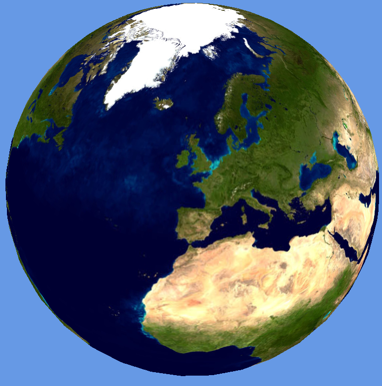
The Oxford NCRM presentation showed the Earth tiled with a single resolution NASA Blue Marble texture, which was apparent as the view zoomed in to London to show the tube network and the screen space resolution of the texture map decreased.
The Earth texture and shape needs some additional work, which is where “level of detail” (LOD) comes in. The key point here is that most of the work is done by the shader using chunked LOD. If the Earth is represented as a spheroid using, for example 40 width segments and 40 height slices, then recursively divided using either quadtree or octtree segmentation, we can draw a more detailed Earth model as the user zooms in. By using the same number of points for each sub-mesh, only a single index buffer is needed for all LODs and no texture coordinates or normals are used. The shader uses the geodetic latitude and longitude calculated from the Cartesian coordinates passed for rendering, along with the patch min and max coordinates, to get the texture coordinates for every texture tile.
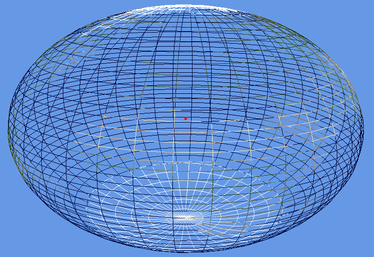
The two images above show the Earth using the the NASA Blue Marble texture. The semi-major axis has been increased by 50%, which gives the “smartie” effect and serves to show the oblateness around the equator. The main reason for doing this was to get the coordinate systems and polygon winding around the poles correct.
In order for the level of detail to work, a screen space error tolerance constant (labelled Tau) is defined. The rendering of the tiled earth now works by starting at the top level and calculating a screen space error based on the space that the patch occupies on the screen. If this is greater than Tau, then the patch is split into its higher resolution children, which are then similarly tested for screen space error recursively. Once the screen space error is within the tolerance, Tau, then the patch is rendered.
The two images above show a correct rendering of the Earth, along with the underlying mesh. The wireframe shows a triangular patch on the Earth at the closest point to the viewer which is double the resolution (highlighted with red line). Octtree segmentation has been used for the LODs.
The code has been made as flexible as possible, allowing all the screen error tolerances, mesh slicing and quad/oct tree tiling to be configured to allow for as much experimentation as possible.
The interesting thing about writing a 3D system like this is that it shows that tiling is a fundamental operation in both 2D and 3D maps. In web-based mapping, 2D, maps are cut into tiles, which are usually 256 pixels square, to avoid having to load massive images onto the web browser. In 3D, the texture sizes might be bigger, but, bearing in mind that Google are reported to be storing around 70TB of texture data for the Earth, there is still the issue of out of core rendering. For the massive terrain rendering systems, management of data being moved between GPU buffers, main memory, local disk and the Internet is the key to performance. My feeling was that I would let Google do the massive terrain rendering and high resolution textures and just concentrate on building programmable worlds that allow exploration, simulation and experimentation with real data.
Finally, here’s a quick look at something new:
The tiled Earth mesh uses procedural generation to create the levels of detail, so, extending this idea to procedural cities, we can follow the “CGA Shape” methodology outlined in the “Procedural Modeling of Buildings” paper to create our own virtual cities.
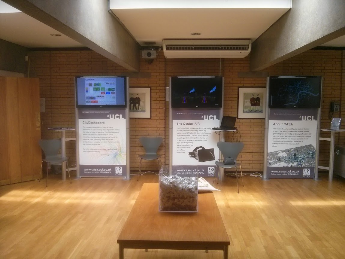
As you can see from the image below, we spent three days at the NCRM Research Methods Festival in Oxford (#RMF14) last week.
In addition to our presentations in the “Researching the City” session on the Wednesday morning, we were also running a Smart Cities exhibition throughout the festival showcasing how the research has been used to create live visualisations of a city. This included the now famous “Pigeon Simulator”, which allows people to fly around London and is always very popular. The “About CASA” screen on the right of the picture above showed a continuous movie loop of some of CASA’s work.
The exhibition was certainly very busy during the coffee breaks and, as always at these types of events, we had some very interesting conversations with people about the exhibits. One discussion with a lawyer about issues around anonymisation of Big Datasets and how you can’t do it in practice made me think about the huge amount of information that we have access to and what we can do with it. Also, the Oculus Rift 3D headset was very popular and over the three days we answered a lot of questions from psychology researchers about the kinds of experiments you could do with this type of device. The interesting thing is that people trying out the Oculus Rift for the first time tended to fall into one of three categories: can’t see the 3D at all, see 3D but with limited effect, or very vivid 3D experience with loss of balance. Personally, I think it’s part psychology and part eye-sight.
Next time I must remember to take pictures when there are people around, but the sweets box got down to 2 inches from the bottom, so it seems to have been quite popular.
We had to get new Lego police cars for the London Riots Table (right), but the tactile nature of the Roving Eye exhibit (white table on the left) never fails to be popular. I’ve lost count of how many hours I’ve spent demonstrating this, but people always seem to go from “this is rubbish, pedestrians don’t behave like that”, through to “OK, now I get it, that’s really quite good”. The 3D printed houses also add an element of urban planning that wasn’t there when we used boxes wrapped in brown paper.
The iPad wall is shown on the left here with the London Data Table on the right. Both show a mix of real-time visualisation and archive animations. The “Bombs dropped during the Blitz” visualisation on the London Data Table which was created by Kate Jones (http://bombsight.org ) was very popular, as was the London Riots movie by Martin Austwick.
All in all, I think we had a fairly good footfall despite the sunshine, live Jazz band and wine reception.
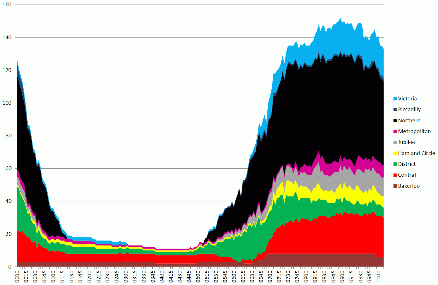
Tubes running up to 10am on 5 February 2014, during the first day of the tube strike
The graph above is a stacked area chart showing the number of tubes running on each of the London Underground lines. The width of the coloured part represents the number of tubes (i.e. 150 is the total number running summed over all lines at the peak around 08:45).
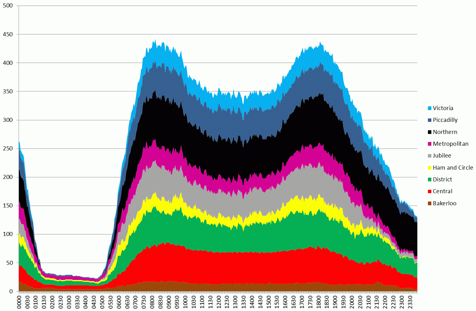
One thing that is apparent is that the Northern line ran a fairly good service. Compare the chart above to a normal day (4th Feb):
Tubes running between midnight and midnight from 4 to 5th February the day before the strike – note different timescale from previous chart
The second graph shows the variation for a whole day, so the earlier graph corresponds to the first peak on the second graph.
In order to quantify these results, I’ve taken the raw data, which is the number of tubes running during each 3 minute period between 07:00 and 10:00, produced totals, and compared this against the previous day’s data (Tuesday 5th).
Based on an average taken over the whole 7-10am period, 33.57% of the normal service was running. The breakdowns by lines are as follows:
Bakerloo: 48.3%
Central: 34.5%
District: 19.4%
Hammersmith and City and Circle: 32.1%
Jubilee: 19.4%
Metropolitan: 15.0%
Northern: 72.2%
Piccadilly: 2.3%
Victoria: 46.2%
The figure for the Piccadilly line looks much lower than I would expect, so this needs further investigation. It could be an issue with a signal problem as the data here is taken straight from the public “trackernet” API. Also, just because tubes are running doesn’t mean you can actually get on one. At the moment we don’t have any loading figures for stations, but this is something we are working on.
Also, these figures don’t show the whole picture as they miss out the spatial variation. With many stations closed, services actually stopping in central London were greatly reduced.
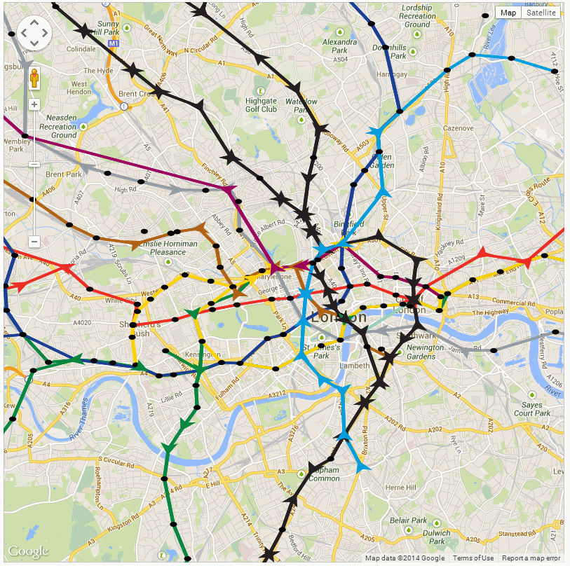
The following is the picture at 9am this morning:
09:00am on 5th February 2014, tubes are shown as arrows pointing in the direction of movement
Although this isn’t the best visualisation, it serves to show that there are some obvious gaps in the service.
Following on from my previous posts on AgentScript and Google Maps, I’ve fixed the performance problem when zooming in and built a model of the London Underground to play with:
An AgentScript model of the London Underground using data for 27 January 2014 at 15:42:00
I’m not going to include the modified code here as it’s grown a bit too long for a blog post, but the aim is to tidy it up and publish it on GitHub as something which other people can use as a library. The zooming in problem with my previous examples occurs because the Canvas used by AgentScript doubles in size each time you zoom in. Google Maps works by using tiles of a fixed size, but AgentScript isn’t designed to use tiles as it uses the vector based drawing methods of the Canvas object. My original idea for fixing the zooming in problem was to include a clip rect on all the Canvas elements which AgentScript adds. This doesn’t work and the only solution seems to be to limit the size of the Canvas to just what is visible on the screen. The new code contains a lot of transformation calculations to change the size of the Canvas as you pan and zoom. When the map is panned you can see the new visible area being drawn when the drag is released (see following YouTube video).
The only drawback of this is that the drawing Canvas for the turtle’s pen can’t be preserved between drag and zoom as it’s being clipped to the visible viewport. You can also see that the station circles aren’t circles as AgentScript is drawing in a Cartesian system which I’m fitting to a Mercator box. These are problems I hope to overcome in a future version.
Now that I’ve got a model of the London Underground in a box, I can start experimenting with it. The code to run the model is as follows:
[code language=”js”]
#######################################################
#AgentScript
#######################################################
u = ABM.util # shortcut for ABM.util
class MyModel extends ABM.Model
#this is a kludge to get the bounds to the model – really need a class to encapsulate this
constructor: (div, size, minX, maxX, minY, maxY, isTorus, hasNeighbors, bounds) ->
@bounds_=bounds
super(div,size,minX,maxX,minY,maxY,isTorus,hasNeighbors)
setup: -> # called by Model constructor
#console.log(@)
#console.log(@gis(52,48))
#@anim.setRate(10) #one frame a second (default is 30)
@lineColours =
B: [0xb0,0x61,0x10]
C: [0xef,0x2e,0x24]
D: [0x00,0x86,0x40]
H: [0xff,0xd2,0x03] #this is yellow!
J: [0x95,0x9c,0xa2]
M: [0x98,0x00,0x5d]
N: [0x23,0x1f,0x20]
P: [0x1c,0x3f,0x95]
V: [0x00,0x9d,0xdc]
W: [0x86,0xce,0xbc]
#lineY colour?
#load tube station data from csv file
xhr = u.xhrLoadFile(‘data/station-codes.csv’,’GET’,’text’,(csv)=>
#there are no quotes in my station list csv file, so parse it the easy way
#jQuery csv or http://code.google.com/p/csv-to-array/ might be better alternatives
lines = csv.split(/\r\n|\r|\n/g)
for line in lines
if line[0]!=’#’
data = line.split(‘,’)
stn = data[0]
lon = data[3]
lat = data[4]
lon=parseFloat(lon)
lat=parseFloat(lat)
if !(isNaN(lat) and isNaN(lon))
pxy = @gisLatLonToPatchXY lat, lon
#ABM.Agent.hatch 1, @nodes
# @x=pxy.patchx
# @y=pxy.patchy
#@nodes.hatch 1
@patches.patchXY(Math.round(pxy.patchx),Math.round(pxy.patchy)).sprout 1, @nodes, (a) =>
a.x=pxy.patchx
a.y=pxy.patchy
a.name=stn
)
#load network graph from json file
xhr2 = u.xhrLoadFile(‘data/tube-network.json’,’GET’,’json’,(json)=>
#it looks like this returns a json object directly
#test = JSON.parse json #newer browers support this, otherwise use var objJSON = eval("(function(){return " + strJSON + ";})()");
#wait for both files (stations+network) to be loaded before making the links between station nodes
u.waitOnFiles(()=>
#console.log("xhr2 wait",@nodes.length)
#json file has [‘B’], [‘C’], [‘D’] etc array at top level for all lines
#each of these contain { ‘0’: zero direction array, ‘1’: one direction array }
#where each array is a list of OD links as follows: { d: "STK", o: "BRX", r: 120 }
#d=destination, o=origin and r=runtime in seconds
for linecode in [ ‘B’, ‘C’, ‘D’, ‘H’, ‘J’, ‘M’, ‘N’, ‘P’, ‘V’, ‘W’ ]
#console.log("line data",json[linecode][‘0’])
for dir in [0, 1]
for v in json[linecode][dir]
agent_o = @nodes.with("o.name==’"+v.o+"’")
agent_d = @nodes.with("o.name==’"+v.d+"’")
@links.create agent_o[0], agent_d[0], (lnk) =>
lnk.lineCode = linecode
lnk.direction = dir
lnk.runlink = v.r
lnk.color = @lineColours[linecode]
#now add a pre-created velocity for this link based on distance and runlink seconds
dx=lnk.end2.x-lnk.end1.x
dy=lnk.end2.y-lnk.end1.y
dist=Math.sqrt(dx*dx+dy*dy)
lnk.velocity = dist/lnk.runlink
#NEW CODE TO LOAD POSITIONS FROM CSV
@loadPositions()
)
)
null # avoid returning "for" results above
loadPositions: ->
#get current positions of tubes from the web service
xhr = u.xhrLoadFile(‘data/trackernet_20140127_154200.csv’,’GET’,’text’,(csv)=>
#set data time here – needed for interpolation
lines = csv.split(/\r\n|\r|\n/g)
for i in [1..lines.length-1]
data = lines[i].split(‘,’)
if data.length==15
#line,trip,set,lat,lon,east,north,timetostation,location,stationcode,stationname,platform,platformdirectioncode,destination,destinationcode
for j in [0..data.length-1]
data[j]=data[j].replace(/\"/g,”) #remove quotes from all columns
lineCode = data[0]
tripcode=data[1]
setcode=data[2]
stationcode = data[9] #.replace(/\"/g,”) #remove quotes
dir = parseInt(data[12])
agent_d = @nodes.with("o.name==’"+stationcode+"’") #destination node station
#find a link with the correct linecode that connects o to d
if (agent_d.length>0)
for l in agent_d[0].myInLinks()
#console.log("l: ",l)
if l.lineCode==lineCode and l.direction==dir
#OK, so l is the link that this tube is on and we just have to position between end1 and end2
#now hatch a new agent driver from this node and place in correct location
#nominally, the link direction is end1 to end2
l.end1.hatch 1, @drivers, (a) => #hatch a driver from a node
a.name=l.lineCode+’_’+tripcode+"_"+setcode #unique name to match up to next data download
a.fromNode = l.end1
a.toNode = l.end2
a.face a.toNode
a.v = l.velocity #use pre-created velocity for this link
a.direction = l.direction
a.lineCode = l.lineCode
a.color=@lineColours[l.lineCode]
)
null
step: ->
for d in @drivers
d.face d.toNode
d.forward Math.min d.v, d.distance d.toNode
if .01 > d.distance d.toNode # or (d.distance d.toNode) < .01
d.fromNode = d.toNode
#choose new node to move towards
#d.toNode = u.oneOf d.toNode.linkNeighbors() #.oneOf()
#console.log(d)
#console.log(d.fromNode.myOutLinks())
#lnks = ABM.AgentSet.asSet(u.oneOf d.fromNode.myOutLinks())
#vlnks = lnks.with("o.line==’V’ && o.direction==1")
#if (vlnks.length>0)
# d.toNode = vlnks.oneOf()
###########################################
#pick a random one of the outlinks from this node
#NOTE: the agent’s myOutLinks code go through all links to find any with from=me i.e. it’s inefficient
#also, you can’t use "with" as it returns an array
lnks = (lnk for lnk in d.fromNode.myOutLinks() when lnk.lineCode==d.lineCode and lnk.direction==d.direction)
#console.log("LINKS: ",lnks)
if (lnks.length>0)
l = lnks[u.randomInt lnks.length]
d.toNode = l.end2
d.v = l.velocity
else
#condition when we’ve got to the end of the line and need to change direction – drop the direction constraint
lnks = (lnk for lnk in d.fromNode.myOutLinks() when lnk.lineCode==d.lineCode)
if (lnks.length>0)
l = lnks[0]
d.direction=l.direction #don’t forget to change the direction – otherwise everybody gets stuck on the last link
d.toNode = l.end2
d.v = l.velocity
else
#should never happen
console.log("ERROR: no end of line choice for driver: ",d)
#d.die ?
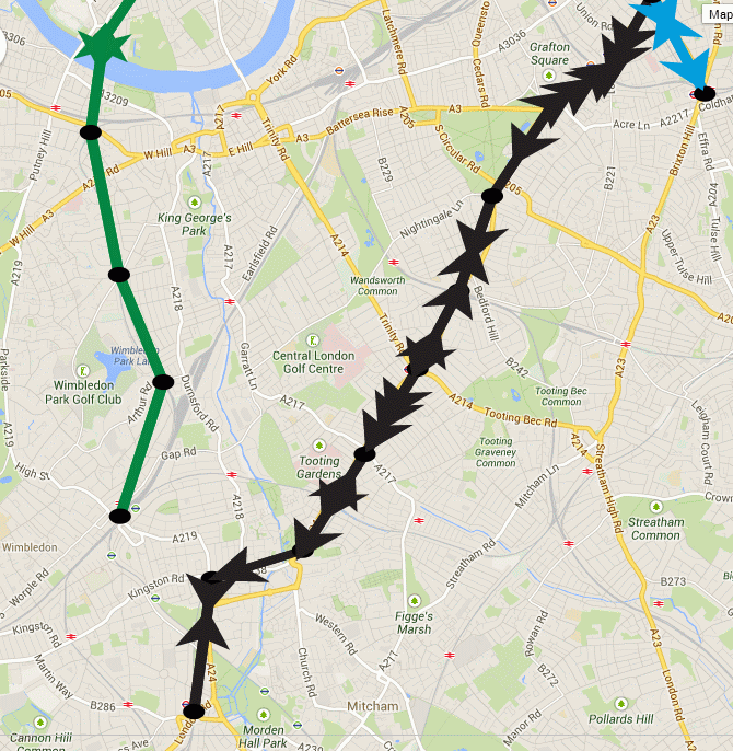
The interesting thing about this is that when you’ve been running the model for a while, you start to notice that the tubes begin to bunch up together:
Snapshot of the London Underground model showing gaps opening up and bunching of trains
Compression waves aren’t supposed to exist in the tube network, but the graphic above clearly shows how a gap has formed in the District line to Wimbledon (green), while the Northern Line to Morden (black) shows three trains travelling south together. It’s more apparent on the YouTube video as you can see how this builds up from the starting condition (27th Jan 2014 15:42), where the tubes are evenly spaced. What I suspect is happening is a function of the network and the random choices that are being made when a train gets to a decision point. The model uses a random number generator (uniform) to make the route choice, so the lines with the most complex branches (e.g. Northern) are showing this problem as a result of the random shuffling of trains. Crucially, the Victoria Line doesn’t exhibit this phenomena as it’s a single piece of straight track.
So, based on the fact that I suspect this is a fault of the model, why would it be of interest in the real tube network? If the route decisions were made correctly based on service frequency and not a highly suspect but supposed to be uniform Javascript random number generator, then you would still see a form of this effect in real life. It must happen just because you can’t guarantee when a train from a connecting branch will join behind another one. The spacings are so close that any longer than average wait at a station will cause problems behind. Line controllers limit this problem by asking trains to wait at stations to maintain the spacing. This is completely missing from the model, which has no feedback of this kind, and so we see the network diverging. The key point is that we can measure how much intervention is required to keep the network in its ideal state, which is where the archives of real life running data come into play. By looking at data from the real network it should be possible to see where these sorts of interventions are being made and compare it to our model. It’s not difficult to add wait times at stations to simulate loading in the rush hour.
It can’t have escaped most people’s attention that the recent release of Internet Explorer 11 contains support for WebGL (IE11 Dev Center). Now that advanced 3D graphics are becoming possible on all platforms, visualisations like the Realtime 3D Tube Trains that I posted about a while ago are likely to become mainstream.
On a similar theme, I’ve been looking at the open source AgentScript library which is a port of the popular NetLogo agent based modelling library to CoffeeScript and Javascript. CoffeeScript is a library to make writing Javascript easier, but my aim was to see whether it could be made to work with Google Maps to build dynamic maps with geospatial agent based models running on them. Going back to the 3D tube trains example, this could allow us to build a model which used realtime data from the TfL API to get the actual positions of trains, then run a “what if” scenario if a tube line failed to try and predict where the biggest problems are likely to occur. In short, the idea is to allow code to be run on maps to make them dynamic (see: http://m.modelling4all.org/ for another website which allows users to publish models).
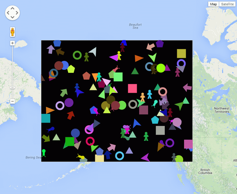
AgentScript (in CoffeeScript) running on a Google Map. If you haven’t see the example, the multi-coloured agent shapes move around randomly.
The example shown above was the result of just a few hours work. It’s actually the “sketches/simple.html” example from the GitHub repository, but I’ve taken out the patches.
The code to achieve this is basically a modification of the standard Google Maps code to convert it to CoffeeScript, which then allows for the integration with AgentScript. The code is shown below:
While this demonstrates the idea of adding an AgentScript Canvas element to a Google Maps overlay, there are still issues with getting the canvas box in the correct position on the map (at the moment it stays in the same position when you zoom out, but the scrolling works). Also, the agents themselves are moving on a flat surface, while the four corners of the box are specified in WGS84 and reprojected to Spherical Mercator by the Google Maps library, so there is a coordinate system issue with the agents’ movement. Despite these issues, it still makes for an interesting proof of concept of what could be possible.
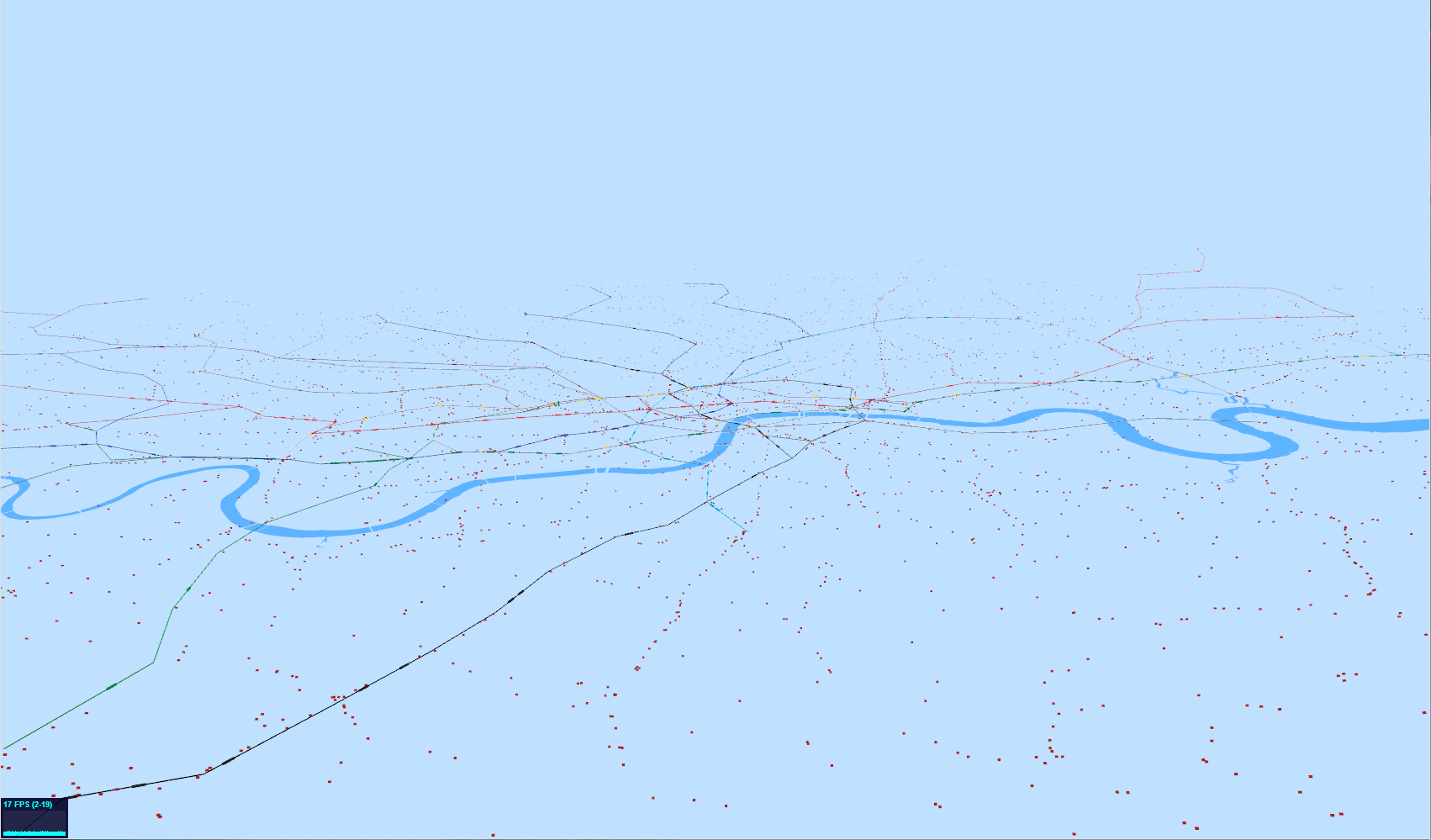
The image above shows the latest attempt at producing a real-time moving visualisation of the whole of London’s transport system. The tube lines are visible with the darker areas showing the locations of the actual tube trains. These are really too small to see at this resolution as I’ve zoomed out to show all the tiny red dots, which are the buses. Both the tubes and the buses are now animated as can be seen in the following YouTube clip:
As a rough guide to performance, there are approximately 450 tubes and 7,000 buses being animated at around 19 frames per second on an i7 with a Radeon 6900M graphics card (27 inch iMac).
The first thing that most people are going to notice is that not all the buses are actually moving. The reason for this is quite interesting as I’ve had to use different methods of animating the tube and bus agents to get the performance. The other thing that’s not quite right is that the buses move in straight lines between stops, not along the road network. This is particularly noticeable for the ones going over bridges.
The tubes are all individual “Object3D” objects in three.js and animate using a network graph of the whole tube network. This works well for the tubes as there are comparatively few of them, so, when the data says “one minute to next station” and we’ve been animating for over a minute, then we can work out what the next stop on its route is and generate a new animation record for the next station along. When there are 7,000 buses and 21,000 bus stops, though, the complete bus network is an order of magnitude more complicated than the tube. For this reason, I’m not using a network graph, but holding the bus position when it gets to the next stop on the route as I can’t calculate the next bus stop without holding the entire 21,000 vertex network in memory. While this would probably work, it seems to make more sense to push the more complicated calculations over to the server side and only hold the animation data on the WebGL client. Including the road network is also another level of complexity, so it would make a lot of sense to include this in the server side code, so the client effectively gets sent a list of waypoints to use for the animation.
Finally, I have to concede that this isn’t terribly useful as a visualisation. It’s not until delays and problems are included in the visualisation that it starts to become interesting.
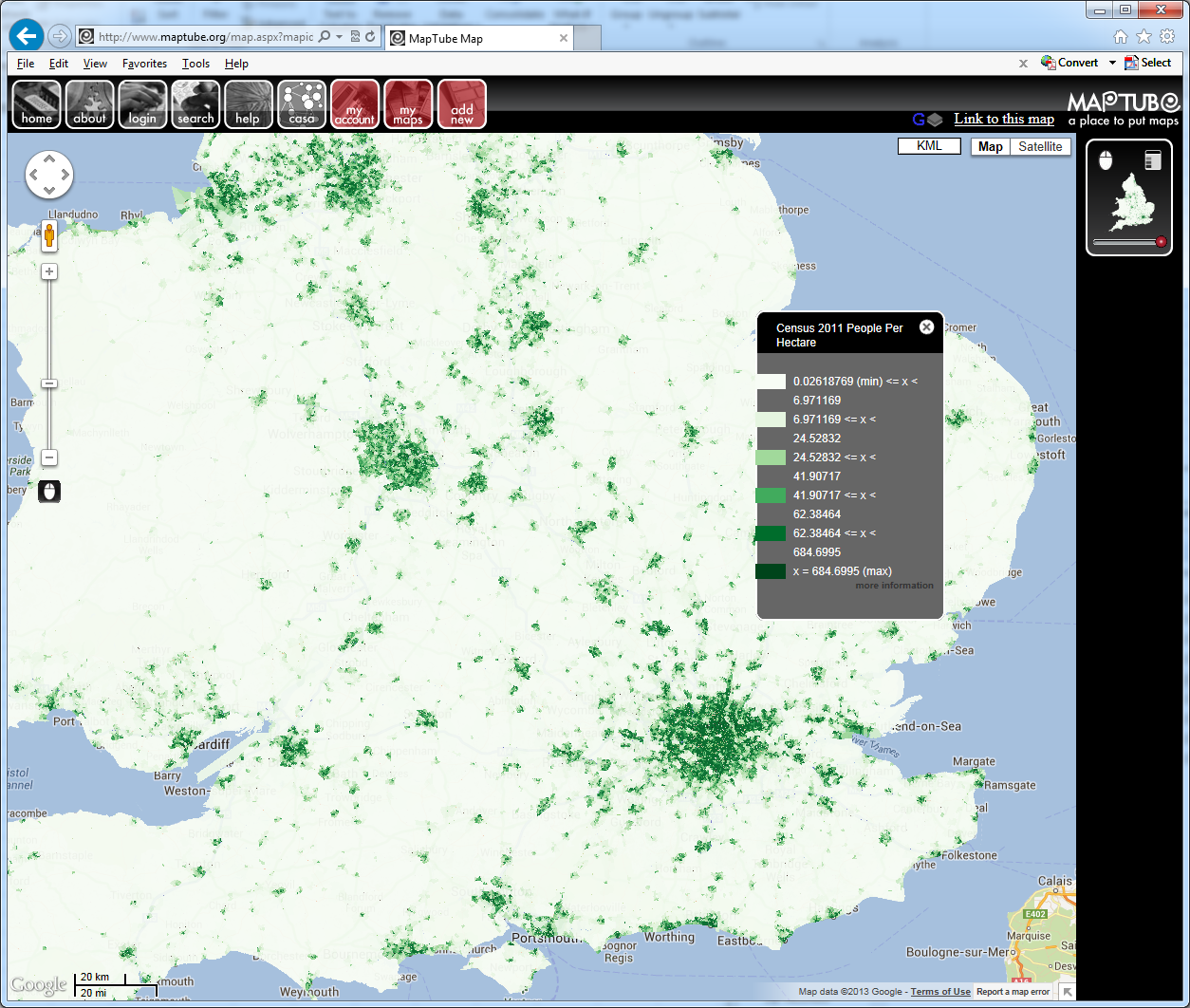
The Census 2011 boundary files for the OA, LSOA and MSOA geographies have just been added to the MapTube tile server, so it’s now possible to make maps from the new Census data. The following is the first example using the population density table:
MapTube showing population density (people per hectare) from the 2011 Census at LSOA level.
The data was uploaded as a CSV file from the NOMIS r2.2 bulk download. As long as there is a CSV file containing a header row, plus a recognisable column containing an area key, MapTube should be able to work out what the file contains and build the map automatically.
Now that the new boundary files are on the live server, it is possible to upload the entire Census release as an automatic process using the DataStore handling code mentioned in previous posts. While this might seem like a good idea, from previous experience, quality is more important than quantity. Using the DataStore mining process to find interesting and unusual data and uploading that instead would seem like the better option.
I’ve been working on the infrastructure to deliver real time data to a web page running WebGL for a while. The results below show locations of all tube trains in London as reported by the TfL Trackernet API.
3D visualisation of London tube trains using the Trackernet API at 14:20 on Monday 24 June 2013
The following link shows a movie which shows the trains moving:
The average time taken for a tube to go between two stations on the London Underground is about 2 minutes, but it’s still surprising to see how slowly they move at this scale.
The map shows the Thames and a 300 metre square block of buildings taken from the OS Open Data release. I’ve randomised the building heights rather than joining with the Lidar data for now, but it gives an impression of the level of data that can be represented using WebGL. Both of these datasets originated as shapefiles in OSGB36, which I reprojected into Cartesian ECEF coordinates. A certain amount of geometry conditioning is necessary to remove degenerates and tidy up holes in polygons before the geometry is correct for three.js to handle. I used a workflow of Java and Geotools to reproject and save a Collada file, which I then loaded into 3DS Max to clean and texture before exporting the final version which you see on the web page. I also experimented with GeoJSON, but Collada worked much better for the 3D nature of the data.
The coloured lines of the tube network are another Collada file, built from a network graph with straight lines between stations. This is actually 3D, using the station platform heights that TfL released, but as there is only a 100 metre variation across the whole tube network the heights aren’t really visible at this resolution. In order to make the trains move, I have a web service that returns a CSV file containing tube locations, direction of motion and time to next station. This is the point where I have to admit that the locations aren’t true real time, as I can only get position updates from the Trackernet API every 3 minutes. This means that there needs to be Javascript code on the page to query the latest position update and continue moving the trains towards their next stations according to their expected arrival times until the next data update is available. This requires something similar to an agent based model to animate the tube agents using the latest data and a network graph structure describing the tube network. The network file is in JSON format with runlinks in minutes between adjacent stations, taken from the official TfL TransXChange data. Without this it wouldn’t be possible to move the tubes along the track at the right speed in the right direction.
That’s the situation for 700 tube trains, but 10,000 buses is a completely different matter. Tests with the Countdown data show that the frame rate drops significantly with 10,000 agents, so level of detail looks like the key here. Also, one potentially interesting twist is that TfL’s Countdown system for buses has a message passing structure, so is potentially closer to true real time than the tubes.
Finally, it really needs a better rendering system as it could look visually so much better, but what you see is the limit of my artistic talent.
It’s been very quiet over Easter and I’ve been meaning to look at 3D visualisation of geographic data for a while. The aim is to build a framework for visualising all the real-time data we have for London without using Google Earth, Bing Maps or World Wind. The reason for doing this is to build a custom visualisation that highlights the data rather than being overwhelmed by the textures and form of the city as in Google Earth. Basically, to see how easy it is to build a data visualisation framework.
After quite a bit of experimentation, the results are shown below:
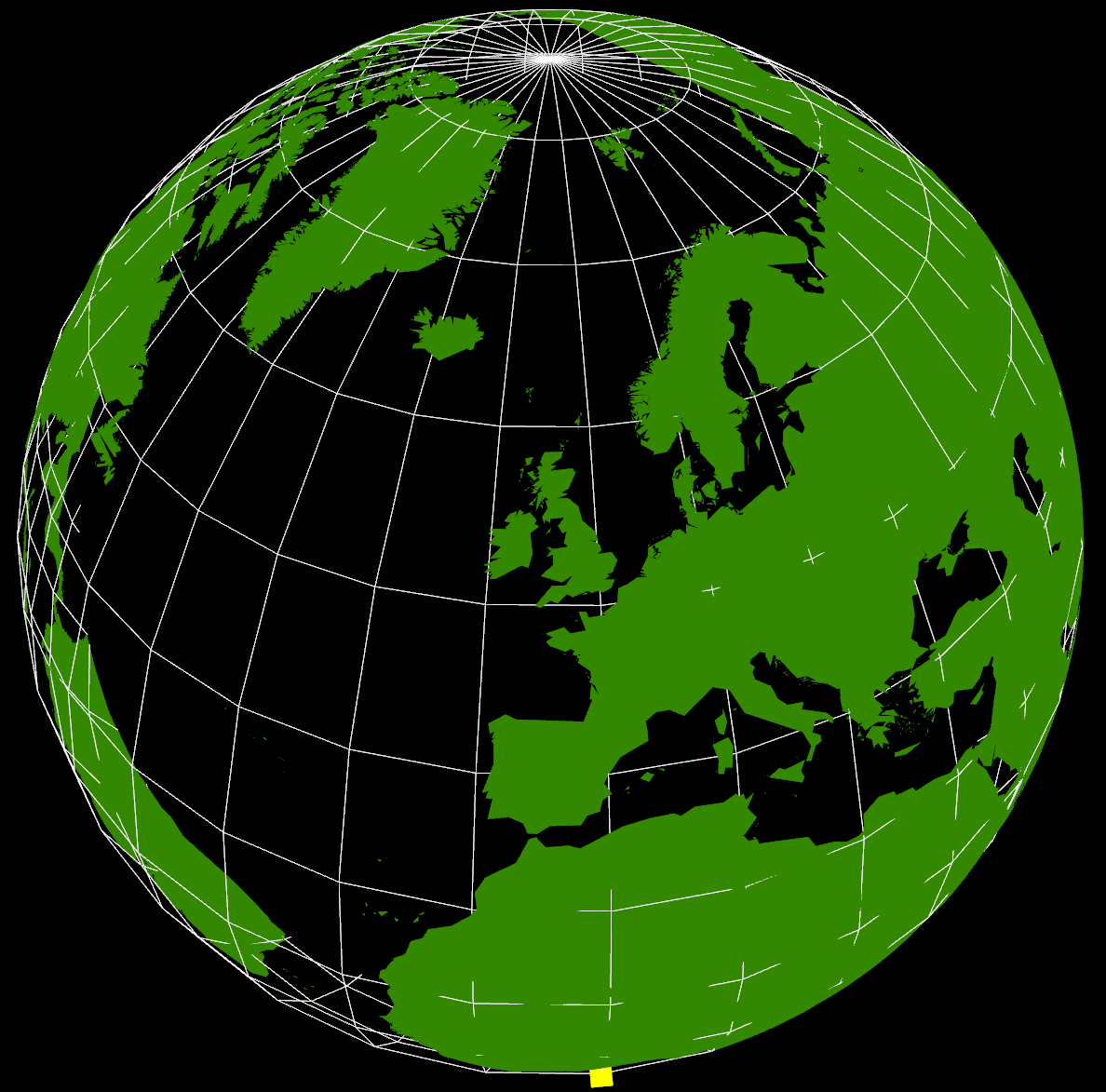
The yellow cube at the extreme southern point is marking (0,0) (lat,lon) as a reference. It’s also possible to see right through the Earth as I haven’t put any water in yet, but that’s not immediately apparent in this screenshot. The globe can be rotated and zoomed using the mouse, so it’s possible to see an area in more detail.
The way this has been constructed is as a WebGL application using THREE.JS running in Chrome. Originally, I started looking at using WebGL directly as I wanted to be able to create custom shaders, but in the end decided that programming at the higher level of abstraction using THREE.JS and a scene graph was going to be a lot faster to develop.
Where I got stuck was with the countries of the World geometry, and what you see in the graphic above still isn’t correct. I’ve seen a lot of 3D visualisations where the geometry sits on a flat plane, and this is how the 3D tubes visualisation that I did for the XBox last year worked. Having got into lots of problems with spatial data not lining up, I knew that the only real way of doing this type of visualisation is to use a spherical model. Incidentally, the Earth that I’m using is a sphere using the WGS84 semi-major axis, rather than the more accurate spheroid. This is the normal practice with data at this scale as the error is too small to notice.
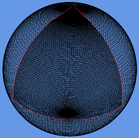
The geometry is loaded from a GeoJSON file (converted from a shapefile) with coordinates in WGS84. I then had to write a GeoJSON loader which builds up the polygons from their outer and inner boundaries as stored in the geometry file. Using the THREE.JS ‘Shape’ object I’m able to construct a 2D shape which is then extruded upwards and converted from the spherical lat/lon coordinates into Cartesian 3D coordinates (ECEF with custom axes to match OpenGL) which form the Earth shown above. This part is wrong as I don’t think that THREE.JS is constructing the complex polygons correctly and I’ve had to remove all the inner holes for this to display correctly. The problem seems to be overlapping edges which are created as part of the tessellation process, so this needs more investigation.
What is interesting about this exercise is the relationship between 3D computer graphics and geographic data. If we want to be able to handle geographic data easily, for example loading GeoJSON files, then we need to be able to tessellate and condition geometry on the fly in the browser. This is required because the geometry specifications for geographic data all use one outer boundary and zero or more inner boundaries to represent shapes. In 3D graphics, this needs to be converted to triangles, edges and faces, which is what the tessellation process does. In something like Google Earth, this has been pre-computed and the system loads conditioned 3D geometry directly. I’m still not clear which approach to take, but it’s essential to get this right to make it easy to fit all our data together. I don’t want to end up in the situation with the 3D Tubes where it was written like a computer game with artwork from different sources that didn’t line up properly.
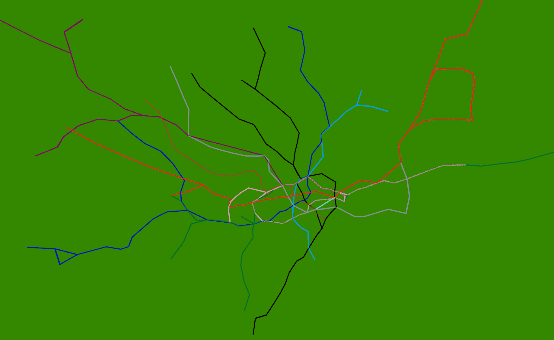
The real reason for building this system is shown below:
Strangely enough, adding the 3D tube lines with real-time tubes, buses and trains is easy once the coordinate systems are worked out. The services to provide this information already exist, so it’s just a case of pulling in what is relatively simple geometry. The road network and buildings are available from the OS Free data release, so, with the addition of Lidar data, we could build another (real-time) Virtual London model.
Just for the record, it took about 4 days to get this working using the following tools: Visual Studio 2010 C# and C++, Autodesk 3DS Max 2012 and the FBX exporter, Python 2.6, NetBeans Java and Geotools 8, Quantum GIS, Chrome Developer Tools
Alison Heppenstall, Gordon Mitchell, Malcolm Sawyer (LUBS) and I have been awarded an 18 month grant by the ESRC through their secondary data analysis initiative. Titled ‘Geospatial Restructuring of Industrial Trade’ (GRIT), the motivation for the grant came from a deceptively simple question: what happens to the spatial economy when the costs of moving goods and people change?
That’s a good old fashioned location theory question, but 21st century challenges are breathing new life into it. During the next few decades an energy revolution must take place if we’re to stand any chance of avoiding the worst effects of climate change. What price must carbon be to keep within a given global temperature? How long will any switch to new infrastructure take? (Kramer and Haigh 2009; Jefferson 2008) In fact, will peak oil get us before climate change does? (Wilkinson 2008; Bridge 2010) In a time when we’re discovering costs may go up as well as down, do we have a good handle on the spatial impact this may have? Can we use new data sources and techniques to answer that, in a way relevant to people and organisations being asked to rapidly adapt?
GRIT will focus on two jobs. First, creating a higher-resolution picture of the current spatial structure of the UK economy. Second, thinking about how possible fuel costs changes could affect it. We’ll examine the web of connections between businesses in the UK, looking to identify what sectors and locations may be put under particular pressure if costs change. There is a direct connection with climate change policy: the most carbon-intensive industries (also very water intensive) are also those with the lowest value density, and so most vulnerable to spatial cost changes.
Most economics still works in what Isard called a “wonderland of no dimension” (Isard 1956, 26) where distance plays no role except as another basic input, in principle substitutable for any other. Some economic geographers believe that because energy and fuel are such a small part of total production costs, “it is better to assume that moving goods is essentially costless than to assume [it] is an important component of the production process” (Glaeser and Kohlhase 2004, 199). At the other extreme, social movements like the transition network privilege the cost of distance above all else. They make the intuitive assumption that if the cost of moving goods goes up, they can’t be moved as far – so localisation is the only possible outcome. They are making a virtue of what they see as economic necessity imposed by climate change and peak oil. At the extreme, some even argue that “to avoid famine and food conflicts‚ we need to plan to re-localise our food economy”.
Reality lies somewhere between those two extremes of ignoring spatial costs altogether or assuming a future of radical relocalisation. GRIT is taking a two-pronged approach to finding out: producing a data-driven model and talking to businesses and others interested in the problem. Our two main data sources both use the ‘standard industrial classification‘ code system, breaking the UK into 110 sectors. First, the national Supply and Use tables contain an input-output matrix of money flows between all of those sectors. (I’ve created a visualisation of this matrix as a network: click sectors to view the top 5% of its trade links and follow them. Warning: more pretty than useful, but gives a sense of the scale of flows between sectors.) It contains no spatial information, however – we plan to get this from our second source, the ‘Business Structure Database‘ (BSD). As well as location information for individual businesses, each is SIC-coded and also provides fields for turnover and staff number. It also has information on firms’ structure: “such as a factory, shop, branch, etc”. (There’s a PDF presentation here outlining how we’re linking them, though I’ll write more about that in a later post.)
By linking these two (and adding a dollop of spatial economic theory) we have a chance to create a quite fine-grained picture of the UK’s spatial economy. From that base, questions of cost change and restructuring can then be asked. The ‘dollop of theory’ is obviously central to that; we’ve tested a synthetic version that produces plausible outputs (see that presentation for more info) but ‘plausible’ doesn’t equal ‘genuinely useful or accurate’. I’ll save those problems for another post also. This sub-regional picture of the UK economy is a central output from the project in its own right and it is hoped it can be used in other ways – for instance, for thinking about how industrial water demand may change over time.
Even before that, two big challenges come with those datasets. First, BSD data is highly sensitive. It is managed by the Secure Data Service (SDS) and can only be accessed under strict conditions (PDF). Work has to take place on their remote server, and anything produced needs to get through their disclosure vetting before they’ll release it, to make sure no firm’s privacy is threatened. These conditions include things like: “SDS data and unauthorised outputs must not be printed or be seen on the user’s computer screen by unauthorised individuals.” So, no-one without authorisation is actually allowed to look at the screen being worked on. Crikey. The main challenge from the BSD, however, is getting any of the geographical information we want through their vetting procedure. The process of working this out is going to be interesting. To their credit, the SDS have so far been very patient and helpful. While genuinely keen to help researchers, they also have to keep to draconian conditions – it can’t be an easy tension to manage.
The second challenge is really getting under the skin of the input-output data. On the surface, it appears to very neatly describe trade networks within the UK, but its money flows can’t all be translated simply to spatial flows. For a start, as the visualisation clearly shows, the largest UK sector, ‘financial services’, gets the UK’s biggest single money flow from ‘imputed rent’ – which doesn’t actually exist as exchanged goods or services. This comes down to the purpose of the Supply and Use table – a way to measure GDP. Imputed rent is a derived quantity used to account for the value to GDP of owned property. That’s only one small example, but it illustrates a point: care is needed when trying to repurpose a dataset to something it wasn’t intended for – in this case, to help investigate the structure of the UK’s spatial economy. It is hoped that less problems exist for more physical sectors, but that can’t be assumed.
The second ‘prong’ is to talk to businesses and other interested parties to find out how they deal with changing costs and to see if the work of the project makes sense from their point of view. We plan to hold two seminars to dig into the affect of changing spatial costs on businesses. Anecdotal evidence suggests suppliers have been citing fuel costs as a reason for price increases for a while now.
A whole range of other groups are keenly interested in spatial economics, though it might not always be labelled thus. An example already mentioned, the ‘transition movement’ is taking action at the local level. It has, in recent years, developed strong links with academic researchers. A vibrant knowledge exchange has developed between locally acting groups and researchers, with the aim of making sure that “transition and research form a symbiotic relationship” (Brangwyn 2012). It isn’t just about spatial economics: it’s imbued with a sense that people can play a part in shaping their own economic destiny. It’s hoped that GRIT will be of interest here also.
So that’s GRIT in a nutshell. There are clear gaps in the project’s current remit. Trade doesn’t stop at the UK’s borders and any change in costs will have international effects (an issue I’ve been pestering Anne Owen from Leeds School of Environment about). Many of the costs most essential to business decisions are either hard to quantify or to do with people, not goods. (Think about how much it costs a hairdresser to get a person’s head under the scissors from some distance away, e.g. in the rent they pay; this hints at the reason data appears to show the service sector may be the most vulnerable to fuel cost changes.)
Aside from the technical aspects of the project, there are two other things to write about I’ll save for later: the nature of distance costs and the place of modelling in research and society. And on that last point, just a bit of brainfood to finish on from Stan Openshaw (1978). In theory, GRIT wants to tread both of these lines, but that’s something far easier said than done. (Hat-tip Andy Turner for lending me the book.)
Without any formal guidance many planners who use models have developed a view of modelling which is the most convenient to their purpose. When judged against academic standards, the results are often misleading, sometimes fraudulent, and occasionally criminal. However, many academic models and perspectives of modelling when assessed against planning realities are often irrelevant. Many of these problems result from widespread, fundamental misunderstandings as to how models are used and should be used in planning. (Openshaw 1978 p.14)
—
Refs:
Brangwyn, Ben. 2012. “Researching Transition: Making Sure It Benefits Transitioners.” Transition Network. http://www.transitionnetwork.org/news/2012-03-29/researching-transition-making-sure-it-benefits-transitioners.
Bridge, Gavin. 2010. “Geographies of peak oil: The other carbon problem.” Geoforum 41 (4) (July): 523–530. doi:10.1016/j.geoforum.2010.06.002
.
Glaeser, EL, and JE Kohlhase. 2004. “Cities, Regions and the Decline of Transport Costs.” Papers in Regional Science 83 (1) (January): 197–228. doi:10.1007/s10110-003-0183-x.
Isard, Walter. 1956. Location and Space-economy: General Theory Relating to Industrial Location, Market Areas, Land Use, Trade and Urban Structure. MIT Press.
Jefferson, M. 2008. “Accelerating the Transition to Sustainable Energy Systems.” Energy Policy 36 (11): 4116–4125.
Kramer, Gert Jan, and Martin Haigh. 2009. “No Quick Switch to Low-carbon Energy.” Nature 462 (7273) (December 3): 568–569. doi:10.1038/462568a.
Openshaw, Stan. 1978. Using Models in Planning: A Practical Guide.
Webber, Michael J. 1984. Explanation, Prediction and Planning. Research in Planning and Design. London: Pion.
Wilkinson, P. 2008. “Peak Oil: Threat, Opportunity or Phantom?” Public Health 122 (7) (July): 664–666; discussion 669–670. doi:10.1016/j.puhe.2008.04.007.