
Last Saturday, 5 May 2012, saw the FA Cup Final and various Olympics preparation events taking place in London, so I couldn’t help wondering was was going to happen to the transport system. The ANTS project (Adaptive Networks for complex Transport Systems) that I’ve been working on is designed as a toolkit for collecting transport data, so I used it to generate data for the Tube and National Rail networks. Now we have this data set, we can use it in other projects as an “FA Cup Final” scenario, allowing us to experiment on a real city.
The schedule of events for the day was as follows:
12:45 Arsenal played Norwich at the Emirates, attendance: 60,092
17:15 FA Cup Final between Liverpool and Chelsea at Wembley, attendance: 89,102
Evening, London Prepares Event at the Olympic Park, attendance: 40,000
![]()
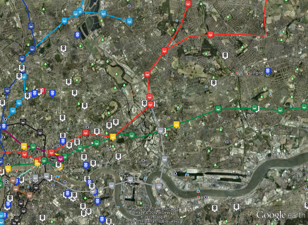
5 May 2012 16:30 BST (45 mins before kickoff). Map shows tube locations taken from the TfL Trackernet API (link to raw data below)
The image above shows the positions of tube trains 45 minutes before the Cup Final kick off. Wembley stadium is located half way between the “y” of Wembley and the two tube lines above it, which is the location of the closest station to the ground, “Wembley Park” on the Metropolitan (purple) and Jubilee (grey) lines. It’s interesting to note the obvious gap in the service on the Bakerloo line (brown) which serves “North Wembley” and “Wembley Central” to the south (where the word “Wembley” cuts the brown line). We can look at the tube status messages from TfL for this time period and see that there are planned closures as follows:
District line (green): Turnham Green to Ealing Broadway
Northern Line (black): Camden Town to Mill Hill East and High Barnet
Piccadilly Line (dark blue): Acton Town to Uxbridge
These can be seen as sections on the map where there is an obvious lack of trains (open the KML links below for the original data containing station names). The significance of this is that any Chelsea supporters living around Turnham Green are going to get pushed towards Paddington to go North. Liverpool fans are likely to be coming from Euston.
If we move on to 20:30 after the Cup Final has finished and as the later events at the Olympic Park are starting, we can see the situation around Stratford (centre of map).
National Rail and Tube trains around Stratford for 20:30 (link to raw data below)
The National Rail trains show as blue, where the service is on time, red, where it is late, and white where the timetable shows there should be a service, but we can’t verify its location. Due to the differences in how National Rail services work, it is a completely different type of data to the Tube. For National Rail we can only look at the departure boards for stations and use the timetable to match up services. There is only one late train for this time period, coloured red and hiding in the top left corner. This highlights the differences in the type of data as it takes several minutes to query enough data from National Rail to make the map, during which time the trains move around, causing the uncertainty in the data.
This is still a work in progress and requires a much more rigorous analysis, but you can see delays occurring around Wembley just before and after the match, plus some services heading for Stratford running a couple of minutes late in the evening. I’ve not got any information on the National Rail closure affecting services back to Liverpool in the evening, but it doesn’t look as if they were any really major problems.
As this was the first attempt at collecting a comprehensive set of data for a single day, it didn’t go completely to plan. There are questions about how you cope with the uncertainties in the National Rail data and how you compare it with the Trackernet information. The DLR and Overground are missing, as are the buses and it’s not clear how to use the TfL tube status information. We also don’t know anything about the commuters on the network, so can only guess at where all their journeys begin and what route they take. What is also needed is baseline data on what a normal Saturday should look like, which will give us the ability to pull anything abnormal out of the data.
Ultimately, the reason behind doing this is to provide a real-time snapshot of London’s transport network and how it behaves over the course of a day. For this we need to establish an automatic method of detecting and highlighting problems which is proving difficult at the moment. Then we can look at how a problem on one line has a knock-on effect on another.
The image below shows an animation of all tube trains for the 16 April 2012 from 8am to 8pm [link to movie]:
Links to data used in this post: