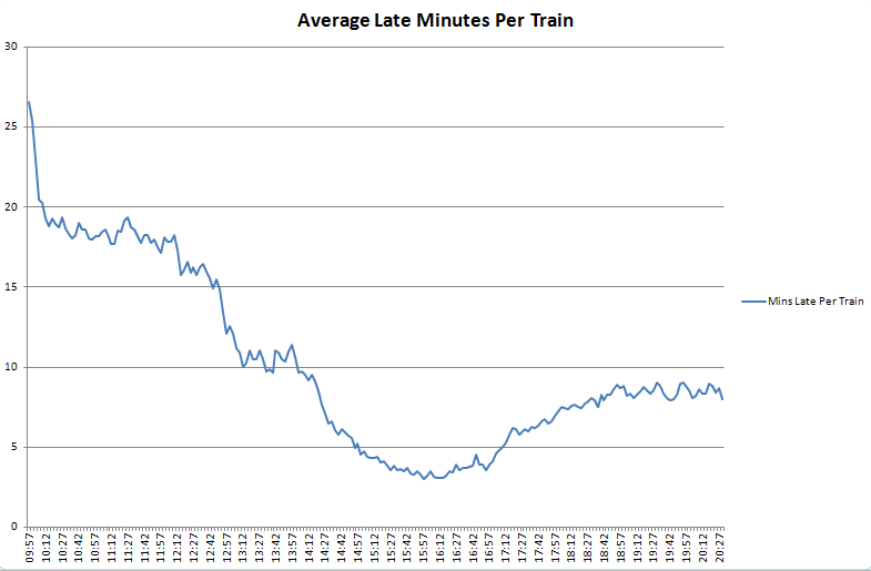
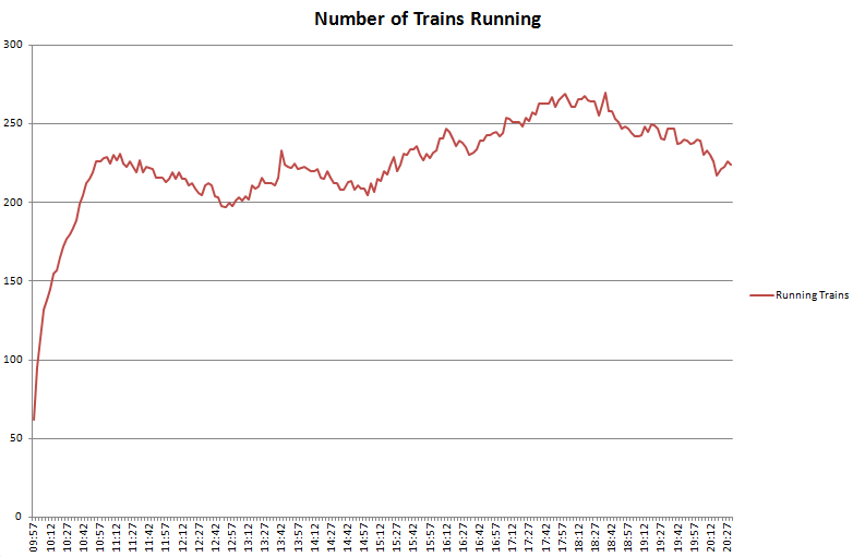
Over the last few weeks I’ve been building systems to collect realtime city data including tubes, buses, trains, air pollution, weather data and airport arrivals/departures. Initially this is all transport related, but the idea is to build up our knowledge of how a city evolves over the course of a day, or even a week, with a view to mining the data in realtime and “now-casting”, or predicting problems just before they happen.
An integral part of this is visualisation of the vast amount of data that we’re now collecting and how to distil this down to only what is important. One of the first visualisations I looked at was the tube numbers count, which I posted previously under Transport During the Olympics as it was a very effective visualisation of how the number of running tubes varies throughout the day and during the weekend.
The challenge now is to produce an effective visualisation based on realtime data, and for this I started looking at the stream graph implementation in D3. It’s well worth reading Lee Byron’s paper on “Stacked Graphs – Geometry and Aesthetics” which goes into the mathematics behind how each type of stream graph works and a mathematical proof of how this applies to 5 design issues.
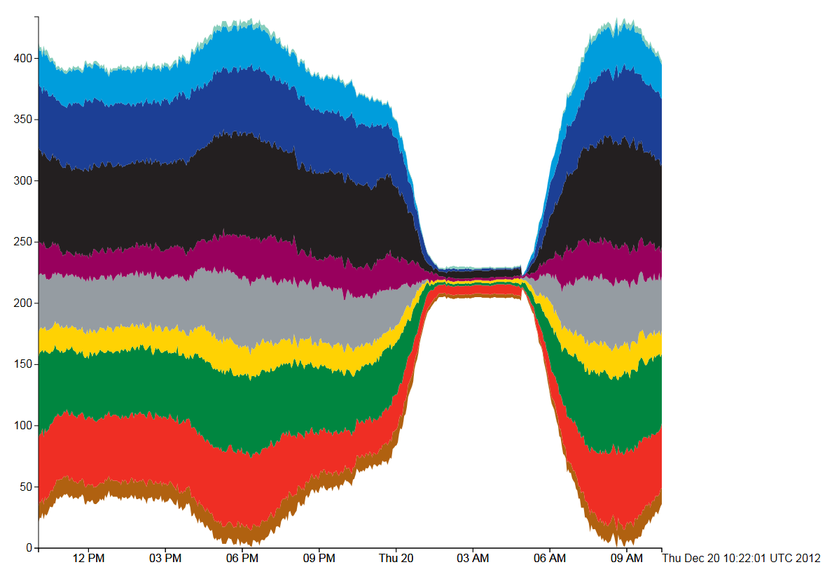
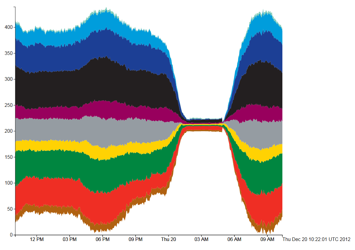
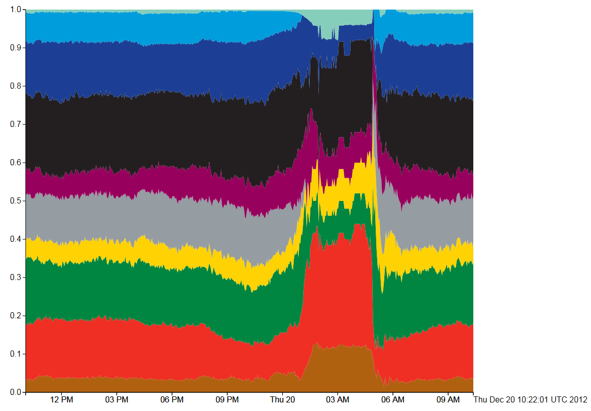
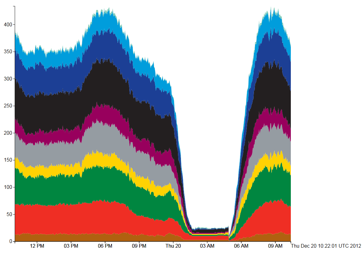
In all the following four diagrams, the total number of tubes running on each line is shown by a stream filled in the tube line’s normal colour. Going from top to bottom, the colours are as follows: Waterloo and City (cyan), Victoria (light blue), Piccadilly (dark blue), Northern (black), Metropolitan (magenta), Jubilee (grey), Hammersmith and City and Circle (yellow), District (green), Central (red), Bakerloo (brown).
Figure 1, Tube Numbers: D3 Streamgraph, Silhouette style
The first type of stream graph is symmetrical in the vertical axis and shows how the total number of tubes varies over the course of the day by the size of the coloured area. A fatter stream means more tube trains, which is reflected in the trace of all 10 tube lines displayed. What is potentially misleading is when, for example, the number of Bakerloo trains (brown) falls, then the Central line (red) trace immediately above it also falls even if the number of Central line trains remains the same. We would generally expect the vertical position of the trace to be indicative of the count, rather than the vertical width.
Figure 2, Tube Numbers: D3 Streamgraph, Wiggle style
The “Wiggle” style is similar to the “silhouette” style, but uses a modified baseline formula (g0 in the paper by Lee Byron and Martin Wattenberg). This attempts to minimise the deviation by minimising the sum of the squares of the slopes at each value of x. This minimises both the distance from the x-axis and the variation in the slope of the curves. Visually, figures 1 and 2 are very similar apart from the loss of symmetry.
Figure 3, Tube Numbers: D3 Streamgraph, Expand style
This type of stream graph is the easiest to explain, but is just plain wrong for this type of data. The Y axis shows that the sum of the counts for each tube line have been added and then normalised to 1 (so all tubes running on all lines=1). Then the whole graph fits into the box perfectly, but what gets lost in the normalisation is the absolute numbers of trains running. In this situation that is the most important data as the tube shut down between 1am and 5am can only be seen by the sudden jump in the data at that point. Also, the fact that the curves all jump up at the point where there are no trains is very misleading.
Figure 4, Tube Numbers: D3 Streamgraph, Zero style
The final type of stream graph in Figure 4 is more similar to the classic stacked area chart. Here, the overnight shut down is immediately apparent and the daily variation can be seen clearly in the 9AM rush hour peak.
In conclusion, all the stream graphs work well except for the normalised “expansion” stream graph (figure 3). The “wiggle” formula (figure 2) seems to be an improvement over both figure 1 and figure 4, although aesthetically, figure 4 shows the daily variation a lot better. It all depends on what information we’re trying to extract from the visualisation, which in the case of the real-time city data is any line where the number of trains suddenly drops. In other words, failures correspond to discontinuities in the counts rather than the absolute numbers of running trains. The main criticism I have about the stream graphs is that the rise and fall in the height of a trace doesn’t necessarily correspond to a rise or fall in the number of tubes on that line, which is counter-intuitive. It’s the width of the trace that is important, but the width of the overall trace for all lines does give a good impression of how the number of tubes varies throughout the day.
This work is still in the early stages, but with running data covering almost a year, plus other sources of data available (i.e. the TfL Tube Status feed), there is a lot of potential for mining this information.

