Cities as Operating Systems


The idea of cities mirroring computer operating systems has been around for a while (see: http://teamhelsinki.blogspot.co.uk/2007/03/city-as-operating-system.html ), but recent events have made me wonder whether this might be about to become more important. Cities are systems in exactly the same way that complex computer systems are, although how cities function is a black box. Despite that difference, computer systems are now so big and complex that understanding how the whole system works is incomprehensible and we rely on monitoring, which is how we come back to the city systems. Recently, we had a hardware failure on a virtual machine host, but in this case I happened to be looking at the Trackernet real-time display of the number of tubes in London.  This alerted me to the fact that something was wrong, so I then switched to the virtual machine monitoring console and diagnosed the failure. We were actually out of the office at the time, so the publicly accessible tube display was easier to access than the locked down secure console for the hardware. The parallels between the real-time monitoring of a server cluster and real-time monitoring of a city system are impossible to ignore. Consider the screenshot below:

trackernet_20130323


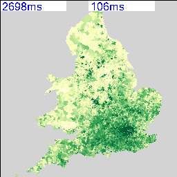
Screenshot from an iPad showing a stream graph of the number of tubes running in London on Friday 22nd and Saturday 23rd March 2013.

We could very easily be looking at CPU load, disk or network bandwidth for a server, but it happens to be the number of tubes running on the London Underground. Points 1 and 2 show a problem on the tube network around 3PM on Friday. It’s not very easy to tell from this visualisation, but the problem is on the Piccadilly line and then the Jubilee line. However, the purpose of this display is to alert the user to any problems which they can then diagnose further. Point 3 is not so easy to detect, but the straight lines suggest missing data. Going back to the original files, everything appears normal and all data is being logged, so this could be an API or other network failure that rectified itself. Point 4 is similar, but this can be explained as a Saturday morning outage for maintenance to prevent the problem that we saw on Wednesday happening again.

It is this symbiotic relationship between the real-time monitoring of city systems and computer systems that is really interesting. We are logging a lot more data than is shown on this graph, so the key is to work out what factors we need to be looking at to understand what is really happening. Add a spatial element to this and the system suddenly becomes a whole lot more complicated.

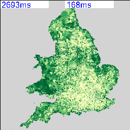
To finish off with, here is view of the rail network at 12pm on 25 March 2013 (another snow day in the North of the country). The similarity between this view and and a seismograph is apparent, but what is being plotted is average minutes late per train. The result is very similar to a CPU or disk activity graph on a server, but minute by minute we’re watching trains running.

NetworkRail_20130325

Links

http://teamhelsinki.blogspot.co.uk/2007/03/city-as-operating-system.html

http://www.smartplanet.com/blog/smart-takes/london-tests-out-smart-city-operating-system/26266


Lots and Lots of Census Maps (part 2)

My last post on the Census Maps got as far as running a simple comparison of every combination of every possible map at LSOA level to obtain a similarity metric. There are 2,558 possible variables that can be mapped, so my dataset contains 6,543,364 lines. I’ve used the graph from the last post to set a cut off of 20 (in RGB units) to select only the closest matches. As the metric I’m using is distance in RGB space, it’s actually a dissimilarity metric, so 0 to 20 gives me about 4.5% of the top matches, resulting in 295,882 lines. Using an additional piece of code I can link this data back to the plain text description of the table and field so I can start to analyse it.

The first thing I noticed in the data is that all my rows are in pairs. A matches with B in the same way that B matches with A and I forgot that the results matrix only needs to be triangular, so I’ve got twice as much data as I actually needed. The second thing I noticed was that most of the data relates to Ethnic Group, Language and Country of Birth or Nationality. The top of my data looks like the following:

0.1336189 QS211EW0094 QS211EW0148 (Ethnic Group (detailed)) Mixed/multiple ethnic group: Israeli AND (Ethnic Group (detailed)) Asian/Asian British: Italian
0.1546012 QS211EW0178 QS211EW0204 (Ethnic Group (detailed)) Black/African/Caribbean/Black British: Black European AND (Ethnic Group (detailed)) Other ethnic group: Australian/New Zealander
0.1546012 QS211EW0204 QS211EW0178 (Ethnic Group (detailed)) Other ethnic group: Australian/New Zealander AND (Ethnic Group (detailed)) Black/African/Caribbean/Black British: Black European
0.1710527 QS211EW0050 QS211EW0030 (Ethnic Group (detailed)) White: Somalilander AND (Ethnic Group (detailed)) White: Kashmiri
0.1883012 QS203EW0073 QS211EW0113 (Country of Birth (detailed)) Antarctica and Oceania: Antarctica AND (Ethnic Group (detailed)) Mixed/multiple ethnic group: Peruvian
0.1883012 QS211EW0113 QS203EW0073 (Ethnic Group (detailed)) Mixed/multiple ethnic group: Peruvian AND (Country of Birth (detailed)) Antarctica and Oceania: Antarctica
0.1889113 QS211EW0170 QS211EW0242 (Ethnic Group (detailed)) Asian/Asian British: Turkish Cypriot AND (Ethnic Group (detailed)) Other ethnic group: Punjabi
0.1925942 QS211EW0133 KS201EW0011 (Ethnic Group (detailed)) Asian/Asian British: Pakistani or British Pakistani AND (Ethnic Group) Asian/Asian British: Pakistani

The data has had the leading diagonal removed so there are no matches between datasets and themselves. The columns show match value (0.133), first column code (QS211EW0094), second column code (QS211EW0148) and finally the plain text description. This takes the form of the Census Table in brackets (Ethnic Group (Detailed)), the column description (Mixed/multiple ethnic group: Israeli), then “AND” followed by the same format for the second table and field being matched against.

It probably makes sense that the highest matches are ethnicity, country of birth, religion and language as there is a definite causal relationship between all these things. The data also picks out groupings between pairs of ethnic groups and nationalities who tend to reside in the same areas. Some of these are surprising, so there must be a case for extracting all the nationality links and producing a graph visualisation of the relationships.

There are also some obvious problems with the data which you can see by looking at the last line of the table above: British Pakistani matches with British Pakistani. No surprise there, but it does highlight the fact that there are a lot of overlaps between columns in different data tables containing identical, or very similar data. At the moment I’m not sure how to remove this, but it needs some kind of equivalence lookup. This also occurs at least once on every table as there is always a total count column that matches with population density:

0.2201077 QS101EW0001 KS202EW0021 (Residence Type) All categories: Residence type AND (National Identity) All categories: National identity British

These two columns are just the total counts for the QS101 and KS202 tables, so they’re both maps of population. Heuristic number one is: remove anything containing “All categories” in both descriptions.

On the basis of this, it’s probably worth looking at the mid-range data rather than the exact matches as this is where it starts to get interesting:

10.82747 KS605EW0020 KS401EW0008 (Industry) A Agriculture, forestry and fishing AND (Dwellings, Household Spaces and Accomodation Type) Whole house or bungalow: Detached
10.8299 QS203EW0078 QS402EW0012 (Country of Birth (detailed)) Other AND (Accomodation Type – Households) Shared dwelling

To sum up, there is a lot more of this data than I was expecting, and my method of matching is rather naive. The next iteration of the data processing is going to have to work a lot harder to remove more of the trivial matches between two sets of data that are the same thing. I also want to see some maps so I can explore the data.


Lots and Lots of Census Maps

I noticed recently that the NOMIS site has a page with a bulk upload of  the latest release of the 2011 Census Data: http://www.nomisweb.co.uk/census/2011/bulk/r2_2

As one of the Talisman aims is to be able to able to handle data in datastores seamlessly, I modified the code that we used to mine the London Datastore and applied the same techniques to the latest Census data. The first step is to automatically create every possible map from every variable in every dataset, which required me uploading the new 2011 Census Boundary files to our server. This then allows the MapTubeD tile server to build maps directly from the CSV files on the NOMIS site. Unfortunately, this isn’t completely straightforward as I had to build some additional staging code to download the OA zip file, then split the main file up into MSOA, LSOA and OA files as all the data is contained in a single file.

The next problem was that running a Jenks stratification on 180,000 records at OA level is computationally intensive, as is building the resulting map. The Jenks breaks can be changed to Quantiles which are O(n) as opposed to O(n^2), but in order to build this many maps in a reasonable time I dropped the geographic data down to LSOA level. This is probably a better option for visualisation anyway and only has 35,000 areas.

The resulting maps look similar to the following:

image_102_5image_5_12


I’m deliberately not saying what these maps show at the moment and you can’t tell from the numbers as that’s part of the debugging code telling me how long they took to render. As there are 2,558 of these maps possible from the data, knowing that this can be done in a reasonable amount of time and that I can leave it running overnight is quite important. My quick calculation based on a 27″ iMac doing about 4 Mips seems to work out about right.

The two maps above show an interesting spatial variation, so the next step was to use a spatial similarity metric on every combination of two maps to generate a correlation matrix containing 2,558 x 2,558 cells. Not knowing whether this was going to work and also being worried about the size of the data that I’m working with, I decided to use a simple RGB difference squared function. The maps are rendered to thumbnails which are 256 x 256 pixels, so the total number of operations to calculate this is going to be (2558*2558)/2 * 65536/4 MIPS, or about 15 hours times however long a single RGB comparison takes.

The result of running this over night is a file containing 6,543,364 correlation scores. What I wanted to do first was to plot this as a distribution of correlation scores to see if I could come up with a sensible similarity threshold. I could derive a statistically significant break threshold theoretically, but I really wanted to look at what was in the data as this could show up any problems in the methodology.

The aim was to plot a cumulative frequency distribution, so I need a workflow that can clean the data and sort 6 million values, then plot the data. There were some nightmare issues with line endings that required the initial clean process to remove them, using “egrep -v “^$” original.csv > cleaned.csv”. My initial thoughts were to use Powershell to do the clean and sort, but it doesn’t scale to the sizes of data that I’m working with. The script to do the whole operation is really easy to code in the integrated environment, but was taking far too long to run. This meant a switch to a program I found on Google Code called “CSVFix“. The operation is really simple using the command line:

csvfix sort -f 5:AN imatch.csv > imatch-sorted.csv

This sorts column 5 ascending (A) using a numeric (N) match and doesn’t take a huge amount of time. The final step is to plot the data and see what I’ve got. This was done using GNUPlot as the data is too big to load into Excel or Matlab. In fact, the only binaries available for GNUPlot are x86, so I was worried I was going to have to build an x64 version to handle the data, but this turned out to be unnecessary. The following commands plot the data:

set datafile separator “,”

plot ‘imatch-sorted.csv’ using 5

And the final graph looks like this:

SCurve

The “S-Curve” that results is interesting as the Y-Axis shows difference with zero being identical and 120 being very different. The X-Axis shows the number of maps that match with the Y-Axis difference or better, so it’s a cumulative plot of similarity. Units for the Y-Axis are RGB intensity, with the X-Axis having no units as it’s a count. There are 2558 maps that match with themselves with zero difference, but up to about 20, there appears to be a linear relationship followed by a turning point and another linear section with reduced gradient until the difference starts to increase rapidly.

Most of this can be explained by the fact that all the maps are of England and so anything in the sea is always going to match on every map regardless. As I explained at the beginning, this is really an exploration of the workflow and methodology, so there are a number of problems with it. The ultimate aim is to show how all the data is related, so similarity, spatial weighted similarity, clustering and comparisons between gridded data, areas and rendered maps all need to be explored.