As part of the on-going ANTS project (Adaptive Networks for Complex Transport Systems) we’ve been tracking how many London buses are running during today’s bus strike. This is a very new development which we only just got working in time, so we don’t have any baseline data to compare against yet, but the two maps from this morning and lunchtime the day before show the geographical areas most affected by the strike.
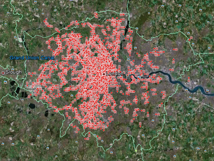
Friday 22nd June 2012 09:00am showing the locations of buses as red markers with direction arrows
The above image shows all the buses running at 09:00am (BST) this morning when the strike was on. According to our data, there were 2,198 buses running in London at that time. We don’t yet have enough baseline data to compare this against, but by taking 13:21 (BST) on the previous day, we can say that there were 6,387 buses running then, giving 34% as a very rough guide.
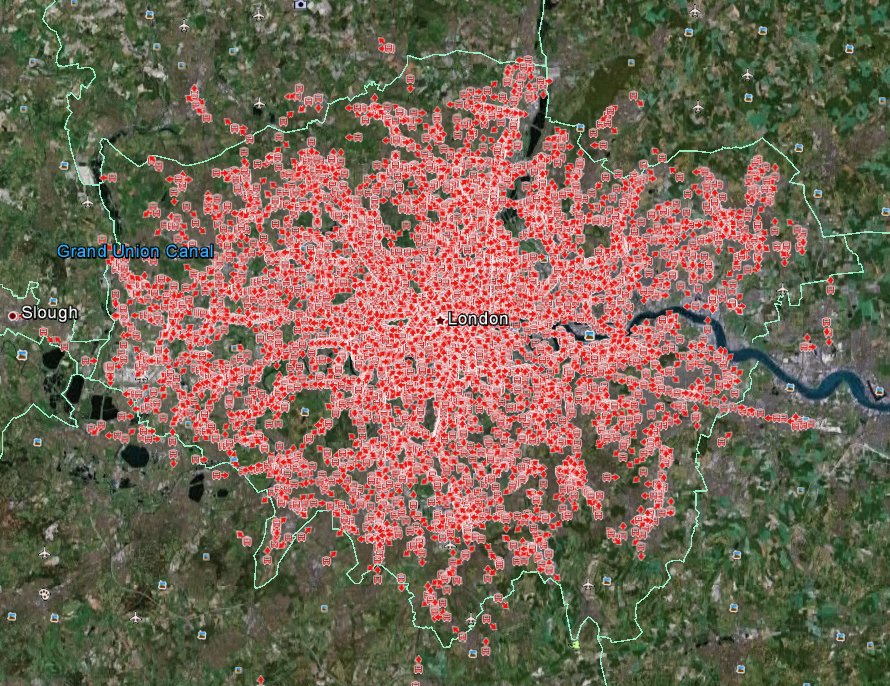
Thursday 21 June 2012 13:18 (BST) showing the locations of buses as red markers with direction arrows
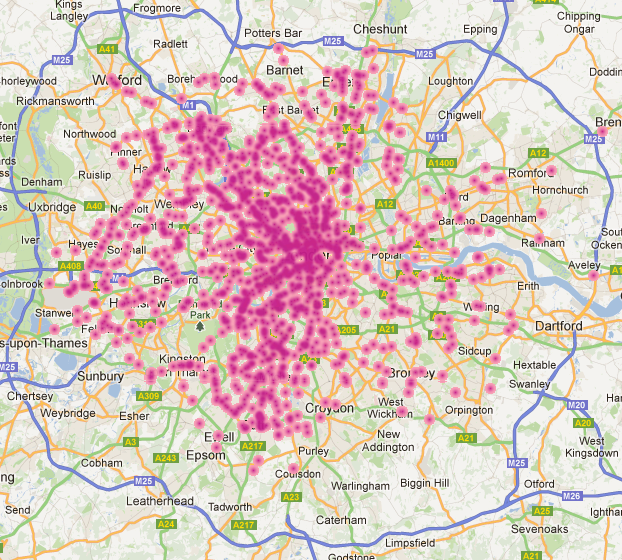
Comparing the two maps, it looks as though the worst affected area was the East of London. We can also show the density of buses using a heatmap:
Heatmap of bus locations for Friday 22nd June 2012 09:00 [Link to original map].
Following on from this, we also have data for the Underground, so this will enable us to analyse multi-modal flows and see how the bus strike has a knock-on effect on the tube.
Thanks to Steven Gray for drawing the bus icons as my original ones were useless.


