Real Time City Data

With the recent snow in London, we’ve been looking at real-time sources of transport data with a view to measuring performance. The latest idea was to use flight arrivals and departures from Heathrow, Gatwick and City to measure what effect snow had on operations. The data for Heathrow is shown below:

sm_Heathrow17Jan2013

Arrivals and departures data for Heathrow from 17 Jan 2013 to 22 Jan 2013

This is our first attempt with this type of flights data and it shows how difficult it is to detect the difference between normal operation and when major problems are occurring. We’ve also got breaks in the data caused by the sampling process which don’t help. Ideally, we would be looking at the length of delays which would give a finer indication of problems, but this is going to require further post processing. After looking at this data, it seems that we need to differentiate between when the airport is shut due to adverse weather, so nothing is delayed because everything is cancelled and the other situation where they’re trying to clear a backlog after re-opening.

If we look at the information for Network Rail services around London, then the picture is a lot easier to interpret:

NetworkRail17Jan2013

Network Rail data for all trains within the London area from 17 January 2013 to 23 January 2013

The graphs plot total late minutes divided by total number of trains, or average late minutes per running train. This gives a very good indicator of when there are problems. Unfortunately, there appears to be a bug in the D3 library which is causing the horizontal lines across the graphs. The situation with South West trains is interesting because it looks from the graph as though they didn’t have any problems with the snow. In reality, they ran a seriously reduced service so the number of trains is not what it should be. This needs to be factored in to any metric we come up with for rail services to cope with the situation where the trains are running, but people can’t get on them because they are full.

countdown17Jan2013


Numbers of buses running between 17 January 2013 and 23 January 2013

The graph of the number of buses running over the weekend is interesting as it doesn’t appear as if the bus numbers on the road were affected by the snow. The Saturday and Sunday difference can be seen very clearly and the morning and evening rush hours for the weekdays are clearly visible despite the annoying horizontal lines.


Visualisations of Realtime City Transport Data

Over the last few weeks I’ve been building systems to collect realtime city data including tubes, buses, trains, air pollution, weather data and airport arrivals/departures. Initially this is all transport related, but the idea is to build up our knowledge of how a city evolves over the course of a day, or even a week, with a view to mining the data in realtime and “now-casting”, or predicting problems just before they happen.

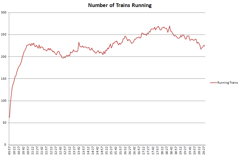
An integral part of this is visualisation of the vast amount of data that we’re now collecting and how to distil this down to only what is important. One of the first visualisations I looked at was the tube numbers count, which I posted previously under Transport During the Olympics as it was a very effective visualisation of how the number of running tubes varies throughout the day and during the weekend.

The challenge now is to produce an effective visualisation based on realtime data, and for this I started looking at the stream graph implementation in D3. It’s well worth reading Lee Byron’s paper on “Stacked Graphs – Geometry and Aesthetics” which goes into the mathematics behind how each type of stream graph works and a mathematical proof of how this applies to 5 design issues.

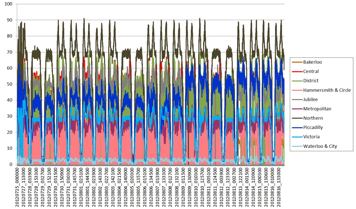
In all the following four diagrams, the total number of tubes running on each line is shown by a stream filled in the tube line’s normal colour. Going from top to bottom, the colours are as follows: Waterloo and City (cyan), Victoria (light blue), Piccadilly (dark blue), Northern (black), Metropolitan (magenta), Jubilee (grey), Hammersmith and City and Circle (yellow), District (green), Central (red), Bakerloo (brown).

Tube Numbers: D3 Silhouette Streamgraph

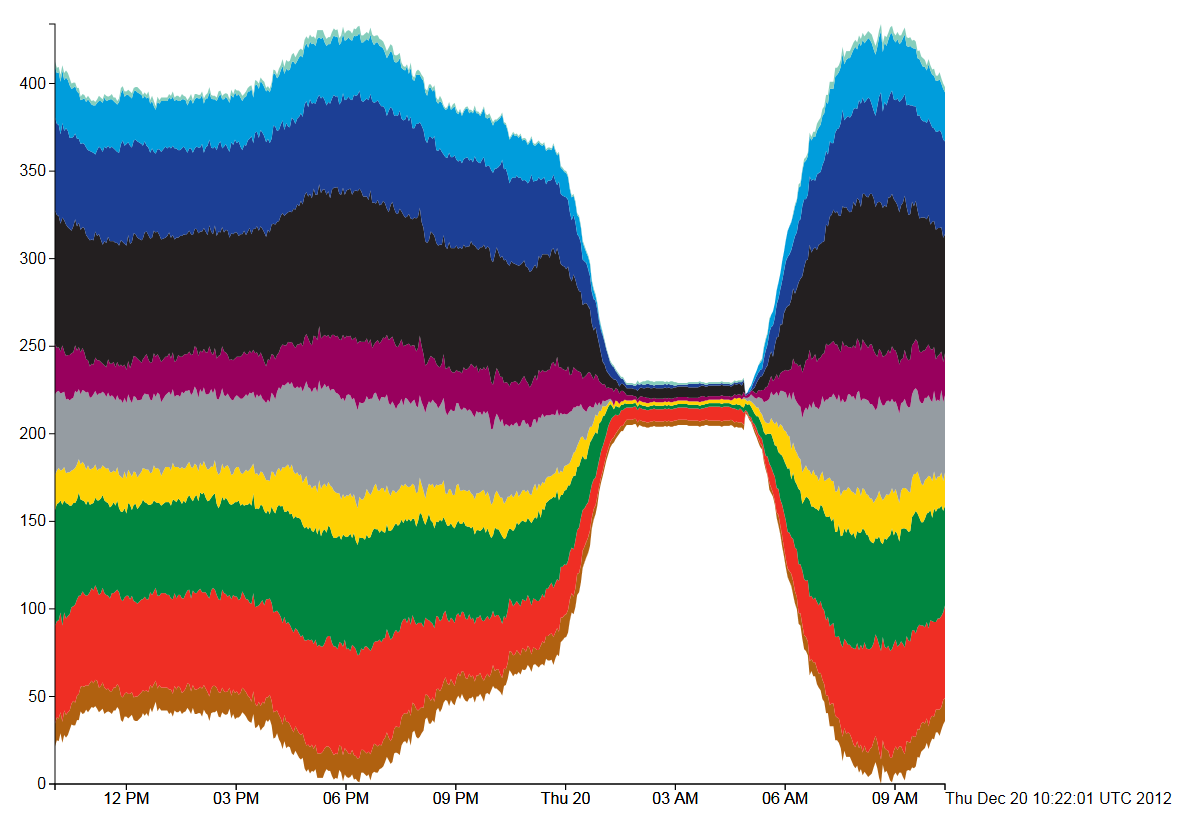
Figure 1, Tube Numbers: D3 Streamgraph, Silhouette style

The first type of stream graph is symmetrical in the vertical axis and shows how the total number of tubes varies over the course of the day by the size of the coloured area. A fatter stream means more tube trains, which is reflected in the trace of all 10 tube lines displayed. What is potentially misleading is when, for example, the number of Bakerloo trains (brown) falls, then the Central line (red) trace immediately above it also falls even if the number of Central line trains remains the same. We would generally expect the vertical position of the trace to be indicative of the count, rather than the vertical width.

tfl-wiggle

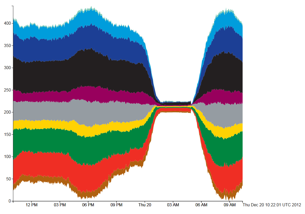
Figure 2, Tube Numbers: D3 Streamgraph, Wiggle style

The “Wiggle” style is similar to the “silhouette” style, but uses a modified baseline formula (g0 in the paper by Lee Byron and Martin Wattenberg). This attempts to minimise the deviation by minimising the sum of the squares of the slopes at each value of x. This minimises both the distance from the x-axis and the variation in the slope of the curves. Visually, figures 1 and 2 are very similar apart from the loss of symmetry.

tfl-expand

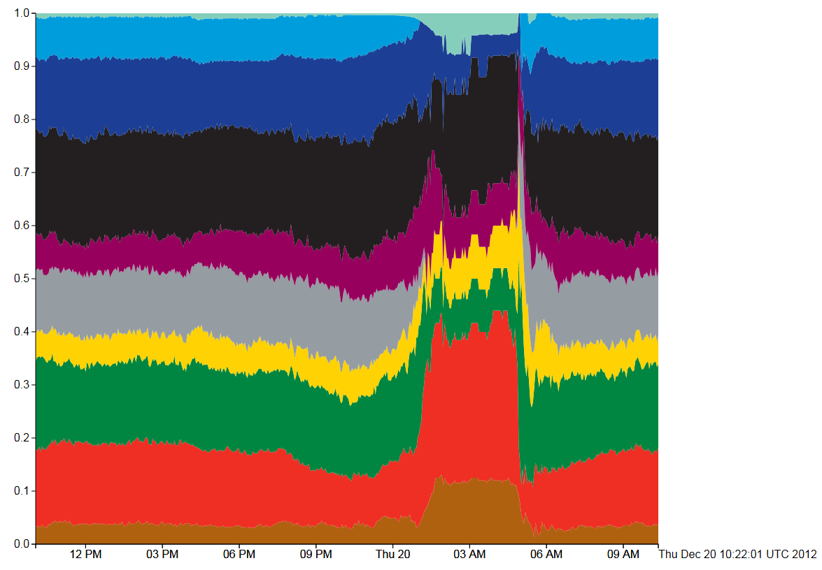
Figure 3, Tube Numbers: D3 Streamgraph, Expand style

This type of stream graph is the easiest to explain, but is just plain wrong for this type of data. The Y axis shows that the sum of the counts for each tube line have been added and then normalised to 1 (so all tubes running on all lines=1). Then the whole graph fits into the box perfectly, but what gets lost in the normalisation is the absolute numbers of trains running. In this situation that is the most important data as the tube shut down between 1am and 5am can only be seen by the sudden jump in the data at that point. Also, the fact that the curves all jump up at the point where there are no trains is very misleading.

tfl-zero

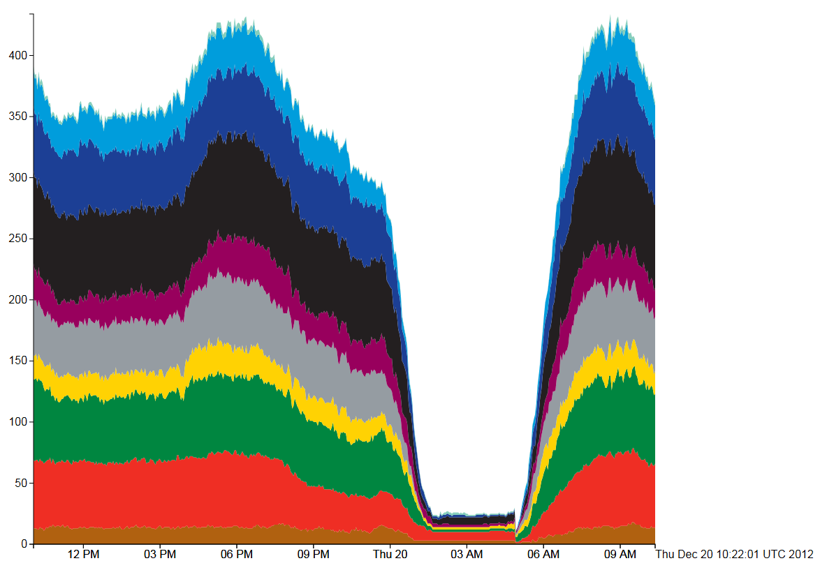
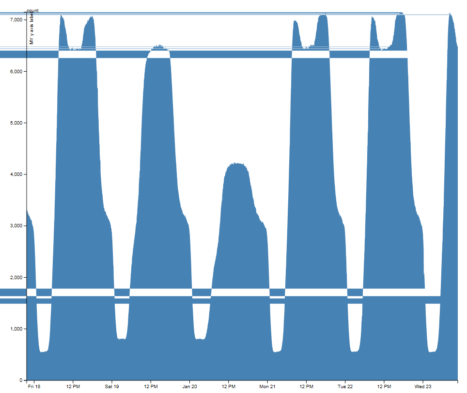
Figure 4, Tube Numbers: D3 Streamgraph, Zero style

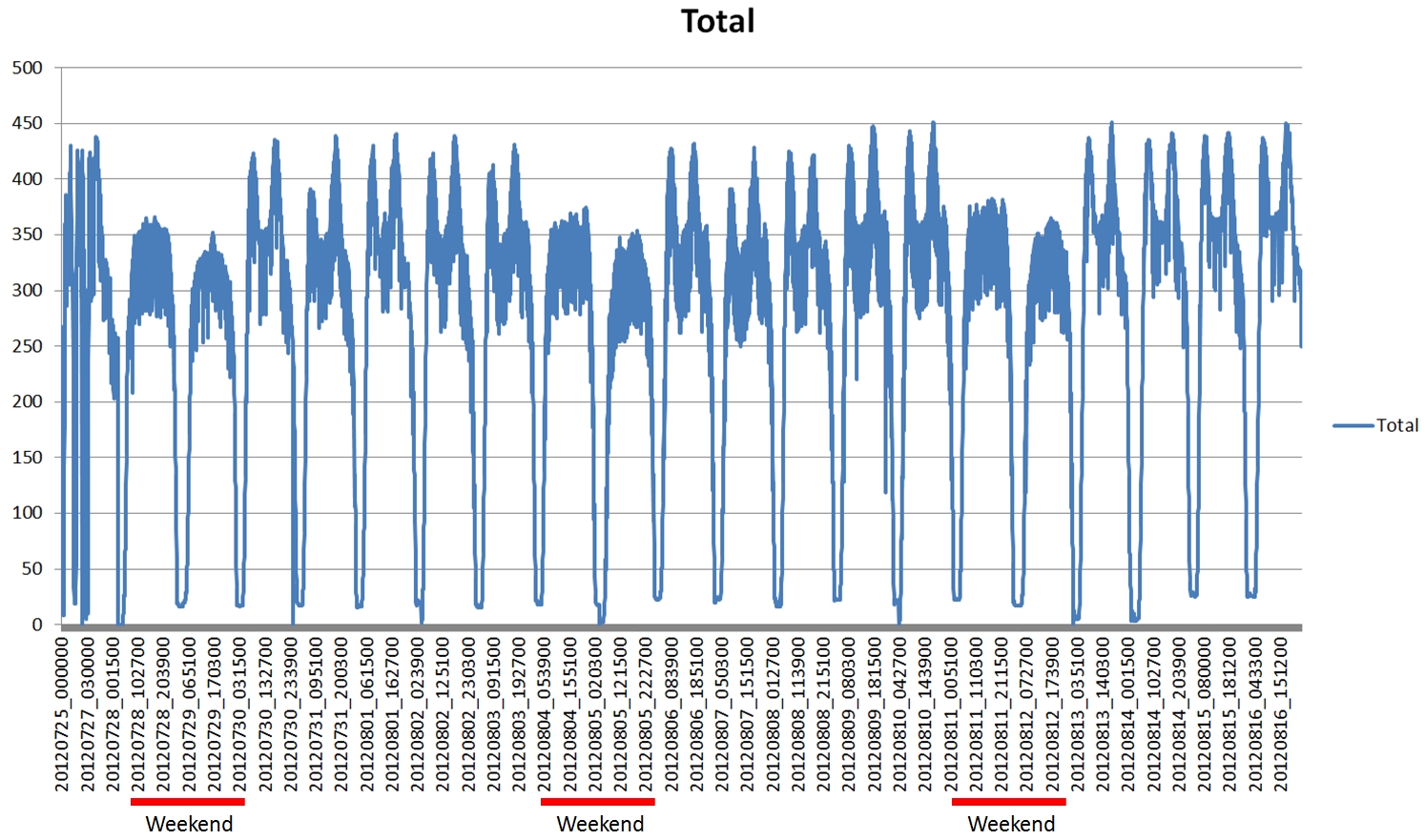
The final type of stream graph in Figure 4 is more similar to the classic stacked area chart. Here, the overnight shut down is immediately apparent and the daily variation can be seen clearly in the 9AM rush hour peak.

In conclusion, all the stream graphs work well except for the normalised “expansion” stream graph (figure 3). The “wiggle” formula (figure 2) seems to be an improvement over both figure 1 and figure 4, although aesthetically, figure 4 shows the daily variation a lot better. It all depends on what information we’re trying to extract from the visualisation, which in the case of the real-time city data is any line where the number of trains suddenly drops. In other words, failures correspond to discontinuities in the counts rather than the absolute numbers of running trains. The main criticism I have about the stream graphs is that the rise and fall in the height of a trace doesn’t necessarily correspond to a rise or fall in the number of tubes on that line, which is counter-intuitive. It’s the width of the trace that is important, but the width of the overall trace for all lines does give a good impression of how the number of tubes varies throughout the day.

This work is still in the early stages, but with running data covering almost a year, plus other sources of data available (i.e. the TfL Tube Status feed), there is a lot of potential for mining this information.

Snow Day

We had the first snow of the Winter in London this morning, around 07:30 and lasting no more than half an hour. I’ve been building the data layer for the iPad video wall, so switched the National Rail data collection on once I got to work around 09:50. The idea was to collect data to measure how the rail system recovered from its early morning shock. The results are shown below:

Total number of minutes late for all trains divided by the number of trains for South West Trains


The graph shows a plot of the number of minutes late for every train running, divided by the total number of trains. In other words, the average number of late minutes per train. It’s evident from the graph that trains initially started out over 30 minutes late, then dropped to 20 and then to 10 minutes late, before reaching a minimum around 4pm in the afternoon. Then the rush hour starts to kick in again and the additional load causes the average late time to creep up again. The official line on the way home was, “due to adverse weather conditions…”.

Count of the total number of SW Trains running throughout the day.

The second graph shows the total number of trains running throughout the day. The data collection system was switched on at around 09:57 and it appears to take about an hour before the number of running trains approaches normal levels.

The aim of this work is to collect as much data about the city as possible, which will allow us to mine the information for significant events. This includes all tube, bus and heavy rail movements, weather and air quality, plus any other data we can obtain in the areas of finance, hydrology, population or telecommunications.

When MonteCarlo envelopes are too narrow to show!

1% k-spatial entropy (k=3) envelopes at collocation distance 4km

Here is a pretty picture of envelopes which are overlaid each with their maximum range (including the observed curve) … to allow multiple variables to be looked at simultaneously even when the range of each curve is very different! For example in year 2011 health, social grade, and transport to work are well below their 1% envelope, so are significantly describing a spatial pattern (as measured by the k-spatial entropy) which is not happening by chance (random permutations of the spatial units). see more on the NARSC 2012 abstract/paper ” Entropic variations of urban dynamics at different spatio-temporal scales:  geocomputational perspectives” Didier G. Leibovici & Mark H. Birkin (http://www.meetingsavvy.com/abstractsearch/). Nonetheless the level of non-uniformity is very different, respectively 0.2, 0.4 and 0.1, but are all quite low compared to a maximum under uniformity of 1.

(click on the picture to see it bigger)

Transport Data During the Olympics

Having collected large amounts of data on tubes, trains and buses over the Olympics period using the ANTS library, the first thing I’ve looked at is to plot the total number of tubes running every day. The two graphs below show the number of tubes by line and the total number of tubes running for all lines.

Numbers of tubes running on each line from 25 July 2012 until 16 August 2012.


Total number of tubes running on all lines from 25 July 2012 to 16 August 2012. Weekend periods are highlighted with red bars.

Looking at this data it becomes apparent that the weekend has a very different characteristic compared to during the week. Also, there is a definite daily variation during the week with a distinct morning and evening rush hour. One interesting thing left to look at is whether the lines serving the Olympics venues show any variation before and during the Olympics period.

Smart Cities, Smart Transport?

I’ve described this as “radar for trains”, but it now also includes a real-time view of bus and tube delays. The idea is to produce a single visualisation highlighting where there are problems with the transport system:

Status of London’s transport system at 13:00 on 8 August 2012. The green squares are bus stops showing delays, while blue is for delays at tube stations.

The map above shows the fusion of all the sources of transport data gained from the ANTS project. Although we know the position of every tube, bus and train in London, simply plotting this information on a map tells you nothing about the current state of the city’s transport network. At any point in time there can be 450 tubes, 7,000 buses and 900 trains, so any real-time view needs to reduce the amount of information to only what is really significant.

London’s transport system at 13:00 on 8 August 2012 showing details about slow running buses on route 242 at the Museum Street stop

The data shown on the map is as follows:

1. National Rail trains more than 5 minutes late shown as red boxes, positioned at their last reported station.

2. Tube Stations where there is a wait of 20% more than normal, shown as blue boxes.

3. Bus Stops where there is a wait of 50% more than normal, shown as green boxes.

4. Segments of tube lines where the TfL status message indicates that there are problems, shown as red lines (there are none on this map).

The first problem with a system like this is that the data comes from three different sources, all of which are fundamentally different. Trains run to a very specific timetable, so you know it’s the 08:46 Waterloo train at Clapham Junction platform 10 and it’s running 6 minutes late. The map above does show the late trains as red boxes, but the Network Rail API is a stream, so it has to run for a period of time to pick up all the train movement messages. On the plus side though, we are getting information for every train in the country, but it quickly becomes apparent that there are a huge number of late trains, so we have to filter only those that are more than 5 minutes late.

When we get to the buses and tubes things get a bit more interesting as the information we get from the APIs isn’t linked to any timetable. In order to work out the delays, I’ve taken several months’ worth of archive data and computed an average wait time for every bus stop, tube station, platform and hour of day. Then what’s plotted on the map is any bus stop showing a wait more than 50% above average, or any tube station 20% above average for the current hour. In addition to this, if a section of tube line is flagged as having problems in the TfL status message, then this section will be highlighted on the map.

Mean wait time for every hour of the day (x-axis 0-23) computed for Oxford Circus, Northbound Platform, Victoria Line using archive data from November 2011 to July 2012

Looking at the mean wait time for Oxford Circus above, it’s possible to see the daily variation in tube frequency for the morning and evening rush hour (07:00-09:00 and 17:00-19:00), along with the overnight shutdown at 03:00 when the wait time is defaulted to zero.

Essentially, this is a data-mining and feature detection system, comparing what we normally expect to see with what’s happening now to highlight any differences. At the moment it’s using the mean wait time to detect problems, but it should probably use number of standard deviations from the mean. Now that we’ve got a working system we can start to look at the best methods for detecting problems and release this to the public once we’re happy with it.

Also see: the PLACR Transport API Website which does a similar thing for tube station wait times.

Tube Delays, Mean, Variance and Numerical Precision

This was something I came across while trying to calculate expected waiting times for tubes and buses. I’ve collected several months’ worth of transport data and wanted to calculate the mean and variance of waiting times at every station and platform. This can be achieved in a few hours for the tube, but there are over 600 bus routes in London and many more stops, so I needed something more computationally efficient than the naive algorithm that I was using.

After looking around, I found the following recurrance formulas for mean and variance:

[latex]M_k=M_{k-1}+(x_k-M_{k-1})/k[/latex]

[latex]S_k=S_{k-1}+(x_k-M_{k-1})*(x_k=M_k)[/latex]

See: http://www.jstor.org/stable/2286154 for a comparison of different methods, but the original method dates back to a paper from 1962 by B. P. Welford published in Technometrics: http://www.jstor.org/stable/1266577. It’s also in Donald Knuth’s book, “The Art of Computer Programming, Volume 2: Semi-Numerical Algorithms”, so I probably should have read my own copy a bit more carefully. The section on “Numerical Precision” in floating point maths is essential reading for any kind of data-mining or mathematical modelling. Not just because of the mantissa size and “Very big number minus very small number equals no change” problem, but also because I want to use running mean and variance to build an adaptive system that can detect problems in the transport network as they happen.

At the moment, the real-time problem detection system for the tube uses statistics that I have pre-computed, so when a waiting time at a station exceeds what is normal, then it gets flagged on the map as a potential problem. With the bus data calculations being so computationally intensive, it makes more sense to use the running mean and variance formulas in an online system so that it adapts over time to what is considered to be the normal operating point of the system.

The London Bus Strike: 22 June 2012

As part of the on-going ANTS project (Adaptive Networks for Complex Transport Systems) we’ve been tracking how many London buses are running during today’s bus strike. This is a very new development which we only just got working in time, so we don’t have any baseline data to compare against yet, but the two maps from this morning and lunchtime the day before show the geographical areas most affected by the strike.

Friday 22nd June 2012 09:00am showing the locations of buses as red markers with direction arrows

The above image shows all the buses running at 09:00am (BST) this morning when the strike was on. According to our data, there were 2,198 buses running in London at that time. We don’t yet have enough baseline data to compare this against, but by taking 13:21 (BST) on the previous day, we can say that there were 6,387 buses running then, giving 34% as a very rough guide.

Thursday 21 June 2012 13:18 (BST) showing the locations of buses as red markers with direction arrows

Comparing the two maps, it looks as though the worst affected area was the East of London. We can also show the density of buses using a heatmap:

Heatmap of bus locations for Friday 22nd June 2012 09:00 [Link to original map].

Following on from this, we also have data for the Underground, so this will enable us to analyse multi-modal flows and see how the bus strike has a knock-on effect on the tube.

Thanks to Steven Gray for drawing the bus icons as my original ones were useless.

ANTS: TfL Countdown API for Buses

The TfL Countdown API for buses was released a couple of weeks ago and I’ve been experimenting with it for the ANTS project so that we can add real-time bus tracking to the Tube, River Services and National Rail libraries. The ultimate aim of the ANTS project is to show how failures affect multi-modal flows, so integrating bus data into this system is the last major hurdle.

Buses on route 73, 17:22 on Monday 18th June 2012

The arrow icons need a bit of work as they are the ones I have been using to test the tube direction calculation code with, but they show which direction the bus is heading in quite effectively. In contrast to the tube data, the bus compass bearing is accessible from the API and seems to be taken directly from the GPS in the bus.

The position calculation is done by building up a passing points database of all the arrival times at bus stops as returned by the API. The aim was not to have to use any timetable data, or route data, so the locations can be calculated using only the data from the API. At the moment I’m only querying route 73 for debugging purposes, but the returned data contains the expected times of all buses for every stop along the route. This includes a unique trip code, a vehicle code and even the licence number of the actual bus. Unfortunately, the previous stop for a bus is missing, so we only know where the bus is heading, which makes interpolation along the route impossible. By building up the passing points database, we can query stopping points for the same bus route for a bus following behind the one we’re interested in and find out where it has come from. Then the position is a simple linear interpolation using the expected time, time now and run length for the link, also extracted from the passing points of a following service.