The London Transport Network in Realtime

Last Saturday, 5 May 2012, saw the FA Cup Final and various Olympics preparation events taking place in London, so I couldn’t help wondering was was going to happen to the transport system. The ANTS project (Adaptive Networks for complex Transport Systems) that I’ve been working on is designed as a toolkit for collecting transport data, so I used it to generate data for the Tube and National Rail networks. Now we have this data set, we can use it in other projects as an “FA Cup Final” scenario, allowing us to experiment on a real city.

The schedule of events for the day was as follows:

12:45 Arsenal played Norwich at the Emirates, attendance: 60,092

17:15 FA Cup Final between Liverpool and Chelsea at Wembley, attendance: 89,102

Evening, London Prepares Event at the Olympic Park, attendance: 40,000

5 May 2012 16:30 BST (45 mins before kickoff). Map shows tube locations taken from the TfL Trackernet API (link to raw data below)

The image above shows the positions of tube trains 45 minutes before the Cup Final kick off. Wembley stadium is located half way between the “y” of Wembley and the two tube lines above it, which is the location of the closest station to the ground, “Wembley Park” on the Metropolitan (purple) and Jubilee (grey) lines. It’s interesting to note the obvious gap in the service on the Bakerloo line (brown) which serves “North Wembley” and “Wembley Central” to the south (where the word “Wembley” cuts the brown line). We can look at the tube status messages from TfL for this time period and see that there are planned closures as follows:

District line (green): Turnham Green to Ealing Broadway

Northern Line (black): Camden Town to Mill Hill East and High Barnet

Piccadilly Line (dark blue): Acton Town to Uxbridge

These can be seen as sections on the map where there is an obvious lack of trains (open the KML links below for the original data containing station names). The significance of this is that any Chelsea supporters living around Turnham Green are going to get pushed towards Paddington to go North. Liverpool fans are likely to be coming from Euston.

If we move on to 20:30 after the Cup Final has finished and as the later events at the Olympic Park are starting, we can see the situation around Stratford (centre of map).

National Rail and Tube trains around Stratford for 20:30 (link to raw data below)

The National Rail trains show as blue, where the service is on time, red, where it is late, and white where the timetable shows there should be a service, but we can’t verify its location. Due to the differences in how National Rail services work, it is a completely different type of data to the Tube. For National Rail we can only look at the departure boards for stations and use the timetable to match up services. There is only one late train for this time period, coloured red and hiding in the top left corner. This highlights the differences in the type of data as it takes several minutes to query enough data from National Rail to make the map, during which time the trains move around, causing the uncertainty in the data.

This is still a work in progress and requires a much more rigorous analysis, but you can see delays occurring around Wembley just before and after the match, plus some services heading for Stratford running a couple of minutes late in the evening. I’ve not got any information on the National Rail closure affecting services back to Liverpool in the evening, but it doesn’t look as if they were any really major problems.

As this was the first attempt at collecting a comprehensive set of data for a single day, it didn’t go completely to plan. There are questions about how you cope with the uncertainties in the National Rail data and how you compare it with the Trackernet information. The DLR and Overground are missing, as are the buses and it’s not clear how to use the TfL tube status information. We also don’t know anything about the commuters on the network, so can only guess at where all their journeys begin and what route they take. What is also needed is baseline data on what a normal Saturday should look like, which will give us the ability to pull anything abnormal out of the data.

Ultimately, the reason behind doing this is to provide a real-time snapshot of London’s transport network and how it behaves over the course of a day. For this we need to establish an automatic method of detecting and highlighting problems which is proving difficult at the moment. Then we can look at how a problem on one line has a knock-on effect on another.

The image below shows an animation of all tube trains for the 16 April 2012 from 8am to 8pm [link to movie]:

Links to data used in this post:

Tube Network KML

Trackernet 16:30 KML

National Rail 20:24 KML

Trackernet 20:30 KML

MapTube Map of Realtime Tube Locations

MapTube Topical Maps

It is four years today since MapTube was launched at the Barbican and to mark this event, I’ve made some changes to how the home page displays. This is a bit of an experiment, but I’ve tried to make the home page display topical data by using RSS feeds from the BBC News page, the Guardian and our own CASA blog aggregator. The basic method is to construct a list of keywords and frequencies from the RSS feeds, removing any words on a “stop words” list like “a”, “and”, “or” etc. Then a network graph of MapTube’s maps is constructed where each vertex is a map which is linked by edges made from where maps share keywords. So, for example, all the “London” maps form a fully connected group. This is similar to my previous post on using “Force Directed Graphs for Visualisation of Search Results”: http://talisman.blogweb.casa.ucl.ac.uk/2012/01/23/force-directed-graphs-for-visualisation-of-search-results/

Network Graph of MapTube London Maps

Once the connections between the maps has been calculated, each vertex is visited in turn and assigned a topicality value based on the RSS word frequency of all the map’s matching keywords. This weight is then propagated through the network via any connected edges up to a distance of 2 links from the parent vertex, with the weight reduced by a factor of 1/(r^2), where “r” is the number of vertices traversed. I did experiment with how many links from the parent vertex to travel, but found that 1 or 2 links from the parent gave the best results. Any further than this and it just ends up giving weight to the maps with the highest number of connections.

As I stated at the beginning, this is still very much an experiment and I’ve deliberately built the system with enough degrees of freedom to allow for some tinkering with the algorithm. I can control which feeds we mine for the topical keywords, the stop words list can be edited (I had to put “us” back in as we have a lot of United States maps) and I also have the ability to add my own keyword weights. At the moment I’ve artificially inflated the real-time tube locations map to get it onto the front page along with our most popular map of the London Underground tube station locations, which is now three years old. The first run of the system on the live server produced high values for a lot of the air quality maps, which was an interesting result.

The biggest criticism I had of MapTube was that the home page always displayed the most popular maps, sorted by the number of hits. This meant that the most popular maps stayed on the front page by virtue of people always clicking on the top ones. We did try showing the most recently added maps for a while, but that didn’t work as lots of test maps get uploaded with no data on them. Hopefully, as this new topical maps system evolves, we should see MapTube as a much more dynamic source of geographical information.

One final point, but by knowing what data we have on MapTube that’s topical, we also know what’s topical that we don’t have and should perhaps try to track down and upload. This approach would form a closed loop geographic information system.

National Rail Train Locations

The purpose of my previous post on the TransXChange timetable data was to make it possible to track National Rail trains in real time. Due to the large number of stations making up the network and the fact that you can’t obtain information for a whole line in one go, the only viable option is to use timetable data. The other limiting factor is the lack of any kind of unique train identifier on the National Rail website (see: http://ojp.nationalrail.co.uk/service/ldbboard/dep/EUS ).

The preliminary results are shown below:

Trains going into or out of Waterloo for 16:42 on a weekday

The technique is quite simple and involves making requests to the National Rail website to probe the current positions of trains. We first ask where the trains should be at the current point in time based on the timetable. Then, we probe the running information for the stations just ahead of where the trains should be. Tested using the whole of the Greater London network, only 319 unique station requests were required to determine train positions out of a total of 2,575 stations. This number can be reduced even further as we only need to hit on a single station ahead of the train in order to find out whether it’s on time. The position can always be worked out from the timetable by asking where it should be on its route at the time now minus the late minutes.

Once all the data for the departure boards has been collected, the next stage is to match up trains to departure details for stations based on the passing points extracted from the TransXChange timetable. This links a train to the running service which tells us all the stopping points and times on its route, along with a unique route code. This unique route code is used to identify the same train on different departure boards so we can use the best position information available, in other words, the departure board that it is approaching next.

An interesting question is what happens if there is enough of a disruption to the services to make the timetable useless? In this situation, the concept of whether a train is late is meaningless, but we still have a system which can probe the departure boards and match trains using the runtimes between stations. Certain network geometries make it impossible to match trains accurately without timetable data if the destination is shared between two routes. For example, a “Y” section where two trains with the same destination code merge onto one line. Another complicating factor is the circular route, where trains all start at Waterloo and end up at Waterloo again.

Using TransXChange Train Timetables

For a project on transport data I needed access to the National Rail timetables to calculate passing points for trains at every station. The National Public Transport Data Repository (NPTDR) TransXChange data is available for download on the data.gov.uk site, but it’s easier to download from the Department for Transport site: http://data.dft.gov.uk/NPTDR/index.html

TransXChange is an XML format which supercedes the old “CIF” format files which were in a coded ASCII format. Once I had downloaded the October 2010 data, which is the latest available as this is only a yearly snapshot done in October, I then had to write some software to calculate all the passing points.

I’m using C#, so the first thing I did was to autogenerate a class matching the TransXChange schema. All the necessary schema files can be found at the following link: http://www.transxchange.org.uk/schema/schemas.htm My TransXChange data is using the 2.1 schema, so I downloaded that version.

Next, I used the following command to create a class for the schema using Visual Studio’s “xsd” tool:

[code]

xsd.exe -c -l:c# -n:TransXChangeXML
TransXChange_general.xsd TransXChange_common.xsd TransXChange_types.xsd TransXChange_registration.xsd
apd\AddressTypes-v1-3.xsd apd\BS7666-v1-3.xsd apd\CitizenIdentificationTypes-v1-3.xsd
apd\CommonSimpleTypes-v1-3.xsd apd\ContactTypes-v1-3.xsd apd\PersonalDetailsTypes-v1-3.xsd apd\PersonDescriptiveTypes-v1-0.xsd

[/code]

This generated a C# class called TransXChangeXML, although I do get lots of warnings about multiple definitions which I ignored.

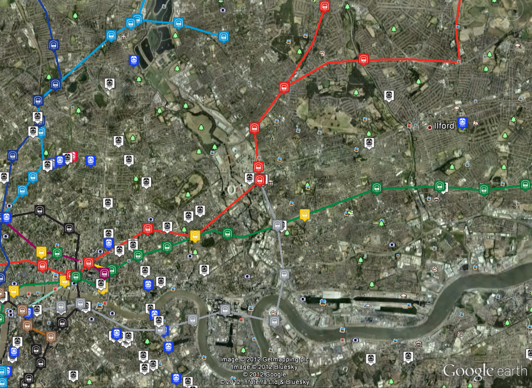
The next part involved deserialising the “ATCO_490_TRAIN.TXC” file into my class. I’m using area 490 which is Greater London, so I had to unpack the relevant zip files from the TransXChange download.

After reading the TransXChange manual for some time and some experimentation, I worked out that the method for calcualting passing points is as follows:

FOR EVERY “<Service>”

Get the JourneyPattern id from inside “<StandardService>”, which is the journey reference code (e.g. “JP8755”) and also the sequence code from the “<JourneyPatternSectionRefs>” (e.g. “SEQ12SEC11”)

Lookup the “<JourneyPatternRef>” code in the “<VehicleJourneys>/<VehicleJourney>” section. This gives us an absolute departure time and a list of “<JourneyPatternTimingLinkRef>” references (e.g. “SEC162POS95”) containing runtimes and wait times for the “from” and “to” links. These sequence positions are merged with ones from “<JourneyPatternSections>” looked up using the “SEQ_SEC_” reference from earlier. The vehicle timing links have preference over the journey pattern timing links.

FOR EVERY TimingLink from previous stage

Link Arrival Time = Previous Link Departure Time + RunTime

Link Departure Time = Arrival Time + Wait Time from end of previous link (“TO”)

The code for this is copied below:

[code language=”csharp”]

//read TransXChange file
XmlReaderSettings settings = new XmlReaderSettings();
settings.ConformanceLevel = ConformanceLevel.Fragment;
settings.IgnoreWhitespace = true;
settings.IgnoreComments = true;

using (XmlReader reader = XmlReader.Create(Filename, settings))
{
XmlSerializer SerializerObj = new XmlSerializer(typeof(TransXChangeXML.TransXChange));
TransXChangeXML.TransXChange TXC = (TransXChangeXML.TransXChange)SerializerObj.Deserialize(reader);

//Build a JourneyPattern index by the section cdoe
Dictionary JPS = new Dictionary();
foreach (TransXChangeXML.JourneyPatternSectionStructure JourneyPattern in TXC.JourneyPatternSections)
{
JPS.Add(JourneyPattern.id, JourneyPattern);
}

//build an index of vehicle journeys by the JP ref code so that we can look them up easily
Dictionary VehicleJourneyByJPRef = new Dictionary();
//VehicleJourneys have departure times
foreach (TransXChangeXML.VehicleJourneyStructure VehicleJourney in TXC.VehicleJourneys.VehicleJourney)
{
string VJourneyCode = VehicleJourney.VehicleJourneyCode;
DateTime VDepartureTime = VehicleJourney.DepartureTime;
string VOperatorRef = VehicleJourney.OperatorRef.Value; //e.g. SW=SW TRAINS

string JPRef = "";
if (VehicleJourney.Item is TransXChangeXML.VehicleJourneyRefStructure) JPRef = (VehicleJourney.Item as string);
else if (VehicleJourney.Item!=null) JPRef = (VehicleJourney.Item as TransXChangeXML.JourneyPatternRefStructure).Value; //this must be an xsd error? All this just to get the JP code?

//TODO: need an array of the duplicates indexed by JPRef
if (!string.IsNullOrEmpty(JPRef))
{
if (VehicleJourneyByJPRef.ContainsKey(JPRef))
{
//System.Diagnostics.Debug.WriteLine("Duplicate key: " + JPRef);
}
else
VehicleJourneyByJPRef.Add(JPRef, VehicleJourney);
}
}

//Now go through all the services, linking them up to the VehicleJourneys via their JP reference. The VehicleJourney contains the
//parent sequence of stops which is then overridden by any JourneyPatternSectionRefs contained in the JourneyPattern.

//Services only have relative timings on them, but link to VehicleJourneys through the JP ref, which gives us absolute times
foreach (TransXChangeXML.ServiceStructure Service in TXC.Services)
{
TransXChangeXML.StandardServiceStructure StandardService = Service.StandardService;
string SDDestination = StandardService.Destination.Value;
string SDOrigin = StandardService.Origin.Value;
//The parent service destination and origin only seem to be to do with the grouping and not something you would actually display
//System.Diagnostics.Debug.WriteLine("Service: Destination = " + SDDestination + " Origin = "+SDOrigin);

foreach (TransXChangeXML.JourneyPatternStructure JP in StandardService.JourneyPattern)
{
string JPRef = JP.id; //this is the JP number
if (JPRef == "JP8755") //This is Shepperton
{
string DestinationDisplay = JP.DestinationDisplay.Value; //this overrides the StandardService Destination
//lookup the journey using the JP code, which gives us a departure time and the section links which can be overridden
TransXChangeXML.VehicleJourneyStructure VehicleJourney = VehicleJourneyByJPRef[JPRef];
DateTime DepartureTime = VehicleJourney.DepartureTime;

//make a list of the timing link overrides from the VehicleJourneys which also gives us waiting times and additional runtimes
Dictionary VTimingLinks = new Dictionary();
if (VehicleJourney.VehicleJourneyTimingLink != null)
{
foreach (TransXChangeXML.VehicleJourneyTimingLinkStructure TimingLink in VehicleJourney.VehicleJourneyTimingLink)
{
VTimingLinks.Add(TimingLink.JourneyPatternTimingLinkRef.Value, TimingLink);
}
}

//get journey pattern timing links from SEQ SEC ref number
System.Diagnostics.Debug.WriteLine("Departure Time: "+DepartureTime + " Destination display: " + DestinationDisplay + " JP id=" + JP.id);
//now traverse the Journey accumulating a TimeDelta at each stop relative to the VehicleJourney Departure Time
TimeSpan TimeDelta = new TimeSpan();
TimeSpan FromWaitTime = new TimeSpan();
TimeSpan ToWaitTime = new TimeSpan();
foreach (TransXChangeXML.JourneyPatternSectionRefStructure SeqSecRef in JP.JourneyPatternSectionRefs)
{
System.Diagnostics.Debug.WriteLine("REF: " + SeqSecRef.Value);
TransXChangeXML.JourneyPatternSectionStructure JourneyPattern = JPS[SeqSecRef.Value]; //lookup JourneyPattern using SEQ SEC ref number
foreach (TransXChangeXML.JourneyPatternTimingLinkStructure TimingLink in JourneyPattern.JourneyPatternTimingLink)
{
//todo: need activity in here…
TimeSpan RunTime = ParseTime(TimingLink.RunTime);

FromWaitTime = ToWaitTime; //weird – wait time on end of last segment rolled around to start of this segment
ToWaitTime = new TimeSpan();
if (!string.IsNullOrEmpty(TimingLink.To.WaitTime)) ToWaitTime = ParseTime(TimingLink.To.WaitTime);

if (VTimingLinks.ContainsKey(TimingLink.id))
{
TransXChangeXML.VehicleJourneyTimingLinkStructure VTimingLink = VTimingLinks[TimingLink.id]; //VehicleTimingLink lookup
if (!string.IsNullOrEmpty(VTimingLink.RunTime)) RunTime = ParseTime(VTimingLink.RunTime);
if ((VTimingLink.To != null) && (!string.IsNullOrEmpty(VTimingLink.To.WaitTime)))
{
ToWaitTime = ParseTime(VTimingLink.To.WaitTime);
}
}

System.Diagnostics.Debug.WriteLine("Arrive: " + (DepartureTime+TimeDelta) + " Depart: " + (DepartureTime+TimeDelta+FromWaitTime)
+ " " + TimingLink.id + " " + TimingLink.From.StopPointRef.Value + " " + TimingLink.To.StopPointRef.Value
+" Runtime="+RunTime+" FromWaitTime="+FromWaitTime+" ToWaitTime="+ToWaitTime);
TimeDelta = TimeDelta + FromWaitTime + RunTime;
}
}
System.Diagnostics.Debug.WriteLine("Final arrival: "+(DepartureTime+TimeDelta));

}
}
}
}

[/code]

I’ve limited the code to only produce the passing points for a single service, “JP8755”, which is a Waterloo to Shepperton service. This produces the following output:

[code]
Departure Time: 01/01/0001 05:12:00 Destination display: Shepperton Rail Station JP id=JP8755
REF: SEQ12SEC11
Arrive: 01/01/0001 05:12:00 Depart: 01/01/0001 05:12:00 SEQ12POS88 9100WATRLMN 9100VAUXHLM Runtime=00:03:00 FromWaitTime=00:00:00 ToWaitTime=00:01:00
Arrive: 01/01/0001 05:15:00 Depart: 01/01/0001 05:16:00 SEQ12POS89 9100VAUXHLM 9100CLPHMJM Runtime=00:04:00 FromWaitTime=00:01:00 ToWaitTime=00:01:00
Arrive: 01/01/0001 05:20:00 Depart: 01/01/0001 05:21:00 SEQ12POS90 9100CLPHMJM 9100ERLFLD Runtime=00:03:00 FromWaitTime=00:01:00 ToWaitTime=00:00:00
Arrive: 01/01/0001 05:24:00 Depart: 01/01/0001 05:24:00 SEQ12POS91 9100ERLFLD 9100WDON Runtime=00:04:00 FromWaitTime=00:00:00 ToWaitTime=00:00:00
Arrive: 01/01/0001 05:28:00 Depart: 01/01/0001 05:28:00 SEQ12POS92 9100WDON 9100RAYNSPK Runtime=00:03:00 FromWaitTime=00:00:00 ToWaitTime=00:00:00
Arrive: 01/01/0001 05:31:00 Depart: 01/01/0001 05:31:00 SEQ12POS93 9100RAYNSPK 9100NEWMLDN Runtime=00:03:00 FromWaitTime=00:00:00 ToWaitTime=00:00:00
Arrive: 01/01/0001 05:34:00 Depart: 01/01/0001 05:34:00 SEQ12POS94 9100NEWMLDN 9100NRBITON Runtime=00:03:00 FromWaitTime=00:00:00 ToWaitTime=00:00:00
Arrive: 01/01/0001 05:37:00 Depart: 01/01/0001 05:37:00 SEQ12POS95 9100NRBITON 9100KGSTON Runtime=00:03:00 FromWaitTime=00:00:00 ToWaitTime=00:00:00
Arrive: 01/01/0001 05:40:00 Depart: 01/01/0001 05:40:00 SEQ12POS96 9100KGSTON 9100HAMWICK Runtime=00:02:00 FromWaitTime=00:00:00 ToWaitTime=00:00:00
Arrive: 01/01/0001 05:42:00 Depart: 01/01/0001 05:42:00 SEQ12POS97 9100HAMWICK 9100TEDNGTN Runtime=00:03:00 FromWaitTime=00:00:00 ToWaitTime=00:00:00
Arrive: 01/01/0001 05:45:00 Depart: 01/01/0001 05:45:00 SEQ12POS98 9100TEDNGTN 9100FULWELL Runtime=00:04:00 FromWaitTime=00:00:00 ToWaitTime=00:00:00
Arrive: 01/01/0001 05:49:00 Depart: 01/01/0001 05:49:00 SEQ12POS99 9100FULWELL 9100HAMPTON Runtime=00:04:00 FromWaitTime=00:00:00 ToWaitTime=00:00:00
Arrive: 01/01/0001 05:53:00 Depart: 01/01/0001 05:53:00 SEQ12POS100 9100HAMPTON 9100KMPTNPK Runtime=00:03:00 FromWaitTime=00:00:00 ToWaitTime=00:00:00
Arrive: 01/01/0001 05:56:00 Depart: 01/01/0001 05:56:00 SEQ12POS101 9100KMPTNPK 9100SUNBURY Runtime=00:02:00 FromWaitTime=00:00:00 ToWaitTime=00:00:00
Arrive: 01/01/0001 05:58:00 Depart: 01/01/0001 05:58:00 SEQ12POS102 9100SUNBURY 9100UHALIFD Runtime=00:02:00 FromWaitTime=00:00:00 ToWaitTime=00:00:00
Arrive: 01/01/0001 06:00:00 Depart: 01/01/0001 06:00:00 SEQ12POS103 9100UHALIFD 9100SHEPRTN Runtime=00:05:00 FromWaitTime=00:00:00 ToWaitTime=00:00:00
Final arrival: 01/01/0001 06:05:00
[/code]

Comparing this with the South West Trains timetable for the service, I can check that all the arrival and departure times are correct. It’s worth pointing out that, while this data is an October 2010 timetable, the current timetable in operation hasn’t changed in that time. This code should also be treated with caution as it hasn’t been rigorously tested. As can be seen from some of the comments, there are parts of the TransXChange schema that I’ve ignored for the sake of simplicity, for example, the activity at the stop and whether it’s a “Dead Run”.

Now that I have a list of passing points for every station in Greater London, I can use the information to build a real-time train tracking system.

Force Directed Graphs for Visualisation of Search Results

I’ve been looking at the D3.js library for data visualisation in Javascript. This is the new evolution of Protovis from the Stanford Visualization group, and uses SVG to create dynamic visualisations from raw data.

What interests me is how large archives of geospatial datasets can be searched for relevant information. On MapTube at the moment we have a large amount of Census data, but it’s not particularly accessible as you can only search by keyword. Thinking ahead to the up-coming 2011 Census release, we really need a way of showing how datasets relate to one another. I’ve shown some examples before of how a network graph can be used to show how London data on population links to employment (workplace population), education, index of multiple deprivation and crime. Recently, I’ve been looking at how to use this technique to enhance the search results on MapTube. Using the MapTube database, which currently contains 715 maps, I create a graph where each vertex is one of the 715 maps, which are linked by non-directed edges where maps share a common keyword. The idea is that when the user inputs a search term, for example “population”, then a sub-graph is created of all the maps containing the “population” keyword. The image below shows this example displayed as a force-directed graph using D3:

Firstly, I should explain that all the edges labelled “population” have been removed as, otherwise, this would be a fully connected graph as they all contain the search keyword. The size of the red dots is also proportional to the number of hits that map has received, so it’s possible to see the more popular maps very easily. What this method of searching has over the standard list view is that you can see that there are three distinct groupings of results. The two U.S. population maps form their own group on the left, the Italian population map is on its own at the top and everything else forms its own UK based group. One other interesting property is that we can see that the “Female” population density map has received a lot more hits than its equivalent “Male” population density map.

The static image from the web page doesn’t do this example justice, as it’s possible to move the nodes around to investigate the structure further. The following link shows how the nodes can be moved around dynamically on the web page: http://youtu.be/TmRQx-Ogm0E

The example was created using a bespoke C# program to create the graph structure from the MapTube database. This was exported as a JSON file which contained the nodes with the map title and number of hits, along with the links as pairs of node numbers.

The D3 code is relatively simple as it’s just a modification of one of the “force” examples, but with an SVG circle and label node added as children of an “svg:g” parent node so that theĀ mapsĀ contain the map title:

[javascript]
var w = 960,
h = 500,
fill = d3.scale.category20();

var vis = d3.select("#chart").append("svg")
.attr("width", w)
.attr("height", h);

d3.json(/*"miserables.json"*/"MapTube.json", function(json) {

var force = d3.layout.force()
.gravity(0.02)
.charge(-120)
.linkDistance(/*30*/200)
.nodes(json.nodes)
.links(json.links)
.size([w, h])
.start();

var link = vis.selectAll("line.link")
.data(json.links)
.enter().append("line")
.attr("class", "link")
.style("stroke-width", function(d) { return Math.sqrt(d.value); })
.attr("x1", function(d) { return d.source.x; })
.attr("y1", function(d) { return d.source.y; })
.attr("x2", function(d) { return d.target.x; })
.attr("y2", function(d) { return d.target.y; });

var node = vis.selectAll("g.node")
.data(json.nodes)
.enter().append("svg:g")
.attr("class", "node")
.call(force.drag);

node.append("svg:circle")
.attr("class","circle")
.attr("r",function(d) { var r=d.hits/4; if (r25) r=25; return r; }); //this is going to be hits

node.append("svg:text")
.attr("class", "nodetext")
.attr("dx", function(d) { var r=d.hits/4; if (r25) r=25; return r; })
.attr("dy", ".35em")
.text(function(d) { return d.name });

force.on("tick", function() {

link.attr("x1", function(d) { return d.source.x; })
.attr("y1", function(d) { return d.source.y; })
.attr("x2", function(d) { return d.target.x; })
.attr("y2", function(d) { return d.target.y; });

node.attr("transform", function(d) { return "translate(" + d.x + "," + d.y + ")"; });
});
});

[/javascript]

This is still only an experiment as the layout rules need some work and I doubt that it will cope very well if there are large numbers of nodes and links, but it’s a different way of looking at search results.

Links:

D3

Examples

D3 Google Groups

InfoVis Toolkit

All the London Datastore Maps

This started out as an experiment in how to handle geospatial data published in Internet data stores. The idea was to make an attempt at structuring the data to make searching, comparison and visualisation easier. The London Datastore publish a manifest file which contains links to CSV files that are in the correct format for MapTube to handle, so I wrote a process to make the maps automatically. The results are one thumbnail map for every field in the first hundred datasets on the London Datastore. I stopped the process once I got to a hundred as it was taking a long time. A section of the results are shown as an image below, but the link goes to the full 10,000 pixel image created using the Image Cutter.

Link to full zoomable image

The name of the dataset and name of the column being visualised are shown in the top left of the map, while the colour scale is a Jenks 5 class range between the min and max of the data. This sort of works, but raises more questions than it answers about the data. To start with, one interesting thing that jumps out of the data is that there was a step change in London population around 1939. This comes from the “London Borough Historic Population” dataset, shown on the top two lines of the image above (it’s seven rows from the bottom of the zoomable image). The 1939 image is the third from the right on the top row.

Continue reading “All the London Datastore Maps”