Bugs. On a Map

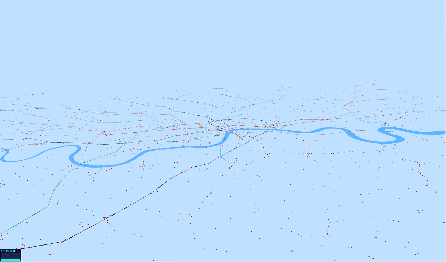
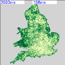
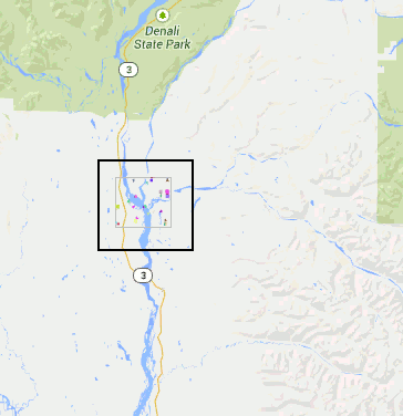
Maybe I’ve been staring at agent based models running on Google Maps for too long, but it does look as though the map is infested with bugs which are crawling all over it. Have a look at the animation below:

bugs on a map
Bugs on a Google Map

This is a Talisman deliverable, which we’ve called “ModelTube”, as the general idea is to be able to run models on MapTube maps in a similar way to how the Modelling 4 All site works with Java Applets. The concept of a framework for “programmable maps” is an interesting one as it allows us to integrate code for calculating real-time positions of tubes, buses and trains based on their last known position, with all the animation happening on the browser. Essentially, what we’re doing here is running Logo on a map to create a visualisation of the data in space and time. The next step is to include some of our city diagnostics about expected frequency of transport services to highlight were problems are occurring, but it’s also possible to couple that with an additional layer of intelligence about the people using the services to predict where the biggest problems are likely to be in the next few minutes (now-casting for cities).

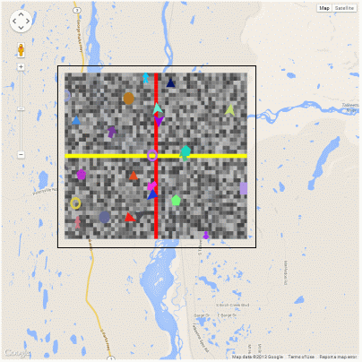
As this is a follow up to my last post about running agent based models on Google Maps using AgentScript, I’m only going to highlight the changes needed to give the agents a geographic context. I’ve sorted out the scaling and position of the canvas that defines the agent world, so they now run inside a lat/lon box that I can define with the zoom in and out functioning correctly. The solid black outline in the animation above is a frame that I’ve added 16 pixels outside of the agent box so that I can verify that it is in the correct position. The lighter grey frame is the edge of the agent canvas which corresponds to my lat/lon bounding box.

In the map above, I’ve removed the patches and made the agent canvas transparent so you can see the map underneath. With the patches turned back on it looks like this:

Patches (grey) and agents (coloured) with the crosshairs showing the origin

The only problem with this technique is that the agent based model runs in its own agent space, which is then mapped to a lat/lon box on the map, which the Google Maps API then reprojects into Mercator. This is the same situation as the GIS extension for NetLogo, where the model runs in its own coordinate space and you define a transform which is used when importing geographic data from shapefiles. The consequence of this is that the model is really running in a Mercator coordinate system, but, given that models tend to model small-scale phenomena, this might not be such a big issue.

For completeness, here are the changes I’ve made to the code to create a Google Maps overlay containing the AgentScript model (coffeescript):

[code language=”javascript”]

class AgentOverlay extends google.maps.OverlayView
constructor: (@id_, @bounds_, @map_) ->
console.log("Building AgentOverlay called ‘"+@id_+"’")
@div_=null
@setMap(@map_)
onAdd: () ->
#console.log("add")
div = document.createElement(‘div’)
div.id=@id_ #+’_outer’
div.style.borderStyle=’none’
div.style.borderWidth=’0px’
div.style.position=’absolute’
div.style.backgroundColor=’#f00′
@div_=div
panes = this.getPanes()
panes.overlayLayer.appendChild(@div_)
#now that the div (s) have been created we can create the model
# div, size, minX, maxX, minY, maxY, torus=true, neighbors=true
#NOTE: canvas pixels = size*(maxX-minX), size*(maxY-minY)
#where size is the patch size in pixels (w and h) and min/max/X/Y are in patch coordinates
@model_ = new MyModel "layers", 5, -25, 25, -20, 20, true
@model_.debug() # Debug: Put Model vars in global name space
@model_.start() # Run model immediately after startup initialization
draw: () ->
#console.log("draw")
overlayProjection = @getProjection()
sw = overlayProjection.fromLatLngToDivPixel(@bounds_.getSouthWest())
ne = overlayProjection.fromLatLngToDivPixel(@bounds_.getNorthEast())
geoPxWidth = ne.x-sw.x #width of map canvas
geoPxHeight = sw.y-ne.y #height of map canvas
div = @div_
div.style.left = sw.x+’px’
div.style.top = ne.y+’px’
div.style.width = geoPxWidth+’px’
div.style.height = geoPxHeight+’px’
#go through each context (canvas2d or image element) and change its size, scaling and translation
for name, ctx of ABM.contexts #each context is a layer i.e. patches, image, drawing, links, agents, spotlight (ABM.patches, ABM.agents, ABM.links)
#console.log(name)
if ctx.canvas
ctx.canvas.width=geoPxWidth
ctx.canvas.height=geoPxHeight
#Drawing on the canvas is in patch coordinates, world.size is the size of the patch i.e. 5 in new MyModel "layers", 5, -25, 25, -20, 20
#Patch coordinates are from the centre of the patch.
#The scaling would normally be so that 1 agent coord equals the patch width (i.e. 5 pixels or world.size).
#We need to make the agent world fit the geoPxWidth|Height, so take the normal scaling (world.size) and multiply by geowidth/world.pxWidth to
#obtain a new scaling in patch coords that fits the map canvas correctly.
ctx.scale geoPxWidth/@model_.world.pxWidth*@model_.world.size, -geoPxHeight/@model_.world.pxHeight*@model_.world.size
#The translation is the same as before with minXcor=minX-0.5 (similarly for Y) and minX=-25 in new MyModel "layers", 5, -25, 25, -20, 20
#Code for this can be found in agentscript.coffee, in the setWorld and setCtxTransform functions
ctx.translate -@model_.world.minXcor, -@model_.world.maxYcor
#@model_.draw(ctx) #you need to force a redraw of the layer, otherwise it isn’t displayed (MOVED TO END)
else
#it’s an image element, so just resize it
ctx.width=geoPxWidth
ctx.height=geoPxHeight
ABM.model.draw(true) #forces a redraw of all layers
#u.clearCtx(ctx) to make the context transparent?
#u.clearCtx(ABM.contexts.patches)
onRemove: () ->
#console.log("remove")
@div_.parentNode.removeChild(@div_)
@div_=null

[/code]

All that’s left now is to wrap all this up into a library and publish it. And maybe do something useful with it?

London on the Move

LondonOnTheMove_20130903_123000

The image above shows the latest attempt at producing a real-time moving visualisation of the whole of London’s transport system. The tube lines are visible with the darker areas showing the locations of the actual tube trains. These are really too small to see at this resolution as I’ve zoomed out to show all the tiny red dots, which are the buses. Both the tubes and the buses are now animated as can be seen in the following YouTube clip:

http://youtu.be/78y2kdLUV-U

As a rough guide to performance, there are approximately 450 tubes and 7,000 buses being animated at around 19 frames per second on an i7 with a Radeon 6900M graphics card (27 inch iMac).

The first thing that most people are going to notice is that not all the buses are actually moving. The reason for this is quite interesting as I’ve had to use different methods of animating the tube and bus agents to get the performance. The other thing that’s not quite right is that the buses move in straight lines between stops, not along the road network. This is particularly noticeable for the ones going over bridges.

The tubes are all individual “Object3D” objects in three.js and animate using a network graph of the whole tube network. This works well for the tubes as there are comparatively few of them, so, when the data says “one minute to next station” and we’ve been animating for over a minute, then we can work out what the next stop on its route is and generate a new animation record for the next station along. When there are 7,000 buses and 21,000 bus stops, though, the complete bus network is an order of magnitude more complicated than the tube. For this reason, I’m not using a network graph, but holding the bus position when it gets to the next stop on the route as I can’t calculate the next bus stop without holding the entire 21,000 vertex network in memory. While this would probably work, it seems to make more sense to push the more complicated calculations over to the server side and only hold the animation data on the WebGL client. Including the road network is also another level of complexity, so it would make a lot of sense to include this in the server side code, so the client effectively gets sent a list of waypoints to use for the animation.

Finally, I have to concede that this isn’t terribly useful as a visualisation. It’s not until delays and problems are included in the visualisation that it starts to become interesting.

Hot Temperatures and Train Delays

It’s been hot in London today, as you can see from the temperature data, obtained from the Met Office Datapoint site:

MetoDataPoint_20130715_1600BST

Air Temperature for 16:00 BST (local time). Full map available at:  http://www.maptube.org/map.aspx?mapid=1276

What isn’t immediately apparent is that the temperature in London was around 30C from mid-morning until the evening and the sustained temperatures caused a lot of problems with the transport system. I would like to be able to see the urban heat island effect, but there are no temperature measurements inside London itself and we’re having to use Heathrow as the nearest. I hope to remedy this situation using a GTS decoder fairly soon, but for now we’re missing London City airport and London weather centre.

Going back to the transport data, the problems outside Waterloo where a rail buckled in the heat, causing the closure of 4 platforms and creating travel chaos for the evening commute were well publicised in the media. The rail data looks something like this:

NetWorkRail-BrokenRail14WLO_Hot_20130716_093000_cropped

Average late minutes per train, plotted for all train operating companies for 15th (9am) to 16th (9am) July 2013.

The problems for SW Trains from 6PM onwards can clearly be seen, but, looking at the other train operating companies, this does not seem like an isolated problem. Southeastern and C2C appear to have issues round about the same time, while East Coast and First Hull Trains have on-going problems.

The key issue here is how to link data of this kind to what is actually happening in the real world, as a small change in our figure here doesn’t adequately convey the complete chaos that is caused. Timing is crucial, so we need to include expected demand on the service, along with spatial data showing where problems are located and what they are affecting. In this situation, the closure of platforms 1 to 4 caused major problems to the loop services which start and finish at Waterloo. Temperature is the root cause and, as a number of operators are affected, there must be a relationship between probability of failure and temperature which we can try and determine from our archive of running data. Unfortunately, we only have a single year of data, but there is enough quantity of data to make for an interesting investigation.

Going back to the weather data, we really need to be able to track these types of events in real time. Bringing in weather underground data might fill some of the data holes in the centre of London, if we can overcome the accuracy problems, but there are satellite instruments that we could use as well. I’ve always wanted to be able to plot the position of the jet stream on a map, using the upper air data (PILOTs and TEMPs). Hopefully, using the Met Office’s Datapoint data, weather underground and the data on the GTS feed, we should be able to integrate everything together to give us a clue as to the bigger picture.

Throwing the spatial analysis ‘baby’ out with the big data ‘bathwater’

Three days at the splendidly organised Twelfth International Conference on GeoComputation (Wuhan, China, 23rd-25th May) have provided a welcome opportunity for intellectual refreshment in the company of old friends and colleagues. Nevertheless an irritating feature of the meeting has been the apparently endless queue of speakers with diverse national and intellectual backgrounds all wanting to wax ever more lyrically on the need for new technologies in order to squeeze the value from rapidly overflowing reservoirs of social and physical data at ever finer scales of spatial and temporal resolution.
I was reminded somewhat of the old-fashioned idea of ‘throwing the baby out with the bathwater’, a multi-layered expression which conveys the general idea of a failure to distinguish the worthwhile from the worthless. In short, I’d like to hear a little bit less about all the new things we can do with our latest empirical goodies, and a bit more about how this helps us to build on the things to which many of us have already devoted the best of our careers.
It concerns me that the discipline of GeoComputation has the potential to become too easily harnessed to superficial readings of the ‘fourth paradigm’ rhetoric in which analytical pursuits are emasculated by the succubus of inductive reasoning. Quantitative geographers have been wrestling for the last sixty years with problems involving the generalisation and analytic representation of spatial problems. Social scientists could legitimately trace similar concerns back to Chicago in the 1920s, if not to scholars of the nineteenth century such as Ravenstein or Charles Booth. Typically such enquiry has wrestled gamely with the issue of a severe deficiency in Vitamin D(ata).
I’d be amongst the last to deny the possibilities for new styles of analysis with virtualised or real-time data, and the importance of emerging patterns of spatial and personal behaviour associated with new technologies such as social media. But surely we need to do this at the same as staying true to our roots. The last thing we need to do is to abandon our traditional concerns with the theory of spatial analysis when we finally have the information we need to start designing and implementing proper tests of what it means to understand the world around us. Wouldn’t it be nice to see a few more models out there (recalling that a model is no more or less than a concrete representation of theory) in which new sources of data are being exploited to test, iterate and refine real ideas which ultimately lead to real insights, and perhaps even real solutions to real problems?

Big Data Masochists must resist the Dominatrix of Social Theory

Here at the AAG in Los Angeles it has been good to witness at first hand the continued vibrancy and diversity of geographical inquiry.  In particular, themes such as Agent-based Modelling, Population Dynamics, and CyberGIS have been well represented alongside sessions on Social Theory, Gender and Cultural and Political Ecology.  At Friday’s sessions on big data and its limits (“More data, more problems”; “the value of small data studies”) I learned, however  that the function of geography is to push back against those who worship at the atheoretical altar of empirical resurrection, while simultaneously getting off on what one delegate branded the ‘fetishisation of numbers’.  The ‘post-positivists’ it seems are far too sophisticated to be seduced by anything so sordid as numerical evidence, while poor old homo quantifactus still can’t quite see past the entrance of his intellectual cave.

Exactly who is being raped here is a moot question however.  ( For those unfamiliar with the reference to the ‘rape of geographia’, see the cartoon here: http://www.quantamike.ca/pdf/94-11_MapDiscipline.pdf).  Speaking as someone who has spent 30 years in the UK working with GIS, simulation and geocomputation, it is hard to escape the conclusion that the dominatrix of social theory has deployed her whips and chains with ruthless efficiency.  Can we therefore be clear on a couple of points.  First, the role of geography (and geographers) is not to push back against specific approaches, but to provide the means for spatial analysis (and theory) which complements other (non-spatial) perspectives.  Second, whether my data is bigger than your data is not the issue, and any argument which couches the debate in terms of ‘the end of theory’ (cf Anderson, 2008 – http://www.wired.com/science/discoveries/magazine/16-07/pb_theory) is missing the point.  New data sources provide immense opportunity for creative approaches to the development of new ‘theories’ of spatial behaviour, and to the testing and refinement of existing theories (which I probably like to call ‘models’, although I’ve not evolved to become a post-positivist yet).

The challenges are tough.  It is possible that some current attempts to navigate the big data maze lack rigour because the sub-discipline is so new, but also after 30 years of chronic under-investment in quantitative geography our community struggles to access the necessary skills.  Far from pushing back against the mathematicians, engineers and other scientists it may be necessary to engage with these constituencies over a long period of time to our mutual benefit.  Observations about what any of us might like to do with numbers in the privacy of our own offices and hotel rooms are a less than helpful contribution to the debate.

Cities as Operating Systems


The idea of cities mirroring computer operating systems has been around for a while (see: http://teamhelsinki.blogspot.co.uk/2007/03/city-as-operating-system.html ), but recent events have made me wonder whether this might be about to become more important. Cities are systems in exactly the same way that complex computer systems are, although how cities function is a black box. Despite that difference, computer systems are now so big and complex that understanding how the whole system works is incomprehensible and we rely on monitoring, which is how we come back to the city systems. Recently, we had a hardware failure on a virtual machine host, but in this case I happened to be looking at the Trackernet real-time display of the number of tubes in London.  This alerted me to the fact that something was wrong, so I then switched to the virtual machine monitoring console and diagnosed the failure. We were actually out of the office at the time, so the publicly accessible tube display was easier to access than the locked down secure console for the hardware. The parallels between the real-time monitoring of a server cluster and real-time monitoring of a city system are impossible to ignore. Consider the screenshot below:

trackernet_20130323


Screenshot from an iPad showing a stream graph of the number of tubes running in London on Friday 22nd and Saturday 23rd March 2013.

We could very easily be looking at CPU load, disk or network bandwidth for a server, but it happens to be the number of tubes running on the London Underground. Points 1 and 2 show a problem on the tube network around 3PM on Friday. It’s not very easy to tell from this visualisation, but the problem is on the Piccadilly line and then the Jubilee line. However, the purpose of this display is to alert the user to any problems which they can then diagnose further. Point 3 is not so easy to detect, but the straight lines suggest missing data. Going back to the original files, everything appears normal and all data is being logged, so this could be an API or other network failure that rectified itself. Point 4 is similar, but this can be explained as a Saturday morning outage for maintenance to prevent the problem that we saw on Wednesday happening again.

It is this symbiotic relationship between the real-time monitoring of city systems and computer systems that is really interesting. We are logging a lot more data than is shown on this graph, so the key is to work out what factors we need to be looking at to understand what is really happening. Add a spatial element to this and the system suddenly becomes a whole lot more complicated.

To finish off with, here is view of the rail network at 12pm on 25 March 2013 (another snow day in the North of the country). The similarity between this view and and a seismograph is apparent, but what is being plotted is average minutes late per train. The result is very similar to a CPU or disk activity graph on a server, but minute by minute we’re watching trains running.

NetworkRail_20130325

Links

http://teamhelsinki.blogspot.co.uk/2007/03/city-as-operating-system.html

http://www.smartplanet.com/blog/smart-takes/london-tests-out-smart-city-operating-system/26266


Lots and Lots of Census Maps (part 2)

My last post on the Census Maps got as far as running a simple comparison of every combination of every possible map at LSOA level to obtain a similarity metric. There are 2,558 possible variables that can be mapped, so my dataset contains 6,543,364 lines. I’ve used the graph from the last post to set a cut off of 20 (in RGB units) to select only the closest matches. As the metric I’m using is distance in RGB space, it’s actually a dissimilarity metric, so 0 to 20 gives me about 4.5% of the top matches, resulting in 295,882 lines. Using an additional piece of code I can link this data back to the plain text description of the table and field so I can start to analyse it.

The first thing I noticed in the data is that all my rows are in pairs. A matches with B in the same way that B matches with A and I forgot that the results matrix only needs to be triangular, so I’ve got twice as much data as I actually needed. The second thing I noticed was that most of the data relates to Ethnic Group, Language and Country of Birth or Nationality. The top of my data looks like the following:

0.1336189 QS211EW0094 QS211EW0148 (Ethnic Group (detailed)) Mixed/multiple ethnic group: Israeli AND (Ethnic Group (detailed)) Asian/Asian British: Italian
0.1546012 QS211EW0178 QS211EW0204 (Ethnic Group (detailed)) Black/African/Caribbean/Black British: Black European AND (Ethnic Group (detailed)) Other ethnic group: Australian/New Zealander
0.1546012 QS211EW0204 QS211EW0178 (Ethnic Group (detailed)) Other ethnic group: Australian/New Zealander AND (Ethnic Group (detailed)) Black/African/Caribbean/Black British: Black European
0.1710527 QS211EW0050 QS211EW0030 (Ethnic Group (detailed)) White: Somalilander AND (Ethnic Group (detailed)) White: Kashmiri
0.1883012 QS203EW0073 QS211EW0113 (Country of Birth (detailed)) Antarctica and Oceania: Antarctica AND (Ethnic Group (detailed)) Mixed/multiple ethnic group: Peruvian
0.1883012 QS211EW0113 QS203EW0073 (Ethnic Group (detailed)) Mixed/multiple ethnic group: Peruvian AND (Country of Birth (detailed)) Antarctica and Oceania: Antarctica
0.1889113 QS211EW0170 QS211EW0242 (Ethnic Group (detailed)) Asian/Asian British: Turkish Cypriot AND (Ethnic Group (detailed)) Other ethnic group: Punjabi
0.1925942 QS211EW0133 KS201EW0011 (Ethnic Group (detailed)) Asian/Asian British: Pakistani or British Pakistani AND (Ethnic Group) Asian/Asian British: Pakistani

The data has had the leading diagonal removed so there are no matches between datasets and themselves. The columns show match value (0.133), first column code (QS211EW0094), second column code (QS211EW0148) and finally the plain text description. This takes the form of the Census Table in brackets (Ethnic Group (Detailed)), the column description (Mixed/multiple ethnic group: Israeli), then “AND” followed by the same format for the second table and field being matched against.

It probably makes sense that the highest matches are ethnicity, country of birth, religion and language as there is a definite causal relationship between all these things. The data also picks out groupings between pairs of ethnic groups and nationalities who tend to reside in the same areas. Some of these are surprising, so there must be a case for extracting all the nationality links and producing a graph visualisation of the relationships.

There are also some obvious problems with the data which you can see by looking at the last line of the table above: British Pakistani matches with British Pakistani. No surprise there, but it does highlight the fact that there are a lot of overlaps between columns in different data tables containing identical, or very similar data. At the moment I’m not sure how to remove this, but it needs some kind of equivalence lookup. This also occurs at least once on every table as there is always a total count column that matches with population density:

0.2201077 QS101EW0001 KS202EW0021 (Residence Type) All categories: Residence type AND (National Identity) All categories: National identity British

These two columns are just the total counts for the QS101 and KS202 tables, so they’re both maps of population. Heuristic number one is: remove anything containing “All categories” in both descriptions.

On the basis of this, it’s probably worth looking at the mid-range data rather than the exact matches as this is where it starts to get interesting:

10.82747 KS605EW0020 KS401EW0008 (Industry) A Agriculture, forestry and fishing AND (Dwellings, Household Spaces and Accomodation Type) Whole house or bungalow: Detached
10.8299 QS203EW0078 QS402EW0012 (Country of Birth (detailed)) Other AND (Accomodation Type – Households) Shared dwelling

To sum up, there is a lot more of this data than I was expecting, and my method of matching is rather naive. The next iteration of the data processing is going to have to work a lot harder to remove more of the trivial matches between two sets of data that are the same thing. I also want to see some maps so I can explore the data.


Lots and Lots of Census Maps

I noticed recently that the NOMIS site has a page with a bulk upload of  the latest release of the 2011 Census Data: http://www.nomisweb.co.uk/census/2011/bulk/r2_2

As one of the Talisman aims is to be able to able to handle data in datastores seamlessly, I modified the code that we used to mine the London Datastore and applied the same techniques to the latest Census data. The first step is to automatically create every possible map from every variable in every dataset, which required me uploading the new 2011 Census Boundary files to our server. This then allows the MapTubeD tile server to build maps directly from the CSV files on the NOMIS site. Unfortunately, this isn’t completely straightforward as I had to build some additional staging code to download the OA zip file, then split the main file up into MSOA, LSOA and OA files as all the data is contained in a single file.

The next problem was that running a Jenks stratification on 180,000 records at OA level is computationally intensive, as is building the resulting map. The Jenks breaks can be changed to Quantiles which are O(n) as opposed to O(n^2), but in order to build this many maps in a reasonable time I dropped the geographic data down to LSOA level. This is probably a better option for visualisation anyway and only has 35,000 areas.

The resulting maps look similar to the following:

image_102_5image_5_12


I’m deliberately not saying what these maps show at the moment and you can’t tell from the numbers as that’s part of the debugging code telling me how long they took to render. As there are 2,558 of these maps possible from the data, knowing that this can be done in a reasonable amount of time and that I can leave it running overnight is quite important. My quick calculation based on a 27″ iMac doing about 4 Mips seems to work out about right.

The two maps above show an interesting spatial variation, so the next step was to use a spatial similarity metric on every combination of two maps to generate a correlation matrix containing 2,558 x 2,558 cells. Not knowing whether this was going to work and also being worried about the size of the data that I’m working with, I decided to use a simple RGB difference squared function. The maps are rendered to thumbnails which are 256 x 256 pixels, so the total number of operations to calculate this is going to be (2558*2558)/2 * 65536/4 MIPS, or about 15 hours times however long a single RGB comparison takes.

The result of running this over night is a file containing 6,543,364 correlation scores. What I wanted to do first was to plot this as a distribution of correlation scores to see if I could come up with a sensible similarity threshold. I could derive a statistically significant break threshold theoretically, but I really wanted to look at what was in the data as this could show up any problems in the methodology.

The aim was to plot a cumulative frequency distribution, so I need a workflow that can clean the data and sort 6 million values, then plot the data. There were some nightmare issues with line endings that required the initial clean process to remove them, using “egrep -v “^$” original.csv > cleaned.csv”. My initial thoughts were to use Powershell to do the clean and sort, but it doesn’t scale to the sizes of data that I’m working with. The script to do the whole operation is really easy to code in the integrated environment, but was taking far too long to run. This meant a switch to a program I found on Google Code called “CSVFix“. The operation is really simple using the command line:

csvfix sort -f 5:AN imatch.csv > imatch-sorted.csv

This sorts column 5 ascending (A) using a numeric (N) match and doesn’t take a huge amount of time. The final step is to plot the data and see what I’ve got. This was done using GNUPlot as the data is too big to load into Excel or Matlab. In fact, the only binaries available for GNUPlot are x86, so I was worried I was going to have to build an x64 version to handle the data, but this turned out to be unnecessary. The following commands plot the data:

set datafile separator “,”

plot ‘imatch-sorted.csv’ using 5

And the final graph looks like this:

SCurve

The “S-Curve” that results is interesting as the Y-Axis shows difference with zero being identical and 120 being very different. The X-Axis shows the number of maps that match with the Y-Axis difference or better, so it’s a cumulative plot of similarity. Units for the Y-Axis are RGB intensity, with the X-Axis having no units as it’s a count. There are 2558 maps that match with themselves with zero difference, but up to about 20, there appears to be a linear relationship followed by a turning point and another linear section with reduced gradient until the difference starts to increase rapidly.

Most of this can be explained by the fact that all the maps are of England and so anything in the sea is always going to match on every map regardless. As I explained at the beginning, this is really an exploration of the workflow and methodology, so there are a number of problems with it. The ultimate aim is to show how all the data is related, so similarity, spatial weighted similarity, clustering and comparisons between gridded data, areas and rendered maps all need to be explored.


Mark 1 Spider Bee

Following on from the Hex Bug Spiders that we were running at Leeds City Museum, I have modified our third spider to use an XBee module for wireless control via a laptop using the 802.15.4 protocol for mesh networks. This gives me a two way channel to the spider, so we can now add sensors to it, or even a camera module.

DSC01681_small

The following clips show the spider walking (turn the sound on to really appreciate these):

Construction details will follow in a later post, but the way this has been constructed is to take a regular Hex Bug spider and remove the carapace containing the battery cover and battery box. The three securing screws are then used to mount some prototyping board onto the body of the hex bug. Two of these white plastic bits can be seen in the picture attaching the board to the green plastic case. The first board contains a Lithium Ion camera battery (3.7v 950mAH). On top of that is a thin black plastic rectangle secured using four 2mm bolts at the corners of the battery board. Onto this is mounted two further prototype boards containing the H-Bridge driver (lower) and XBee board (upper). The upper board has a further daughter board attached to take the XBee module which sits at the very top along with the red and green LEDs. The blinking red LED shows that the network is connected while the green LED indicates received packets. The main reason for having the XBee plugged in to this adapter is to convert the 2mm spacing pins of the XBee to the 0.1 inch holes of the prototype board. The XBee adapter is actually plugged in to a chip holder that is mounted on the top board. Ideally I would have re-used the motor driver electronics of the existing Hex Bug controller, but it turned out to be too fiddly to modify, so it was easier just to construct new circuitry. This is only a prototype, but using a double-sided PCB it would be quite easy to mount everything onto a single board that would sit neatly above the battery.

In terms of software, the controller is built using Java and the XBee API that can be downloaded from Google Code: http://code.google.com/p/xbee-api/

The coordinator XBee connects to the laptop via a USB cable and is plugged in to an XBee serial adapter. This runs in API mode (escaped) while the router XBee on the spider is in AT mode. Both use the Series 2 firmware with the coordinator sending commands to the spider using Remote AT command packets (which are only available in API mode).

Now that this is running, we have the potential to run more than two spiders at once so we can build a more complex agent simulation. With the code all using Java, there is the potential to link this to NetLogo, but the missing link is the vision software which I’m still working on.

D3 Graph Problems

My last post on the delays caused by the snow contained a comment about a bug in the D3 library. Not wanting to just leave this, I’ve done some more testing with the latest D3 code. As can be seen from the graph below, something corrupts the x coordinate in the SVG path:

BusCounts_Broken


On further inspection, the horizontal lines are caused by the following anomaly in the SVG path element:

<path d=”M890,69.15851272015652………….

L774.8666471048152,5.417948001118248
L773.0392824747554,3.3994967850153444
L771.201277694171,0.6374056471903486
L-13797062.104351573,5.736650824713479
L767.5585693674684,5.736650824713479
L765.6888979556953,12.004473022085563
L763.9054848634413,12.004473022085563
L762.0744956782887,12.004473022085563

Looking at line 4, a large negative number has crept into the X coordinate list, which is giving the horizontal lines.

I’ve verified that the original data is correct, I’m using the v3 release version of D3 and exactly the same thing happens with IE9, Chrome and Firefox. This graph has 486 data values, so it’s not exactly massive.

I’ll post more once I’ve tracked the problem down.