
I noticed recently that the NOMIS site has a page with a bulk upload of the latest release of the 2011 Census Data: http://www.nomisweb.co.uk/census/2011/bulk/r2_2
As one of the Talisman aims is to be able to able to handle data in datastores seamlessly, I modified the code that we used to mine the London Datastore and applied the same techniques to the latest Census data. The first step is to automatically create every possible map from every variable in every dataset, which required me uploading the new 2011 Census Boundary files to our server. This then allows the MapTubeD tile server to build maps directly from the CSV files on the NOMIS site. Unfortunately, this isn’t completely straightforward as I had to build some additional staging code to download the OA zip file, then split the main file up into MSOA, LSOA and OA files as all the data is contained in a single file.
The next problem was that running a Jenks stratification on 180,000 records at OA level is computationally intensive, as is building the resulting map. The Jenks breaks can be changed to Quantiles which are O(n) as opposed to O(n^2), but in order to build this many maps in a reasonable time I dropped the geographic data down to LSOA level. This is probably a better option for visualisation anyway and only has 35,000 areas.
The resulting maps look similar to the following:
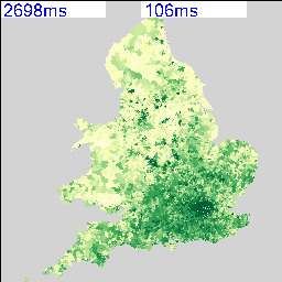
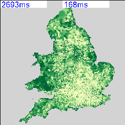
I’m deliberately not saying what these maps show at the moment and you can’t tell from the numbers as that’s part of the debugging code telling me how long they took to render. As there are 2,558 of these maps possible from the data, knowing that this can be done in a reasonable amount of time and that I can leave it running overnight is quite important. My quick calculation based on a 27″ iMac doing about 4 Mips seems to work out about right.
The two maps above show an interesting spatial variation, so the next step was to use a spatial similarity metric on every combination of two maps to generate a correlation matrix containing 2,558 x 2,558 cells. Not knowing whether this was going to work and also being worried about the size of the data that I’m working with, I decided to use a simple RGB difference squared function. The maps are rendered to thumbnails which are 256 x 256 pixels, so the total number of operations to calculate this is going to be (2558*2558)/2 * 65536/4 MIPS, or about 15 hours times however long a single RGB comparison takes.
The result of running this over night is a file containing 6,543,364 correlation scores. What I wanted to do first was to plot this as a distribution of correlation scores to see if I could come up with a sensible similarity threshold. I could derive a statistically significant break threshold theoretically, but I really wanted to look at what was in the data as this could show up any problems in the methodology.
The aim was to plot a cumulative frequency distribution, so I need a workflow that can clean the data and sort 6 million values, then plot the data. There were some nightmare issues with line endings that required the initial clean process to remove them, using “egrep -v “^$” original.csv > cleaned.csv”. My initial thoughts were to use Powershell to do the clean and sort, but it doesn’t scale to the sizes of data that I’m working with. The script to do the whole operation is really easy to code in the integrated environment, but was taking far too long to run. This meant a switch to a program I found on Google Code called “CSVFix“. The operation is really simple using the command line:
csvfix sort -f 5:AN imatch.csv > imatch-sorted.csv
This sorts column 5 ascending (A) using a numeric (N) match and doesn’t take a huge amount of time. The final step is to plot the data and see what I’ve got. This was done using GNUPlot as the data is too big to load into Excel or Matlab. In fact, the only binaries available for GNUPlot are x86, so I was worried I was going to have to build an x64 version to handle the data, but this turned out to be unnecessary. The following commands plot the data:
set datafile separator “,”
plot ‘imatch-sorted.csv’ using 5
And the final graph looks like this:
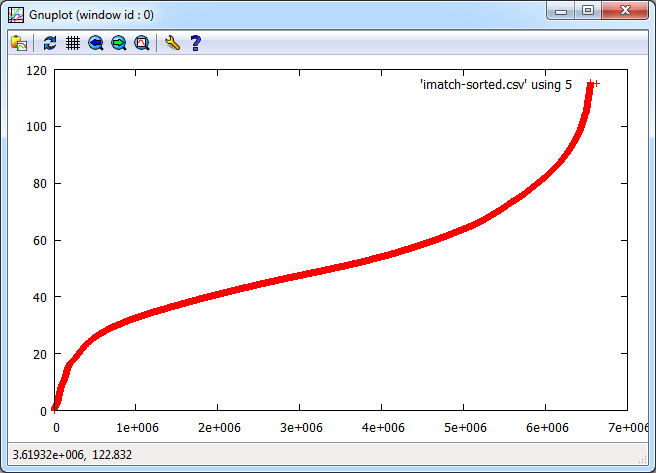
The “S-Curve” that results is interesting as the Y-Axis shows difference with zero being identical and 120 being very different. The X-Axis shows the number of maps that match with the Y-Axis difference or better, so it’s a cumulative plot of similarity. Units for the Y-Axis are RGB intensity, with the X-Axis having no units as it’s a count. There are 2558 maps that match with themselves with zero difference, but up to about 20, there appears to be a linear relationship followed by a turning point and another linear section with reduced gradient until the difference starts to increase rapidly.
Most of this can be explained by the fact that all the maps are of England and so anything in the sea is always going to match on every map regardless. As I explained at the beginning, this is really an exploration of the workflow and methodology, so there are a number of problems with it. The ultimate aim is to show how all the data is related, so similarity, spatial weighted similarity, clustering and comparisons between gridded data, areas and rendered maps all need to be explored.
Richard, really nice work, it’s clear that you’ve figured out a smart way to handle all of the data. Looking forward to the next steps to see what “insight” you might be able to ascertain…I hope you keep posting in this series!