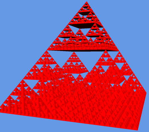
I blame whoever printed out the Sierpinski triangle wikipedia page on Friday, but I’ve always been interested geometry, so I had to have a go at building one. The title of this post is a reference to the fact that this type of procedural geometry is often used in benchmarking 3D graphics systems as it quickly becomes computationally explosive. I’ve been writing geometry classes to create physical networks from graph topologies anyway, so this was easy by comparison.
The movies of depth 4 and 5 pyramids are on YouTube at the following links:
As a sneak preview of what else I’ve been working on, you can see a 3D GIS engine to visualise all the real-time London data that we’ve been collecting. If you look very closely, you can just see the tube network inside the pyramid. The general idea is to make it easy to generate some of the 3D tube and bus movies that I’ve previously used 3DS Max for. What was missing was a geospatial data aware 3D system, which was lacking in 3DS Max or Three.js. I’ve taken the Javascript Three.js visualisations about as far as they will go, so a higher end visualisation system in native C++ using OpenGL was a natural progression.
As an update to the last post, I’ve put the agent script model of the live tube trains on the web. This shows the “nearly” live positions of all tube trains in London.
One warning though, you need to reload the page to refresh the data. I wasn’t planning on releasing this just yet, so it’s still a prototype. The live positions are only loaded on the page load and tubes continue on their paths on the network with forecast positions from that point onwards. The page can be reloaded every THREE MINUTES to get updated position data.
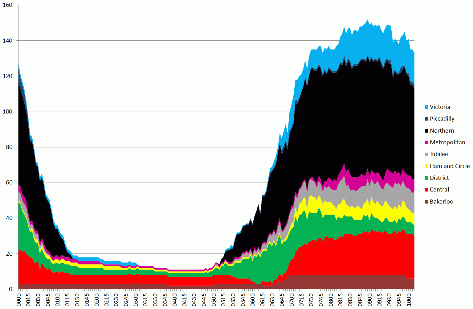
Tubes running up to 10am on 5 February 2014, during the first day of the tube strike
The graph above is a stacked area chart showing the number of tubes running on each of the London Underground lines. The width of the coloured part represents the number of tubes (i.e. 150 is the total number running summed over all lines at the peak around 08:45).
One thing that is apparent is that the Northern line ran a fairly good service. Compare the chart above to a normal day (4th Feb):
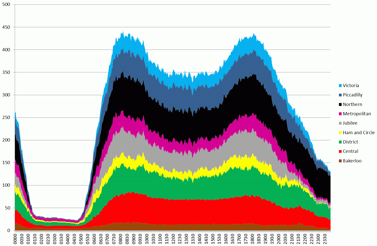
Tubes running between midnight and midnight from 4 to 5th February the day before the strike – note different timescale from previous chart
The second graph shows the variation for a whole day, so the earlier graph corresponds to the first peak on the second graph.
In order to quantify these results, I’ve taken the raw data, which is the number of tubes running during each 3 minute period between 07:00 and 10:00, produced totals, and compared this against the previous day’s data (Tuesday 5th).
Based on an average taken over the whole 7-10am period, 33.57% of the normal service was running. The breakdowns by lines are as follows:
Bakerloo: 48.3%
Central: 34.5%
District: 19.4%
Hammersmith and City and Circle: 32.1%
Jubilee: 19.4%
Metropolitan: 15.0%
Northern: 72.2%
Piccadilly: 2.3%
Victoria: 46.2%
The figure for the Piccadilly line looks much lower than I would expect, so this needs further investigation. It could be an issue with a signal problem as the data here is taken straight from the public “trackernet” API. Also, just because tubes are running doesn’t mean you can actually get on one. At the moment we don’t have any loading figures for stations, but this is something we are working on.
Also, these figures don’t show the whole picture as they miss out the spatial variation. With many stations closed, services actually stopping in central London were greatly reduced.
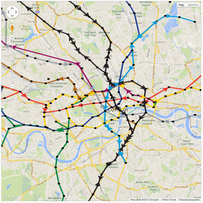
The following is the picture at 9am this morning:
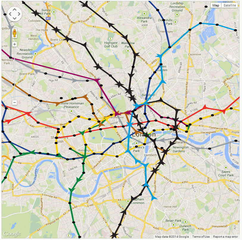
09:00am on 5th February 2014, tubes are shown as arrows pointing in the direction of movement
Although this isn’t the best visualisation, it serves to show that there are some obvious gaps in the service.
Following on from my previous posts on AgentScript and Google Maps, I’ve fixed the performance problem when zooming in and built a model of the London Underground to play with:
An AgentScript model of the London Underground using data for 27 January 2014 at 15:42:00
I’m not going to include the modified code here as it’s grown a bit too long for a blog post, but the aim is to tidy it up and publish it on GitHub as something which other people can use as a library. The zooming in problem with my previous examples occurs because the Canvas used by AgentScript doubles in size each time you zoom in. Google Maps works by using tiles of a fixed size, but AgentScript isn’t designed to use tiles as it uses the vector based drawing methods of the Canvas object. My original idea for fixing the zooming in problem was to include a clip rect on all the Canvas elements which AgentScript adds. This doesn’t work and the only solution seems to be to limit the size of the Canvas to just what is visible on the screen. The new code contains a lot of transformation calculations to change the size of the Canvas as you pan and zoom. When the map is panned you can see the new visible area being drawn when the drag is released (see following YouTube video).
The only drawback of this is that the drawing Canvas for the turtle’s pen can’t be preserved between drag and zoom as it’s being clipped to the visible viewport. You can also see that the station circles aren’t circles as AgentScript is drawing in a Cartesian system which I’m fitting to a Mercator box. These are problems I hope to overcome in a future version.
Now that I’ve got a model of the London Underground in a box, I can start experimenting with it. The code to run the model is as follows:
[code language=”js”]
#######################################################
#AgentScript
#######################################################
u = ABM.util # shortcut for ABM.util
class MyModel extends ABM.Model
#this is a kludge to get the bounds to the model – really need a class to encapsulate this
constructor: (div, size, minX, maxX, minY, maxY, isTorus, hasNeighbors, bounds) ->
@bounds_=bounds
super(div,size,minX,maxX,minY,maxY,isTorus,hasNeighbors)
setup: -> # called by Model constructor
#console.log(@)
#console.log(@gis(52,48))
#@anim.setRate(10) #one frame a second (default is 30)
@lineColours =
B: [0xb0,0x61,0x10]
C: [0xef,0x2e,0x24]
D: [0x00,0x86,0x40]
H: [0xff,0xd2,0x03] #this is yellow!
J: [0x95,0x9c,0xa2]
M: [0x98,0x00,0x5d]
N: [0x23,0x1f,0x20]
P: [0x1c,0x3f,0x95]
V: [0x00,0x9d,0xdc]
W: [0x86,0xce,0xbc]
#lineY colour?
#load tube station data from csv file
xhr = u.xhrLoadFile(‘data/station-codes.csv’,’GET’,’text’,(csv)=>
#there are no quotes in my station list csv file, so parse it the easy way
#jQuery csv or http://code.google.com/p/csv-to-array/ might be better alternatives
lines = csv.split(/\r\n|\r|\n/g)
for line in lines
if line[0]!=’#’
data = line.split(‘,’)
stn = data[0]
lon = data[3]
lat = data[4]
lon=parseFloat(lon)
lat=parseFloat(lat)
if !(isNaN(lat) and isNaN(lon))
pxy = @gisLatLonToPatchXY lat, lon
#ABM.Agent.hatch 1, @nodes
# @x=pxy.patchx
# @y=pxy.patchy
#@nodes.hatch 1
@patches.patchXY(Math.round(pxy.patchx),Math.round(pxy.patchy)).sprout 1, @nodes, (a) =>
a.x=pxy.patchx
a.y=pxy.patchy
a.name=stn
)
#load network graph from json file
xhr2 = u.xhrLoadFile(‘data/tube-network.json’,’GET’,’json’,(json)=>
#it looks like this returns a json object directly
#test = JSON.parse json #newer browers support this, otherwise use var objJSON = eval("(function(){return " + strJSON + ";})()");
#wait for both files (stations+network) to be loaded before making the links between station nodes
u.waitOnFiles(()=>
#console.log("xhr2 wait",@nodes.length)
#json file has [‘B’], [‘C’], [‘D’] etc array at top level for all lines
#each of these contain { ‘0’: zero direction array, ‘1’: one direction array }
#where each array is a list of OD links as follows: { d: "STK", o: "BRX", r: 120 }
#d=destination, o=origin and r=runtime in seconds
for linecode in [ ‘B’, ‘C’, ‘D’, ‘H’, ‘J’, ‘M’, ‘N’, ‘P’, ‘V’, ‘W’ ]
#console.log("line data",json[linecode][‘0’])
for dir in [0, 1]
for v in json[linecode][dir]
agent_o = @nodes.with("o.name==’"+v.o+"’")
agent_d = @nodes.with("o.name==’"+v.d+"’")
@links.create agent_o[0], agent_d[0], (lnk) =>
lnk.lineCode = linecode
lnk.direction = dir
lnk.runlink = v.r
lnk.color = @lineColours[linecode]
#now add a pre-created velocity for this link based on distance and runlink seconds
dx=lnk.end2.x-lnk.end1.x
dy=lnk.end2.y-lnk.end1.y
dist=Math.sqrt(dx*dx+dy*dy)
lnk.velocity = dist/lnk.runlink
#NEW CODE TO LOAD POSITIONS FROM CSV
@loadPositions()
)
)
null # avoid returning "for" results above
loadPositions: ->
#get current positions of tubes from the web service
xhr = u.xhrLoadFile(‘data/trackernet_20140127_154200.csv’,’GET’,’text’,(csv)=>
#set data time here – needed for interpolation
lines = csv.split(/\r\n|\r|\n/g)
for i in [1..lines.length-1]
data = lines[i].split(‘,’)
if data.length==15
#line,trip,set,lat,lon,east,north,timetostation,location,stationcode,stationname,platform,platformdirectioncode,destination,destinationcode
for j in [0..data.length-1]
data[j]=data[j].replace(/\"/g,”) #remove quotes from all columns
lineCode = data[0]
tripcode=data[1]
setcode=data[2]
stationcode = data[9] #.replace(/\"/g,”) #remove quotes
dir = parseInt(data[12])
agent_d = @nodes.with("o.name==’"+stationcode+"’") #destination node station
#find a link with the correct linecode that connects o to d
if (agent_d.length>0)
for l in agent_d[0].myInLinks()
#console.log("l: ",l)
if l.lineCode==lineCode and l.direction==dir
#OK, so l is the link that this tube is on and we just have to position between end1 and end2
#now hatch a new agent driver from this node and place in correct location
#nominally, the link direction is end1 to end2
l.end1.hatch 1, @drivers, (a) => #hatch a driver from a node
a.name=l.lineCode+’_’+tripcode+"_"+setcode #unique name to match up to next data download
a.fromNode = l.end1
a.toNode = l.end2
a.face a.toNode
a.v = l.velocity #use pre-created velocity for this link
a.direction = l.direction
a.lineCode = l.lineCode
a.color=@lineColours[l.lineCode]
)
null
step: ->
for d in @drivers
d.face d.toNode
d.forward Math.min d.v, d.distance d.toNode
if .01 > d.distance d.toNode # or (d.distance d.toNode) < .01
d.fromNode = d.toNode
#choose new node to move towards
#d.toNode = u.oneOf d.toNode.linkNeighbors() #.oneOf()
#console.log(d)
#console.log(d.fromNode.myOutLinks())
#lnks = ABM.AgentSet.asSet(u.oneOf d.fromNode.myOutLinks())
#vlnks = lnks.with("o.line==’V’ && o.direction==1")
#if (vlnks.length>0)
# d.toNode = vlnks.oneOf()
###########################################
#pick a random one of the outlinks from this node
#NOTE: the agent’s myOutLinks code go through all links to find any with from=me i.e. it’s inefficient
#also, you can’t use "with" as it returns an array
lnks = (lnk for lnk in d.fromNode.myOutLinks() when lnk.lineCode==d.lineCode and lnk.direction==d.direction)
#console.log("LINKS: ",lnks)
if (lnks.length>0)
l = lnks[u.randomInt lnks.length]
d.toNode = l.end2
d.v = l.velocity
else
#condition when we’ve got to the end of the line and need to change direction – drop the direction constraint
lnks = (lnk for lnk in d.fromNode.myOutLinks() when lnk.lineCode==d.lineCode)
if (lnks.length>0)
l = lnks[0]
d.direction=l.direction #don’t forget to change the direction – otherwise everybody gets stuck on the last link
d.toNode = l.end2
d.v = l.velocity
else
#should never happen
console.log("ERROR: no end of line choice for driver: ",d)
#d.die ?
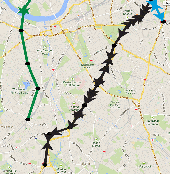
The interesting thing about this is that when you’ve been running the model for a while, you start to notice that the tubes begin to bunch up together:
Snapshot of the London Underground model showing gaps opening up and bunching of trains
Compression waves aren’t supposed to exist in the tube network, but the graphic above clearly shows how a gap has formed in the District line to Wimbledon (green), while the Northern Line to Morden (black) shows three trains travelling south together. It’s more apparent on the YouTube video as you can see how this builds up from the starting condition (27th Jan 2014 15:42), where the tubes are evenly spaced. What I suspect is happening is a function of the network and the random choices that are being made when a train gets to a decision point. The model uses a random number generator (uniform) to make the route choice, so the lines with the most complex branches (e.g. Northern) are showing this problem as a result of the random shuffling of trains. Crucially, the Victoria Line doesn’t exhibit this phenomena as it’s a single piece of straight track.
So, based on the fact that I suspect this is a fault of the model, why would it be of interest in the real tube network? If the route decisions were made correctly based on service frequency and not a highly suspect but supposed to be uniform Javascript random number generator, then you would still see a form of this effect in real life. It must happen just because you can’t guarantee when a train from a connecting branch will join behind another one. The spacings are so close that any longer than average wait at a station will cause problems behind. Line controllers limit this problem by asking trains to wait at stations to maintain the spacing. This is completely missing from the model, which has no feedback of this kind, and so we see the network diverging. The key point is that we can measure how much intervention is required to keep the network in its ideal state, which is where the archives of real life running data come into play. By looking at data from the real network it should be possible to see where these sorts of interventions are being made and compare it to our model. It’s not difficult to add wait times at stations to simulate loading in the rush hour.
Maybe I’ve been staring at agent based models running on Google Maps for too long, but it does look as though the map is infested with bugs which are crawling all over it. Have a look at the animation below:
Bugs on a Google Map
This is a Talisman deliverable, which we’ve called “ModelTube”, as the general idea is to be able to run models on MapTube maps in a similar way to how the Modelling 4 All site works with Java Applets. The concept of a framework for “programmable maps” is an interesting one as it allows us to integrate code for calculating real-time positions of tubes, buses and trains based on their last known position, with all the animation happening on the browser. Essentially, what we’re doing here is running Logo on a map to create a visualisation of the data in space and time. The next step is to include some of our city diagnostics about expected frequency of transport services to highlight were problems are occurring, but it’s also possible to couple that with an additional layer of intelligence about the people using the services to predict where the biggest problems are likely to be in the next few minutes (now-casting for cities).
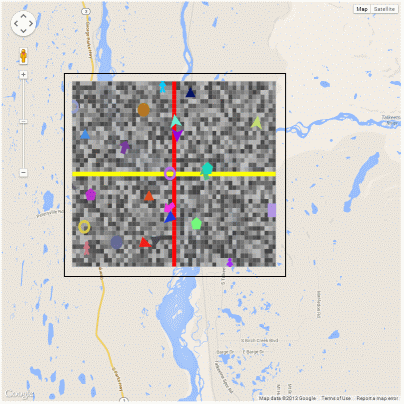
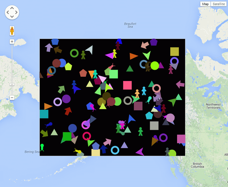
As this is a follow up to my last post about running agent based models on Google Maps using AgentScript, I’m only going to highlight the changes needed to give the agents a geographic context. I’ve sorted out the scaling and position of the canvas that defines the agent world, so they now run inside a lat/lon box that I can define with the zoom in and out functioning correctly. The solid black outline in the animation above is a frame that I’ve added 16 pixels outside of the agent box so that I can verify that it is in the correct position. The lighter grey frame is the edge of the agent canvas which corresponds to my lat/lon bounding box.
In the map above, I’ve removed the patches and made the agent canvas transparent so you can see the map underneath. With the patches turned back on it looks like this:
Patches (grey) and agents (coloured) with the crosshairs showing the origin
The only problem with this technique is that the agent based model runs in its own agent space, which is then mapped to a lat/lon box on the map, which the Google Maps API then reprojects into Mercator. This is the same situation as the GIS extension for NetLogo, where the model runs in its own coordinate space and you define a transform which is used when importing geographic data from shapefiles. The consequence of this is that the model is really running in a Mercator coordinate system, but, given that models tend to model small-scale phenomena, this might not be such a big issue.
For completeness, here are the changes I’ve made to the code to create a Google Maps overlay containing the AgentScript model (coffeescript):
[code language=”javascript”]
class AgentOverlay extends google.maps.OverlayView
constructor: (@id_, @bounds_, @map_) ->
console.log("Building AgentOverlay called ‘"+@id_+"’")
@div_=null
@setMap(@map_)
onAdd: () ->
#console.log("add")
div = document.createElement(‘div’)
div.id=@id_ #+’_outer’
div.style.borderStyle=’none’
div.style.borderWidth=’0px’
div.style.position=’absolute’
div.style.backgroundColor=’#f00′
@div_=div
panes = this.getPanes()
panes.overlayLayer.appendChild(@div_)
#now that the div (s) have been created we can create the model
# div, size, minX, maxX, minY, maxY, torus=true, neighbors=true
#NOTE: canvas pixels = size*(maxX-minX), size*(maxY-minY)
#where size is the patch size in pixels (w and h) and min/max/X/Y are in patch coordinates
@model_ = new MyModel "layers", 5, -25, 25, -20, 20, true
@model_.debug() # Debug: Put Model vars in global name space
@model_.start() # Run model immediately after startup initialization
draw: () ->
#console.log("draw")
overlayProjection = @getProjection()
sw = overlayProjection.fromLatLngToDivPixel(@bounds_.getSouthWest())
ne = overlayProjection.fromLatLngToDivPixel(@bounds_.getNorthEast())
geoPxWidth = ne.x-sw.x #width of map canvas
geoPxHeight = sw.y-ne.y #height of map canvas
div = @div_
div.style.left = sw.x+’px’
div.style.top = ne.y+’px’
div.style.width = geoPxWidth+’px’
div.style.height = geoPxHeight+’px’
#go through each context (canvas2d or image element) and change its size, scaling and translation
for name, ctx of ABM.contexts #each context is a layer i.e. patches, image, drawing, links, agents, spotlight (ABM.patches, ABM.agents, ABM.links)
#console.log(name)
if ctx.canvas
ctx.canvas.width=geoPxWidth
ctx.canvas.height=geoPxHeight
#Drawing on the canvas is in patch coordinates, world.size is the size of the patch i.e. 5 in new MyModel "layers", 5, -25, 25, -20, 20
#Patch coordinates are from the centre of the patch.
#The scaling would normally be so that 1 agent coord equals the patch width (i.e. 5 pixels or world.size).
#We need to make the agent world fit the geoPxWidth|Height, so take the normal scaling (world.size) and multiply by geowidth/world.pxWidth to
#obtain a new scaling in patch coords that fits the map canvas correctly.
ctx.scale geoPxWidth/@model_.world.pxWidth*@model_.world.size, -geoPxHeight/@model_.world.pxHeight*@model_.world.size
#The translation is the same as before with minXcor=minX-0.5 (similarly for Y) and minX=-25 in new MyModel "layers", 5, -25, 25, -20, 20
#Code for this can be found in agentscript.coffee, in the setWorld and setCtxTransform functions
ctx.translate -@model_.world.minXcor, -@model_.world.maxYcor
#@model_.draw(ctx) #you need to force a redraw of the layer, otherwise it isn’t displayed (MOVED TO END)
else
#it’s an image element, so just resize it
ctx.width=geoPxWidth
ctx.height=geoPxHeight
ABM.model.draw(true) #forces a redraw of all layers
#u.clearCtx(ctx) to make the context transparent?
#u.clearCtx(ABM.contexts.patches)
onRemove: () ->
#console.log("remove")
@div_.parentNode.removeChild(@div_)
@div_=null
[/code]
All that’s left now is to wrap all this up into a library and publish it. And maybe do something useful with it?
It can’t have escaped most people’s attention that the recent release of Internet Explorer 11 contains support for WebGL (IE11 Dev Center). Now that advanced 3D graphics are becoming possible on all platforms, visualisations like the Realtime 3D Tube Trains that I posted about a while ago are likely to become mainstream.
On a similar theme, I’ve been looking at the open source AgentScript library which is a port of the popular NetLogo agent based modelling library to CoffeeScript and Javascript. CoffeeScript is a library to make writing Javascript easier, but my aim was to see whether it could be made to work with Google Maps to build dynamic maps with geospatial agent based models running on them. Going back to the 3D tube trains example, this could allow us to build a model which used realtime data from the TfL API to get the actual positions of trains, then run a “what if” scenario if a tube line failed to try and predict where the biggest problems are likely to occur. In short, the idea is to allow code to be run on maps to make them dynamic (see: http://m.modelling4all.org/ for another website which allows users to publish models).
AgentScript (in CoffeeScript) running on a Google Map. If you haven’t see the example, the multi-coloured agent shapes move around randomly.
The example shown above was the result of just a few hours work. It’s actually the “sketches/simple.html” example from the GitHub repository, but I’ve taken out the patches.
The code to achieve this is basically a modification of the standard Google Maps code to convert it to CoffeeScript, which then allows for the integration with AgentScript. The code is shown below:
While this demonstrates the idea of adding an AgentScript Canvas element to a Google Maps overlay, there are still issues with getting the canvas box in the correct position on the map (at the moment it stays in the same position when you zoom out, but the scrolling works). Also, the agents themselves are moving on a flat surface, while the four corners of the box are specified in WGS84 and reprojected to Spherical Mercator by the Google Maps library, so there is a coordinate system issue with the agents’ movement. Despite these issues, it still makes for an interesting proof of concept of what could be possible.
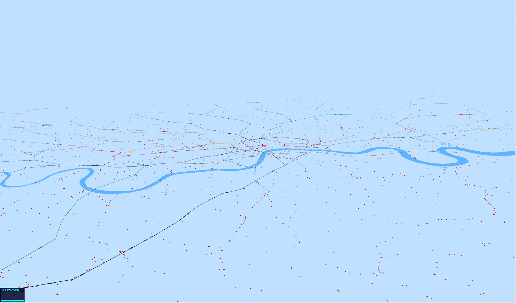
The image above shows the latest attempt at producing a real-time moving visualisation of the whole of London’s transport system. The tube lines are visible with the darker areas showing the locations of the actual tube trains. These are really too small to see at this resolution as I’ve zoomed out to show all the tiny red dots, which are the buses. Both the tubes and the buses are now animated as can be seen in the following YouTube clip:
As a rough guide to performance, there are approximately 450 tubes and 7,000 buses being animated at around 19 frames per second on an i7 with a Radeon 6900M graphics card (27 inch iMac).
The first thing that most people are going to notice is that not all the buses are actually moving. The reason for this is quite interesting as I’ve had to use different methods of animating the tube and bus agents to get the performance. The other thing that’s not quite right is that the buses move in straight lines between stops, not along the road network. This is particularly noticeable for the ones going over bridges.
The tubes are all individual “Object3D” objects in three.js and animate using a network graph of the whole tube network. This works well for the tubes as there are comparatively few of them, so, when the data says “one minute to next station” and we’ve been animating for over a minute, then we can work out what the next stop on its route is and generate a new animation record for the next station along. When there are 7,000 buses and 21,000 bus stops, though, the complete bus network is an order of magnitude more complicated than the tube. For this reason, I’m not using a network graph, but holding the bus position when it gets to the next stop on the route as I can’t calculate the next bus stop without holding the entire 21,000 vertex network in memory. While this would probably work, it seems to make more sense to push the more complicated calculations over to the server side and only hold the animation data on the WebGL client. Including the road network is also another level of complexity, so it would make a lot of sense to include this in the server side code, so the client effectively gets sent a list of waypoints to use for the animation.
Finally, I have to concede that this isn’t terribly useful as a visualisation. It’s not until delays and problems are included in the visualisation that it starts to become interesting.
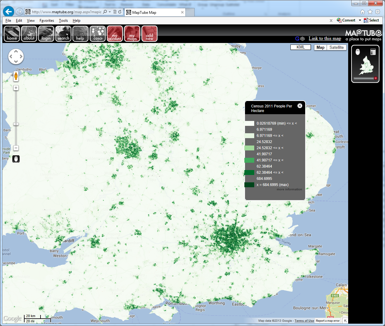
The Census 2011 boundary files for the OA, LSOA and MSOA geographies have just been added to the MapTube tile server, so it’s now possible to make maps from the new Census data. The following is the first example using the population density table:
MapTube showing population density (people per hectare) from the 2011 Census at LSOA level.
The data was uploaded as a CSV file from the NOMIS r2.2 bulk download. As long as there is a CSV file containing a header row, plus a recognisable column containing an area key, MapTube should be able to work out what the file contains and build the map automatically.
Now that the new boundary files are on the live server, it is possible to upload the entire Census release as an automatic process using the DataStore handling code mentioned in previous posts. While this might seem like a good idea, from previous experience, quality is more important than quantity. Using the DataStore mining process to find interesting and unusual data and uploading that instead would seem like the better option.
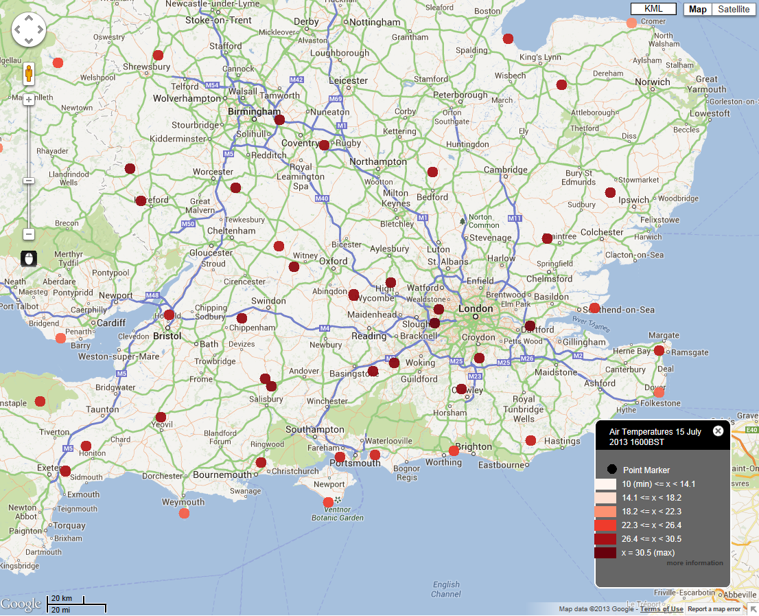
What isn’t immediately apparent is that the temperature in London was around 30C from mid-morning until the evening and the sustained temperatures caused a lot of problems with the transport system. I would like to be able to see the urban heat island effect, but there are no temperature measurements inside London itself and we’re having to use Heathrow as the nearest. I hope to remedy this situation using a GTS decoder fairly soon, but for now we’re missing London City airport and London weather centre.
Going back to the transport data, the problems outside Waterloo where a rail buckled in the heat, causing the closure of 4 platforms and creating travel chaos for the evening commute were well publicised in the media. The rail data looks something like this:
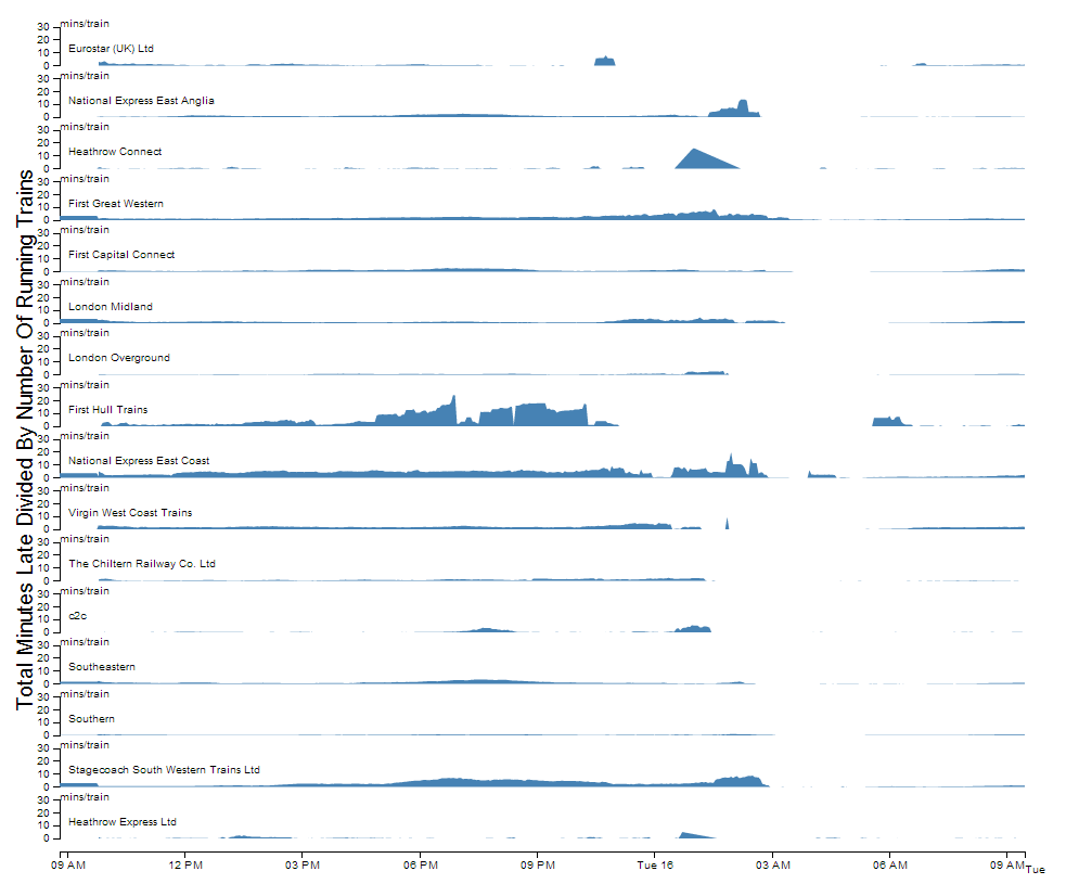
Average late minutes per train, plotted for all train operating companies for 15th (9am) to 16th (9am) July 2013.
The problems for SW Trains from 6PM onwards can clearly be seen, but, looking at the other train operating companies, this does not seem like an isolated problem. Southeastern and C2C appear to have issues round about the same time, while East Coast and First Hull Trains have on-going problems.
The key issue here is how to link data of this kind to what is actually happening in the real world, as a small change in our figure here doesn’t adequately convey the complete chaos that is caused. Timing is crucial, so we need to include expected demand on the service, along with spatial data showing where problems are located and what they are affecting. In this situation, the closure of platforms 1 to 4 caused major problems to the loop services which start and finish at Waterloo. Temperature is the root cause and, as a number of operators are affected, there must be a relationship between probability of failure and temperature which we can try and determine from our archive of running data. Unfortunately, we only have a single year of data, but there is enough quantity of data to make for an interesting investigation.
Going back to the weather data, we really need to be able to track these types of events in real time. Bringing in weather underground data might fill some of the data holes in the centre of London, if we can overcome the accuracy problems, but there are satellite instruments that we could use as well. I’ve always wanted to be able to plot the position of the jet stream on a map, using the upper air data (PILOTs and TEMPs). Hopefully, using the Met Office’s Datapoint data, weather underground and the data on the GTS feed, we should be able to integrate everything together to give us a clue as to the bigger picture.
I’ve been working on the infrastructure to deliver real time data to a web page running WebGL for a while. The results below show locations of all tube trains in London as reported by the TfL Trackernet API.
3D visualisation of London tube trains using the Trackernet API at 14:20 on Monday 24 June 2013
The following link shows a movie which shows the trains moving:
The average time taken for a tube to go between two stations on the London Underground is about 2 minutes, but it’s still surprising to see how slowly they move at this scale.
The map shows the Thames and a 300 metre square block of buildings taken from the OS Open Data release. I’ve randomised the building heights rather than joining with the Lidar data for now, but it gives an impression of the level of data that can be represented using WebGL. Both of these datasets originated as shapefiles in OSGB36, which I reprojected into Cartesian ECEF coordinates. A certain amount of geometry conditioning is necessary to remove degenerates and tidy up holes in polygons before the geometry is correct for three.js to handle. I used a workflow of Java and Geotools to reproject and save a Collada file, which I then loaded into 3DS Max to clean and texture before exporting the final version which you see on the web page. I also experimented with GeoJSON, but Collada worked much better for the 3D nature of the data.
The coloured lines of the tube network are another Collada file, built from a network graph with straight lines between stations. This is actually 3D, using the station platform heights that TfL released, but as there is only a 100 metre variation across the whole tube network the heights aren’t really visible at this resolution. In order to make the trains move, I have a web service that returns a CSV file containing tube locations, direction of motion and time to next station. This is the point where I have to admit that the locations aren’t true real time, as I can only get position updates from the Trackernet API every 3 minutes. This means that there needs to be Javascript code on the page to query the latest position update and continue moving the trains towards their next stations according to their expected arrival times until the next data update is available. This requires something similar to an agent based model to animate the tube agents using the latest data and a network graph structure describing the tube network. The network file is in JSON format with runlinks in minutes between adjacent stations, taken from the official TfL TransXChange data. Without this it wouldn’t be possible to move the tubes along the track at the right speed in the right direction.
That’s the situation for 700 tube trains, but 10,000 buses is a completely different matter. Tests with the Countdown data show that the frame rate drops significantly with 10,000 agents, so level of detail looks like the key here. Also, one potentially interesting twist is that TfL’s Countdown system for buses has a message passing structure, so is potentially closer to true real time than the tubes.
Finally, it really needs a better rendering system as it could look visually so much better, but what you see is the limit of my artistic talent.