Virtual Globes

It’s been very quiet over Easter and I’ve been meaning to look at 3D visualisation of geographic data for a while. The aim is to build a framework for visualising all the real-time data we have for London without using Google Earth, Bing Maps or World Wind. The reason for doing this is to build a custom visualisation that highlights the data rather than being overwhelmed by the textures and form of the city as in Google Earth. Basically, to see how easy it is to build a data visualisation framework.

After quite a bit of experimentation, the results are shown below:

VirtualGlobe

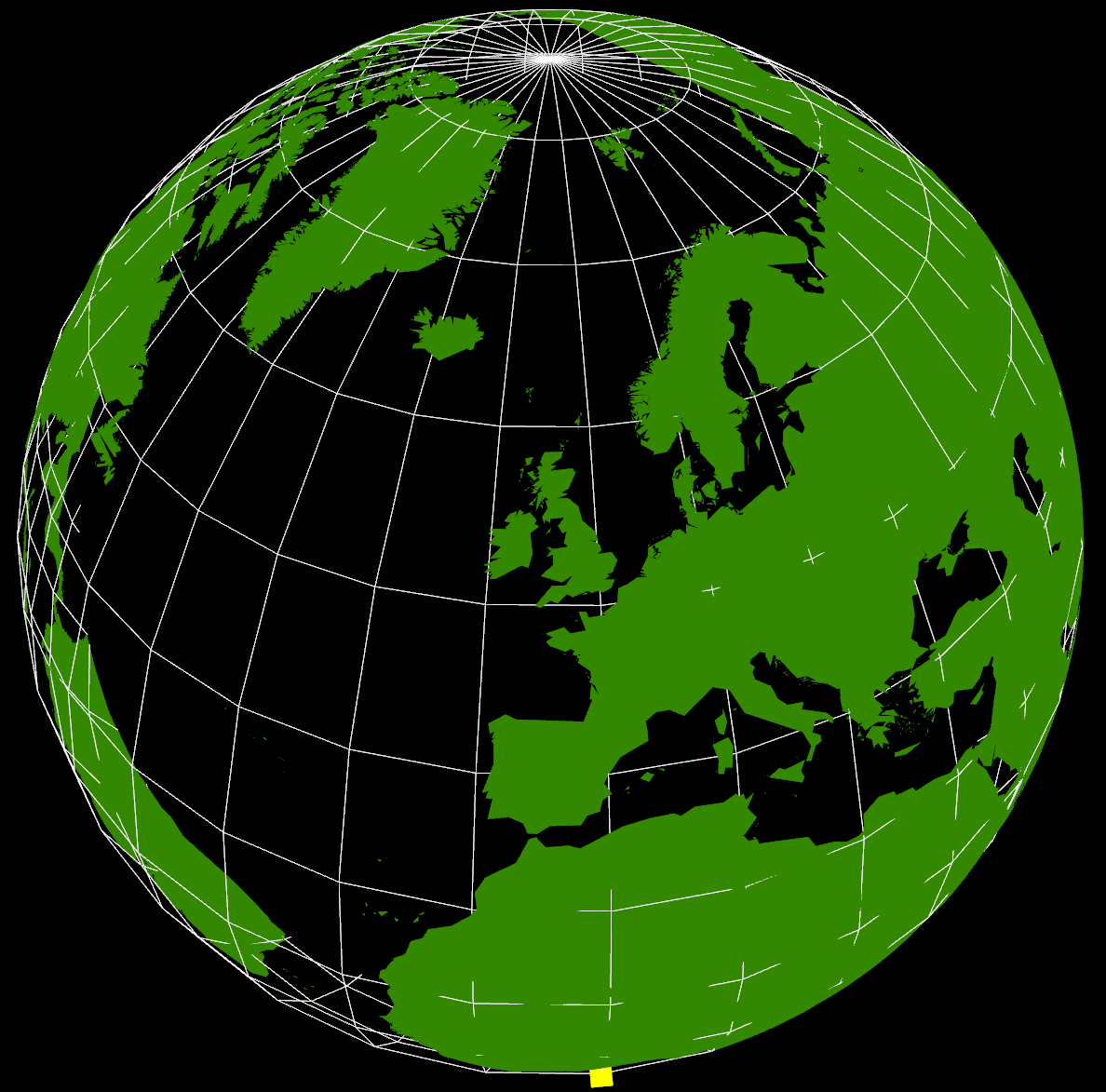
The yellow cube at the extreme southern point is marking (0,0) (lat,lon) as a reference. It’s also possible to see right through the Earth as I haven’t put any water in yet, but that’s not immediately apparent in this screenshot. The globe can be rotated and zoomed using the mouse, so it’s possible to see an area in more detail.

The way this has been constructed is as a WebGL application using THREE.JS running in Chrome. Originally, I started looking at using WebGL directly as I wanted to be able to create custom shaders, but in the end decided that programming at the higher level of abstraction using THREE.JS and a scene graph was going to be a lot faster to develop.

Where I got stuck was with the countries of the World geometry, and what you see in the graphic above still isn’t correct. I’ve seen a lot of 3D visualisations where the geometry sits on a flat plane, and this is how the 3D tubes visualisation that I did for the XBox last year worked. Having got into lots of problems with spatial data not lining up, I knew that the only real way of doing this type of visualisation is to use a spherical model. Incidentally, the Earth that I’m using is a sphere using the WGS84 semi-major axis, rather than the more accurate spheroid. This is the normal practice with data at this scale as the error is too small to notice.

The geometry is loaded from a GeoJSON file (converted from a shapefile) with coordinates in WGS84. I then had to write a GeoJSON loader which builds up the polygons from their outer and inner boundaries as stored in the geometry file. Using the THREE.JS ‘Shape’ object I’m able to construct a 2D shape which is then extruded upwards and converted from the spherical lat/lon coordinates into Cartesian 3D coordinates (ECEF with custom axes to match OpenGL) which form the Earth shown above. This part is wrong as I don’t think that THREE.JS is constructing the complex polygons correctly and I’ve had to remove all the inner holes for this to display correctly. The problem seems to be overlapping edges which are created as part of the tessellation process, so this needs more investigation.

What is interesting about this exercise is the relationship between 3D computer graphics and geographic data. If we want to be able to handle geographic data easily, for example loading GeoJSON files, then we need to be able to tessellate and condition geometry on the fly in the browser. This is required because the geometry specifications for geographic data all use one outer boundary and zero or more inner boundaries to represent shapes. In 3D graphics, this needs to be converted to triangles, edges and faces, which is what the tessellation process does. In something like Google Earth, this has been pre-computed and the system loads conditioned 3D geometry directly. I’m still not clear which approach to take, but it’s essential to get this right to make it easy to fit all our data together. I don’t want to end up in the situation with the 3D Tubes where it was written like a computer game with artwork from different sources that didn’t line up properly.

The real reason for building this system is shown below:

VirtualGlobe2

VirtualGlobe3

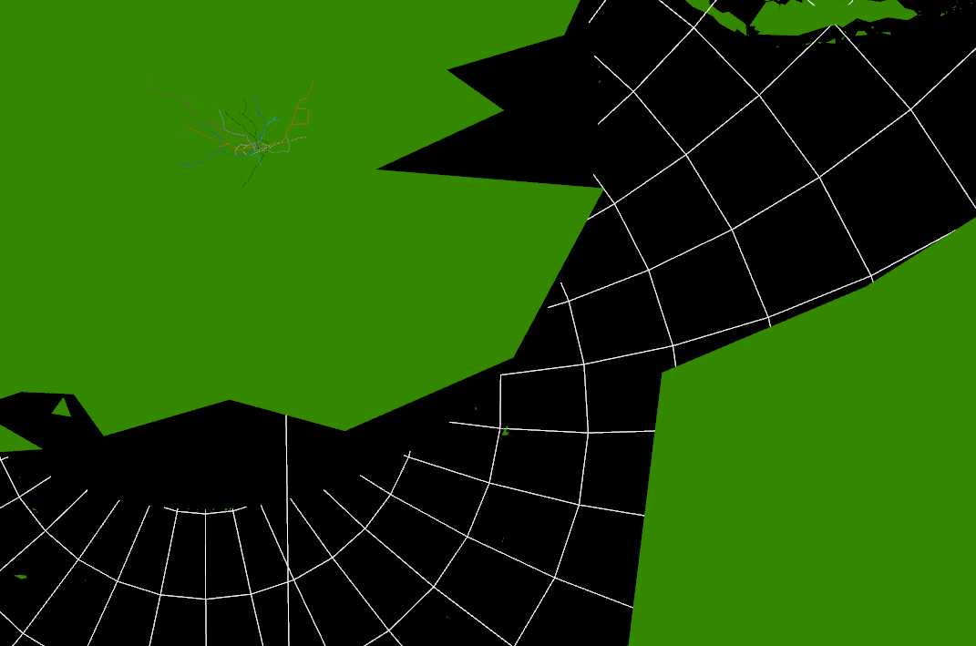
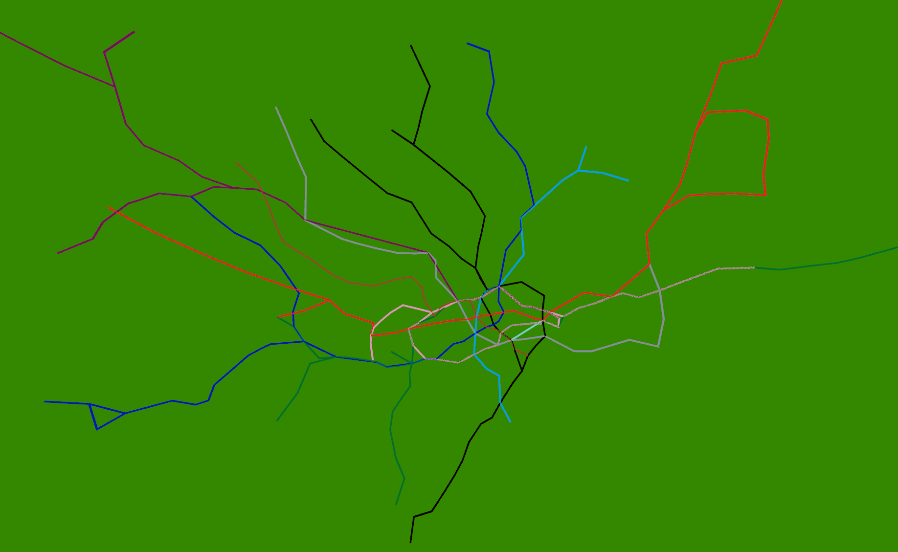
Strangely enough, adding the 3D tube lines with real-time tubes, buses and trains is easy once the coordinate systems are worked out. The services to provide this information already exist, so it’s just a case of pulling in what is relatively simple geometry. The road network and buildings are available from the OS Free data release, so, with the addition of Lidar data, we could build another (real-time) Virtual London model.

Just for the record, it took about 4 days to get this working using the following tools: Visual Studio 2010 C# and C++, Autodesk 3DS Max 2012 and the FBX exporter, Python 2.6, NetBeans Java and Geotools 8, Quantum GIS, Chrome Developer Tools

Cities as Operating Systems


The idea of cities mirroring computer operating systems has been around for a while (see: http://teamhelsinki.blogspot.co.uk/2007/03/city-as-operating-system.html ), but recent events have made me wonder whether this might be about to become more important. Cities are systems in exactly the same way that complex computer systems are, although how cities function is a black box. Despite that difference, computer systems are now so big and complex that understanding how the whole system works is incomprehensible and we rely on monitoring, which is how we come back to the city systems. Recently, we had a hardware failure on a virtual machine host, but in this case I happened to be looking at the Trackernet real-time display of the number of tubes in London.  This alerted me to the fact that something was wrong, so I then switched to the virtual machine monitoring console and diagnosed the failure. We were actually out of the office at the time, so the publicly accessible tube display was easier to access than the locked down secure console for the hardware. The parallels between the real-time monitoring of a server cluster and real-time monitoring of a city system are impossible to ignore. Consider the screenshot below:

trackernet_20130323


Screenshot from an iPad showing a stream graph of the number of tubes running in London on Friday 22nd and Saturday 23rd March 2013.

We could very easily be looking at CPU load, disk or network bandwidth for a server, but it happens to be the number of tubes running on the London Underground. Points 1 and 2 show a problem on the tube network around 3PM on Friday. It’s not very easy to tell from this visualisation, but the problem is on the Piccadilly line and then the Jubilee line. However, the purpose of this display is to alert the user to any problems which they can then diagnose further. Point 3 is not so easy to detect, but the straight lines suggest missing data. Going back to the original files, everything appears normal and all data is being logged, so this could be an API or other network failure that rectified itself. Point 4 is similar, but this can be explained as a Saturday morning outage for maintenance to prevent the problem that we saw on Wednesday happening again.

It is this symbiotic relationship between the real-time monitoring of city systems and computer systems that is really interesting. We are logging a lot more data than is shown on this graph, so the key is to work out what factors we need to be looking at to understand what is really happening. Add a spatial element to this and the system suddenly becomes a whole lot more complicated.

To finish off with, here is view of the rail network at 12pm on 25 March 2013 (another snow day in the North of the country). The similarity between this view and and a seismograph is apparent, but what is being plotted is average minutes late per train. The result is very similar to a CPU or disk activity graph on a server, but minute by minute we’re watching trains running.

NetworkRail_20130325

Links

http://teamhelsinki.blogspot.co.uk/2007/03/city-as-operating-system.html

http://www.smartplanet.com/blog/smart-takes/london-tests-out-smart-city-operating-system/26266


Lots and Lots of Census Maps (part 2)

My last post on the Census Maps got as far as running a simple comparison of every combination of every possible map at LSOA level to obtain a similarity metric. There are 2,558 possible variables that can be mapped, so my dataset contains 6,543,364 lines. I’ve used the graph from the last post to set a cut off of 20 (in RGB units) to select only the closest matches. As the metric I’m using is distance in RGB space, it’s actually a dissimilarity metric, so 0 to 20 gives me about 4.5% of the top matches, resulting in 295,882 lines. Using an additional piece of code I can link this data back to the plain text description of the table and field so I can start to analyse it.

The first thing I noticed in the data is that all my rows are in pairs. A matches with B in the same way that B matches with A and I forgot that the results matrix only needs to be triangular, so I’ve got twice as much data as I actually needed. The second thing I noticed was that most of the data relates to Ethnic Group, Language and Country of Birth or Nationality. The top of my data looks like the following:

0.1336189 QS211EW0094 QS211EW0148 (Ethnic Group (detailed)) Mixed/multiple ethnic group: Israeli AND (Ethnic Group (detailed)) Asian/Asian British: Italian
0.1546012 QS211EW0178 QS211EW0204 (Ethnic Group (detailed)) Black/African/Caribbean/Black British: Black European AND (Ethnic Group (detailed)) Other ethnic group: Australian/New Zealander
0.1546012 QS211EW0204 QS211EW0178 (Ethnic Group (detailed)) Other ethnic group: Australian/New Zealander AND (Ethnic Group (detailed)) Black/African/Caribbean/Black British: Black European
0.1710527 QS211EW0050 QS211EW0030 (Ethnic Group (detailed)) White: Somalilander AND (Ethnic Group (detailed)) White: Kashmiri
0.1883012 QS203EW0073 QS211EW0113 (Country of Birth (detailed)) Antarctica and Oceania: Antarctica AND (Ethnic Group (detailed)) Mixed/multiple ethnic group: Peruvian
0.1883012 QS211EW0113 QS203EW0073 (Ethnic Group (detailed)) Mixed/multiple ethnic group: Peruvian AND (Country of Birth (detailed)) Antarctica and Oceania: Antarctica
0.1889113 QS211EW0170 QS211EW0242 (Ethnic Group (detailed)) Asian/Asian British: Turkish Cypriot AND (Ethnic Group (detailed)) Other ethnic group: Punjabi
0.1925942 QS211EW0133 KS201EW0011 (Ethnic Group (detailed)) Asian/Asian British: Pakistani or British Pakistani AND (Ethnic Group) Asian/Asian British: Pakistani

The data has had the leading diagonal removed so there are no matches between datasets and themselves. The columns show match value (0.133), first column code (QS211EW0094), second column code (QS211EW0148) and finally the plain text description. This takes the form of the Census Table in brackets (Ethnic Group (Detailed)), the column description (Mixed/multiple ethnic group: Israeli), then “AND” followed by the same format for the second table and field being matched against.

It probably makes sense that the highest matches are ethnicity, country of birth, religion and language as there is a definite causal relationship between all these things. The data also picks out groupings between pairs of ethnic groups and nationalities who tend to reside in the same areas. Some of these are surprising, so there must be a case for extracting all the nationality links and producing a graph visualisation of the relationships.

There are also some obvious problems with the data which you can see by looking at the last line of the table above: British Pakistani matches with British Pakistani. No surprise there, but it does highlight the fact that there are a lot of overlaps between columns in different data tables containing identical, or very similar data. At the moment I’m not sure how to remove this, but it needs some kind of equivalence lookup. This also occurs at least once on every table as there is always a total count column that matches with population density:

0.2201077 QS101EW0001 KS202EW0021 (Residence Type) All categories: Residence type AND (National Identity) All categories: National identity British

These two columns are just the total counts for the QS101 and KS202 tables, so they’re both maps of population. Heuristic number one is: remove anything containing “All categories” in both descriptions.

On the basis of this, it’s probably worth looking at the mid-range data rather than the exact matches as this is where it starts to get interesting:

10.82747 KS605EW0020 KS401EW0008 (Industry) A Agriculture, forestry and fishing AND (Dwellings, Household Spaces and Accomodation Type) Whole house or bungalow: Detached
10.8299 QS203EW0078 QS402EW0012 (Country of Birth (detailed)) Other AND (Accomodation Type – Households) Shared dwelling

To sum up, there is a lot more of this data than I was expecting, and my method of matching is rather naive. The next iteration of the data processing is going to have to work a lot harder to remove more of the trivial matches between two sets of data that are the same thing. I also want to see some maps so I can explore the data.


Lots and Lots of Census Maps

I noticed recently that the NOMIS site has a page with a bulk upload of  the latest release of the 2011 Census Data: http://www.nomisweb.co.uk/census/2011/bulk/r2_2

As one of the Talisman aims is to be able to able to handle data in datastores seamlessly, I modified the code that we used to mine the London Datastore and applied the same techniques to the latest Census data. The first step is to automatically create every possible map from every variable in every dataset, which required me uploading the new 2011 Census Boundary files to our server. This then allows the MapTubeD tile server to build maps directly from the CSV files on the NOMIS site. Unfortunately, this isn’t completely straightforward as I had to build some additional staging code to download the OA zip file, then split the main file up into MSOA, LSOA and OA files as all the data is contained in a single file.

The next problem was that running a Jenks stratification on 180,000 records at OA level is computationally intensive, as is building the resulting map. The Jenks breaks can be changed to Quantiles which are O(n) as opposed to O(n^2), but in order to build this many maps in a reasonable time I dropped the geographic data down to LSOA level. This is probably a better option for visualisation anyway and only has 35,000 areas.

The resulting maps look similar to the following:

image_102_5image_5_12


I’m deliberately not saying what these maps show at the moment and you can’t tell from the numbers as that’s part of the debugging code telling me how long they took to render. As there are 2,558 of these maps possible from the data, knowing that this can be done in a reasonable amount of time and that I can leave it running overnight is quite important. My quick calculation based on a 27″ iMac doing about 4 Mips seems to work out about right.

The two maps above show an interesting spatial variation, so the next step was to use a spatial similarity metric on every combination of two maps to generate a correlation matrix containing 2,558 x 2,558 cells. Not knowing whether this was going to work and also being worried about the size of the data that I’m working with, I decided to use a simple RGB difference squared function. The maps are rendered to thumbnails which are 256 x 256 pixels, so the total number of operations to calculate this is going to be (2558*2558)/2 * 65536/4 MIPS, or about 15 hours times however long a single RGB comparison takes.

The result of running this over night is a file containing 6,543,364 correlation scores. What I wanted to do first was to plot this as a distribution of correlation scores to see if I could come up with a sensible similarity threshold. I could derive a statistically significant break threshold theoretically, but I really wanted to look at what was in the data as this could show up any problems in the methodology.

The aim was to plot a cumulative frequency distribution, so I need a workflow that can clean the data and sort 6 million values, then plot the data. There were some nightmare issues with line endings that required the initial clean process to remove them, using “egrep -v “^$” original.csv > cleaned.csv”. My initial thoughts were to use Powershell to do the clean and sort, but it doesn’t scale to the sizes of data that I’m working with. The script to do the whole operation is really easy to code in the integrated environment, but was taking far too long to run. This meant a switch to a program I found on Google Code called “CSVFix“. The operation is really simple using the command line:

csvfix sort -f 5:AN imatch.csv > imatch-sorted.csv

This sorts column 5 ascending (A) using a numeric (N) match and doesn’t take a huge amount of time. The final step is to plot the data and see what I’ve got. This was done using GNUPlot as the data is too big to load into Excel or Matlab. In fact, the only binaries available for GNUPlot are x86, so I was worried I was going to have to build an x64 version to handle the data, but this turned out to be unnecessary. The following commands plot the data:

set datafile separator “,”

plot ‘imatch-sorted.csv’ using 5

And the final graph looks like this:

SCurve

The “S-Curve” that results is interesting as the Y-Axis shows difference with zero being identical and 120 being very different. The X-Axis shows the number of maps that match with the Y-Axis difference or better, so it’s a cumulative plot of similarity. Units for the Y-Axis are RGB intensity, with the X-Axis having no units as it’s a count. There are 2558 maps that match with themselves with zero difference, but up to about 20, there appears to be a linear relationship followed by a turning point and another linear section with reduced gradient until the difference starts to increase rapidly.

Most of this can be explained by the fact that all the maps are of England and so anything in the sea is always going to match on every map regardless. As I explained at the beginning, this is really an exploration of the workflow and methodology, so there are a number of problems with it. The ultimate aim is to show how all the data is related, so similarity, spatial weighted similarity, clustering and comparisons between gridded data, areas and rendered maps all need to be explored.


Mark 1 Spider Bee

Following on from the Hex Bug Spiders that we were running at Leeds City Museum, I have modified our third spider to use an XBee module for wireless control via a laptop using the 802.15.4 protocol for mesh networks. This gives me a two way channel to the spider, so we can now add sensors to it, or even a camera module.

DSC01681_small

The following clips show the spider walking (turn the sound on to really appreciate these):

Construction details will follow in a later post, but the way this has been constructed is to take a regular Hex Bug spider and remove the carapace containing the battery cover and battery box. The three securing screws are then used to mount some prototyping board onto the body of the hex bug. Two of these white plastic bits can be seen in the picture attaching the board to the green plastic case. The first board contains a Lithium Ion camera battery (3.7v 950mAH). On top of that is a thin black plastic rectangle secured using four 2mm bolts at the corners of the battery board. Onto this is mounted two further prototype boards containing the H-Bridge driver (lower) and XBee board (upper). The upper board has a further daughter board attached to take the XBee module which sits at the very top along with the red and green LEDs. The blinking red LED shows that the network is connected while the green LED indicates received packets. The main reason for having the XBee plugged in to this adapter is to convert the 2mm spacing pins of the XBee to the 0.1 inch holes of the prototype board. The XBee adapter is actually plugged in to a chip holder that is mounted on the top board. Ideally I would have re-used the motor driver electronics of the existing Hex Bug controller, but it turned out to be too fiddly to modify, so it was easier just to construct new circuitry. This is only a prototype, but using a double-sided PCB it would be quite easy to mount everything onto a single board that would sit neatly above the battery.

In terms of software, the controller is built using Java and the XBee API that can be downloaded from Google Code: http://code.google.com/p/xbee-api/

The coordinator XBee connects to the laptop via a USB cable and is plugged in to an XBee serial adapter. This runs in API mode (escaped) while the router XBee on the spider is in AT mode. Both use the Series 2 firmware with the coordinator sending commands to the spider using Remote AT command packets (which are only available in API mode).

Now that this is running, we have the potential to run more than two spiders at once so we can build a more complex agent simulation. With the code all using Java, there is the potential to link this to NetLogo, but the missing link is the vision software which I’m still working on.

D3 Graph Problems

My last post on the delays caused by the snow contained a comment about a bug in the D3 library. Not wanting to just leave this, I’ve done some more testing with the latest D3 code. As can be seen from the graph below, something corrupts the x coordinate in the SVG path:

BusCounts_Broken


On further inspection, the horizontal lines are caused by the following anomaly in the SVG path element:

<path d=”M890,69.15851272015652………….

L774.8666471048152,5.417948001118248
L773.0392824747554,3.3994967850153444
L771.201277694171,0.6374056471903486
L-13797062.104351573,5.736650824713479
L767.5585693674684,5.736650824713479
L765.6888979556953,12.004473022085563
L763.9054848634413,12.004473022085563
L762.0744956782887,12.004473022085563

Looking at line 4, a large negative number has crept into the X coordinate list, which is giving the horizontal lines.

I’ve verified that the original data is correct, I’m using the v3 release version of D3 and exactly the same thing happens with IE9, Chrome and Firefox. This graph has 486 data values, so it’s not exactly massive.

I’ll post more once I’ve tracked the problem down.

Real Time City Data

With the recent snow in London, we’ve been looking at real-time sources of transport data with a view to measuring performance. The latest idea was to use flight arrivals and departures from Heathrow, Gatwick and City to measure what effect snow had on operations. The data for Heathrow is shown below:

sm_Heathrow17Jan2013

Arrivals and departures data for Heathrow from 17 Jan 2013 to 22 Jan 2013

This is our first attempt with this type of flights data and it shows how difficult it is to detect the difference between normal operation and when major problems are occurring. We’ve also got breaks in the data caused by the sampling process which don’t help. Ideally, we would be looking at the length of delays which would give a finer indication of problems, but this is going to require further post processing. After looking at this data, it seems that we need to differentiate between when the airport is shut due to adverse weather, so nothing is delayed because everything is cancelled and the other situation where they’re trying to clear a backlog after re-opening.

If we look at the information for Network Rail services around London, then the picture is a lot easier to interpret:

NetworkRail17Jan2013

Network Rail data for all trains within the London area from 17 January 2013 to 23 January 2013

The graphs plot total late minutes divided by total number of trains, or average late minutes per running train. This gives a very good indicator of when there are problems. Unfortunately, there appears to be a bug in the D3 library which is causing the horizontal lines across the graphs. The situation with South West trains is interesting because it looks from the graph as though they didn’t have any problems with the snow. In reality, they ran a seriously reduced service so the number of trains is not what it should be. This needs to be factored in to any metric we come up with for rail services to cope with the situation where the trains are running, but people can’t get on them because they are full.

countdown17Jan2013


Numbers of buses running between 17 January 2013 and 23 January 2013

The graph of the number of buses running over the weekend is interesting as it doesn’t appear as if the bus numbers on the road were affected by the snow. The Saturday and Sunday difference can be seen very clearly and the morning and evening rush hours for the weekdays are clearly visible despite the annoying horizontal lines.


Visualisations of Realtime City Transport Data

Over the last few weeks I’ve been building systems to collect realtime city data including tubes, buses, trains, air pollution, weather data and airport arrivals/departures. Initially this is all transport related, but the idea is to build up our knowledge of how a city evolves over the course of a day, or even a week, with a view to mining the data in realtime and “now-casting”, or predicting problems just before they happen.

An integral part of this is visualisation of the vast amount of data that we’re now collecting and how to distil this down to only what is important. One of the first visualisations I looked at was the tube numbers count, which I posted previously under Transport During the Olympics as it was a very effective visualisation of how the number of running tubes varies throughout the day and during the weekend.

The challenge now is to produce an effective visualisation based on realtime data, and for this I started looking at the stream graph implementation in D3. It’s well worth reading Lee Byron’s paper on “Stacked Graphs – Geometry and Aesthetics” which goes into the mathematics behind how each type of stream graph works and a mathematical proof of how this applies to 5 design issues.

In all the following four diagrams, the total number of tubes running on each line is shown by a stream filled in the tube line’s normal colour. Going from top to bottom, the colours are as follows: Waterloo and City (cyan), Victoria (light blue), Piccadilly (dark blue), Northern (black), Metropolitan (magenta), Jubilee (grey), Hammersmith and City and Circle (yellow), District (green), Central (red), Bakerloo (brown).

Tube Numbers: D3 Silhouette Streamgraph

Figure 1, Tube Numbers: D3 Streamgraph, Silhouette style

The first type of stream graph is symmetrical in the vertical axis and shows how the total number of tubes varies over the course of the day by the size of the coloured area. A fatter stream means more tube trains, which is reflected in the trace of all 10 tube lines displayed. What is potentially misleading is when, for example, the number of Bakerloo trains (brown) falls, then the Central line (red) trace immediately above it also falls even if the number of Central line trains remains the same. We would generally expect the vertical position of the trace to be indicative of the count, rather than the vertical width.

tfl-wiggle

Figure 2, Tube Numbers: D3 Streamgraph, Wiggle style

The “Wiggle” style is similar to the “silhouette” style, but uses a modified baseline formula (g0 in the paper by Lee Byron and Martin Wattenberg). This attempts to minimise the deviation by minimising the sum of the squares of the slopes at each value of x. This minimises both the distance from the x-axis and the variation in the slope of the curves. Visually, figures 1 and 2 are very similar apart from the loss of symmetry.

tfl-expand

Figure 3, Tube Numbers: D3 Streamgraph, Expand style

This type of stream graph is the easiest to explain, but is just plain wrong for this type of data. The Y axis shows that the sum of the counts for each tube line have been added and then normalised to 1 (so all tubes running on all lines=1). Then the whole graph fits into the box perfectly, but what gets lost in the normalisation is the absolute numbers of trains running. In this situation that is the most important data as the tube shut down between 1am and 5am can only be seen by the sudden jump in the data at that point. Also, the fact that the curves all jump up at the point where there are no trains is very misleading.

tfl-zero

Figure 4, Tube Numbers: D3 Streamgraph, Zero style

The final type of stream graph in Figure 4 is more similar to the classic stacked area chart. Here, the overnight shut down is immediately apparent and the daily variation can be seen clearly in the 9AM rush hour peak.

In conclusion, all the stream graphs work well except for the normalised “expansion” stream graph (figure 3). The “wiggle” formula (figure 2) seems to be an improvement over both figure 1 and figure 4, although aesthetically, figure 4 shows the daily variation a lot better. It all depends on what information we’re trying to extract from the visualisation, which in the case of the real-time city data is any line where the number of trains suddenly drops. In other words, failures correspond to discontinuities in the counts rather than the absolute numbers of running trains. The main criticism I have about the stream graphs is that the rise and fall in the height of a trace doesn’t necessarily correspond to a rise or fall in the number of tubes on that line, which is counter-intuitive. It’s the width of the trace that is important, but the width of the overall trace for all lines does give a good impression of how the number of tubes varies throughout the day.

This work is still in the early stages, but with running data covering almost a year, plus other sources of data available (i.e. the TfL Tube Status feed), there is a lot of potential for mining this information.

Snow Day

We had the first snow of the Winter in London this morning, around 07:30 and lasting no more than half an hour. I’ve been building the data layer for the iPad video wall, so switched the National Rail data collection on once I got to work around 09:50. The idea was to collect data to measure how the rail system recovered from its early morning shock. The results are shown below:

Total number of minutes late for all trains divided by the number of trains for South West Trains


The graph shows a plot of the number of minutes late for every train running, divided by the total number of trains. In other words, the average number of late minutes per train. It’s evident from the graph that trains initially started out over 30 minutes late, then dropped to 20 and then to 10 minutes late, before reaching a minimum around 4pm in the afternoon. Then the rush hour starts to kick in again and the additional load causes the average late time to creep up again. The official line on the way home was, “due to adverse weather conditions…”.

Count of the total number of SW Trains running throughout the day.

The second graph shows the total number of trains running throughout the day. The data collection system was switched on at around 09:57 and it appears to take about an hour before the number of running trains approaches normal levels.

The aim of this work is to collect as much data about the city as possible, which will allow us to mine the information for significant events. This includes all tube, bus and heavy rail movements, weather and air quality, plus any other data we can obtain in the areas of finance, hydrology, population or telecommunications.

Three Days and Two Nights at the Museum

As part of the ESRC Festival of Social Science, CASA and Leeds University held a three day event at Leeds City museum called “Smart Cities: Bridging the Physical and Digital”. This took place on the 8th, 9th and 10th of November.

The London Table and City Dashboard on the main overhead screen, plus tweetometer on the side screens

The museum’s central arena venue for the exhibition was a fantastic choice because of the domed roof and suspended overhead screens (see picture). There was also a map of the Leeds area set into the floor and a gallery on the first floor where people could look down on the exhibits and take pictures.

The timing of the event also coincided with a market in the square outside and a number of children’s events taking place in the museum on the Saturday, so we had plenty of visitors.

Although this was a follow-up to the Smart Cities event which we did in London in April, there were a number of additions and changes to exhibits. Firstly, we added a second pigeon sim which was centred on Leeds City museum, in addition to the London version centred on City Hall. Although we expected the Leeds one to be popular, people seemed to be fascinated by the London version and the fact that you could fly around all the famous landmarks. I spent a lot of time giving people directions to the Olympics site and pointing out famous places. Having watched a lot of people flying around London it might be interesting to see how it changes their spatial perception as a lot of people don’t realise how small some things are and how densely packed London is.

Leeds Pigeon Sim and Riots Table
The Leeds Pigeon Sim on the left, with the image on the projector showing Leeds City museum

Both the pigeon sims use Google Earth, controlled via an XBox Kinect and its skeleton tracking. This has always worked very well in practice, but did require some height adjustment for the under fives. The image on the right also shows the riots table which uses another Kinect camera to sense Lego Police cars on the surface of the table. A model of the London riots runs on the computer and displays a map on the table which players use the Police cars to control. The Lego cars survived fairly well intact, despite being continually broken into pieces and lots of children enjoyed rebuilding them for us.

Another change to the London “Smart Cities” exhibition was the addition of the HexBug spiders to the Roving Eye exhibit. Previous posts have covered how a HexBug spider was modified to be controlled from a computer.

The Roving Eye and HexBug Spiders table showing the computers that control both parts with a spider on the table in the middle

The original “Roving Eye” projected “eyeball” agents onto the table and used a Kinect camera to sense objects placed on the table which formed barriers. The addition of the HexBug spider adds a physical robot which moves around the table and can be detected by the Kinect camera, causing the eyeballs to avoid it. This exhibit is built from two totally separate systems, with the iMac, Kinect and projector running the Roving Eye processing sketch (left computer), while the Windows 7 machine (right) uses a cheap webcam, Arduino, OpenCV and modified HexBug transmitter to control the spider. This is an interesting mix of the “Bridging the Physical and Digital”, and there were a lot of discussions with visitors during the three days of the exhibition about crowd modelling in general.

Also new for the Leeds exhibition was the Survey Mapper Live exhibit, which allows people to vote in a Survey Mapper survey by standing in front of the screen and waving their hand over one of the four answers.

Survey Mapper Live

The question asked was about increased Leeds independence and over the course of the three days we received a good number of responses. The results will follow in another post once they have been analysed, but, for a first test of the system, this worked really well. The aim is to put something like this into a public space in the future.

Finally, the view from the gallery on the first floor shows the scale of the event and the size of the suspended screens.

Looking down from the gallery
Five Screens