
With the recent snow in London, we’ve been looking at real-time sources of transport data with a view to measuring performance. The latest idea was to use flight arrivals and departures from Heathrow, Gatwick and City to measure what effect snow had on operations. The data for Heathrow is shown below:
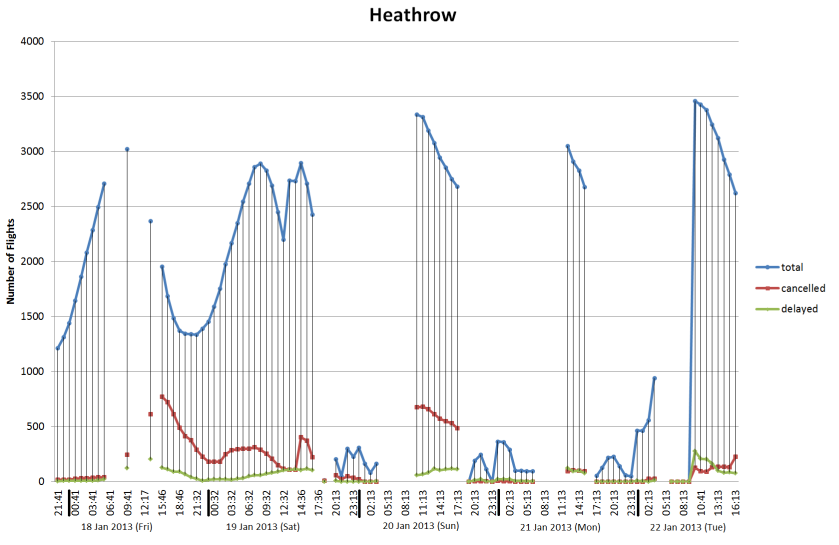
Arrivals and departures data for Heathrow from 17 Jan 2013 to 22 Jan 2013
This is our first attempt with this type of flights data and it shows how difficult it is to detect the difference between normal operation and when major problems are occurring. We’ve also got breaks in the data caused by the sampling process which don’t help. Ideally, we would be looking at the length of delays which would give a finer indication of problems, but this is going to require further post processing. After looking at this data, it seems that we need to differentiate between when the airport is shut due to adverse weather, so nothing is delayed because everything is cancelled and the other situation where they’re trying to clear a backlog after re-opening.
If we look at the information for Network Rail services around London, then the picture is a lot easier to interpret:
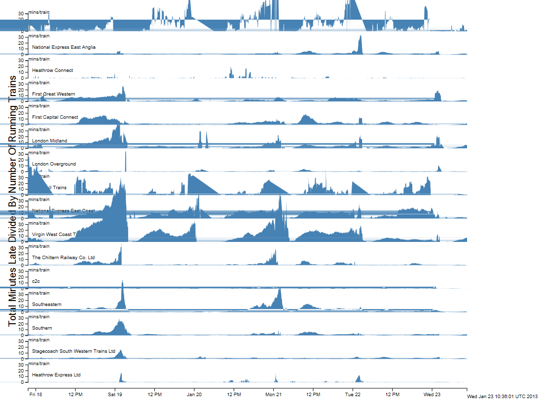
Network Rail data for all trains within the London area from 17 January 2013 to 23 January 2013
The graphs plot total late minutes divided by total number of trains, or average late minutes per running train. This gives a very good indicator of when there are problems. Unfortunately, there appears to be a bug in the D3 library which is causing the horizontal lines across the graphs. The situation with South West trains is interesting because it looks from the graph as though they didn’t have any problems with the snow. In reality, they ran a seriously reduced service so the number of trains is not what it should be. This needs to be factored in to any metric we come up with for rail services to cope with the situation where the trains are running, but people can’t get on them because they are full.
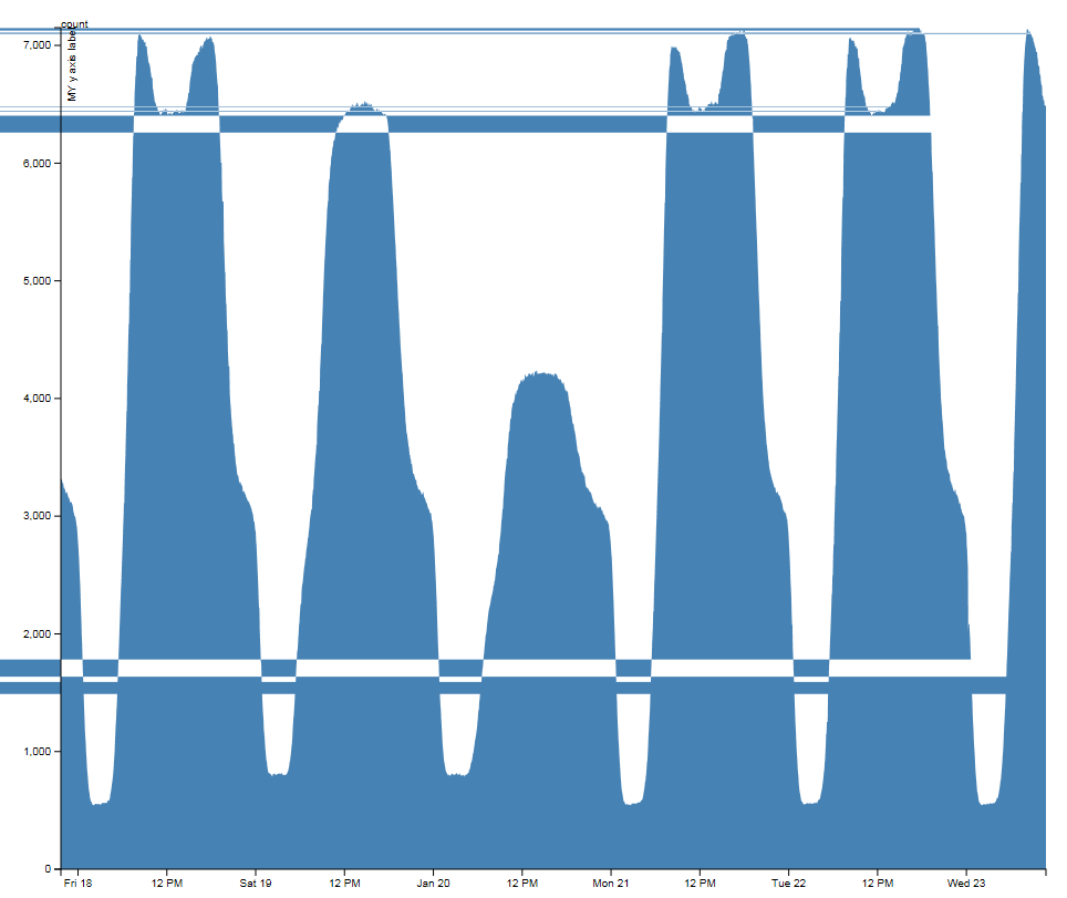
Numbers of buses running between 17 January 2013 and 23 January 2013
The graph of the number of buses running over the weekend is interesting as it doesn’t appear as if the bus numbers on the road were affected by the snow. The Saturday and Sunday difference can be seen very clearly and the morning and evening rush hours for the weekdays are clearly visible despite the annoying horizontal lines.