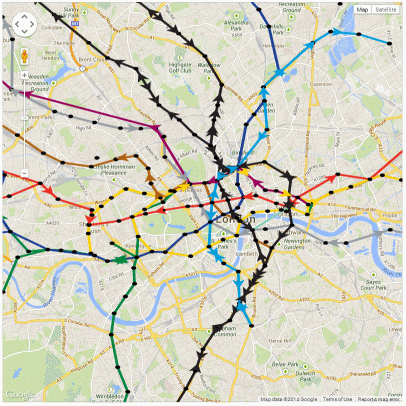
Tubes running up to 10am on 5 February 2014, during the first day of the tube strike
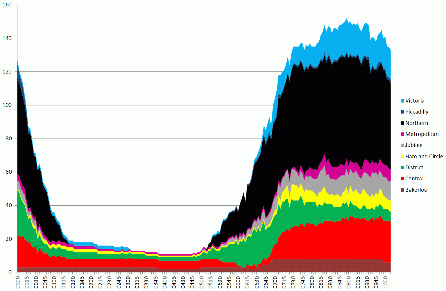
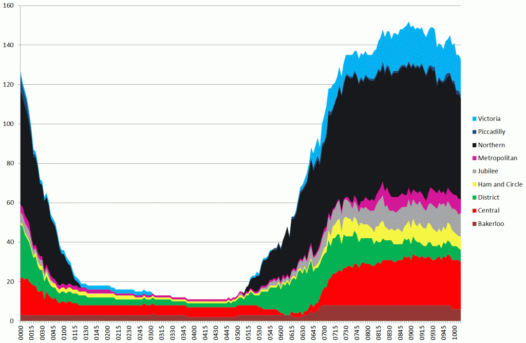
The graph above is a stacked area chart showing the number of tubes running on each of the London Underground lines. The width of the coloured part represents the number of tubes (i.e. 150 is the total number running summed over all lines at the peak around 08:45).
One thing that is apparent is that the Northern line ran a fairly good service. Compare the chart above to a normal day (4th Feb):

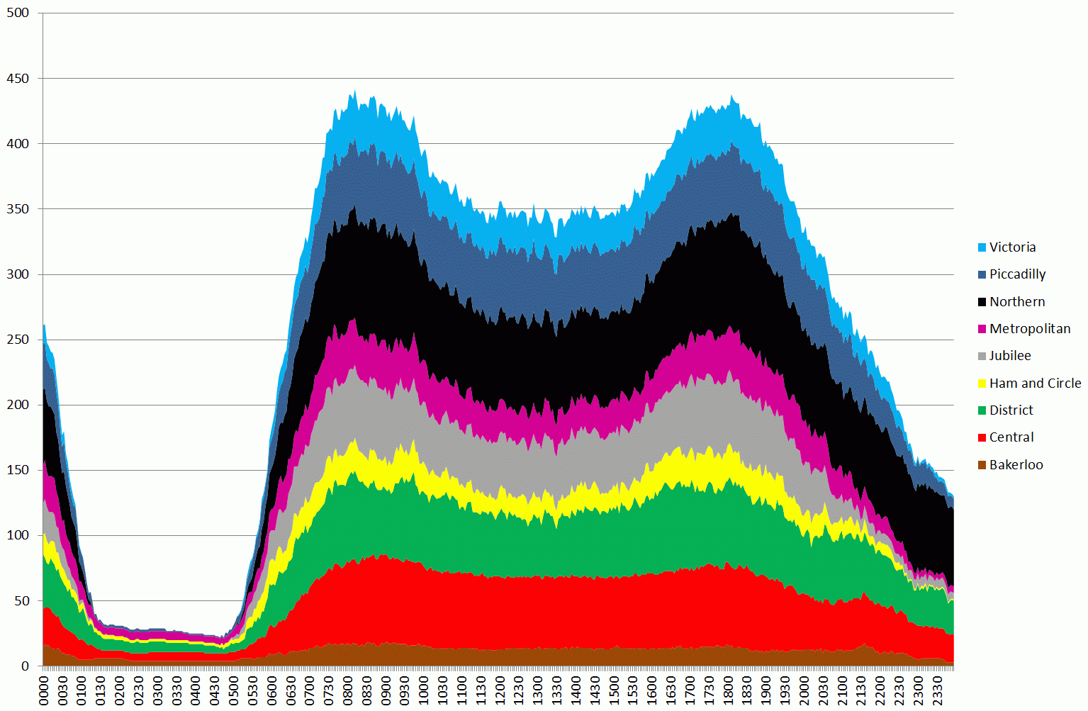
Tubes running between midnight and midnight from 4 to 5th February the day before the strike – note different timescale from previous chart
The second graph shows the variation for a whole day, so the earlier graph corresponds to the first peak on the second graph.
In order to quantify these results, I’ve taken the raw data, which is the number of tubes running during each 3 minute period between 07:00 and 10:00, produced totals, and compared this against the previous day’s data (Tuesday 5th).
Based on an average taken over the whole 7-10am period, 33.57% of the normal service was running. The breakdowns by lines are as follows:
Bakerloo: 48.3%
Central: 34.5%
District: 19.4%
Hammersmith and City and Circle: 32.1%
Jubilee: 19.4%
Metropolitan: 15.0%
Northern: 72.2%
Piccadilly: 2.3%
Victoria: 46.2%
The figure for the Piccadilly line looks much lower than I would expect, so this needs further investigation. It could be an issue with a signal problem as the data here is taken straight from the public “trackernet” API. Also, just because tubes are running doesn’t mean you can actually get on one. At the moment we don’t have any loading figures for stations, but this is something we are working on.
Also, these figures don’t show the whole picture as they miss out the spatial variation. With many stations closed, services actually stopping in central London were greatly reduced.
The following is the picture at 9am this morning:
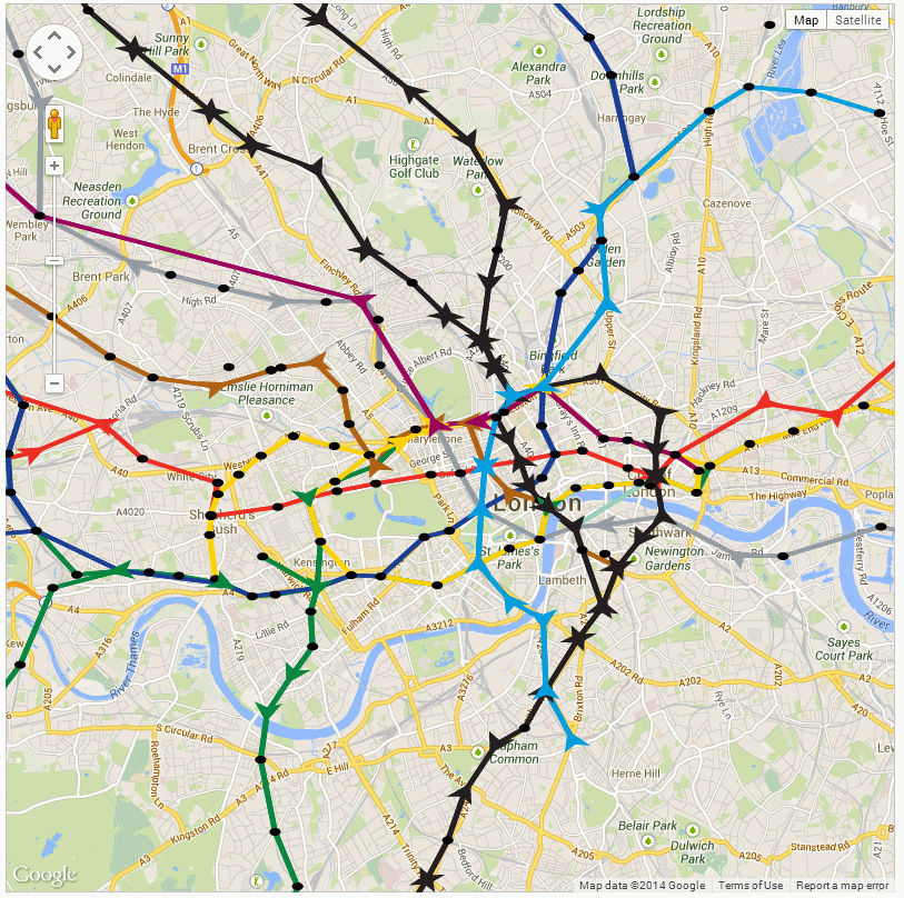
09:00am on 5th February 2014, tubes are shown as arrows pointing in the direction of movement
Although this isn’t the best visualisation, it serves to show that there are some obvious gaps in the service.