I’ve described this as “radar for trains”, but it now also includes a real-time view of bus and tube delays. The idea is to produce a single visualisation highlighting where there are problems with the transport system:
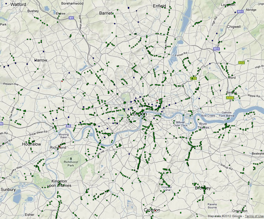
Status of London’s transport system at 13:00 on 8 August 2012. The green squares are bus stops showing delays, while blue is for delays at tube stations.
The map above shows the fusion of all the sources of transport data gained from the ANTS project. Although we know the position of every tube, bus and train in London, simply plotting this information on a map tells you nothing about the current state of the city’s transport network. At any point in time there can be 450 tubes, 7,000 buses and 900 trains, so any real-time view needs to reduce the amount of information to only what is really significant.
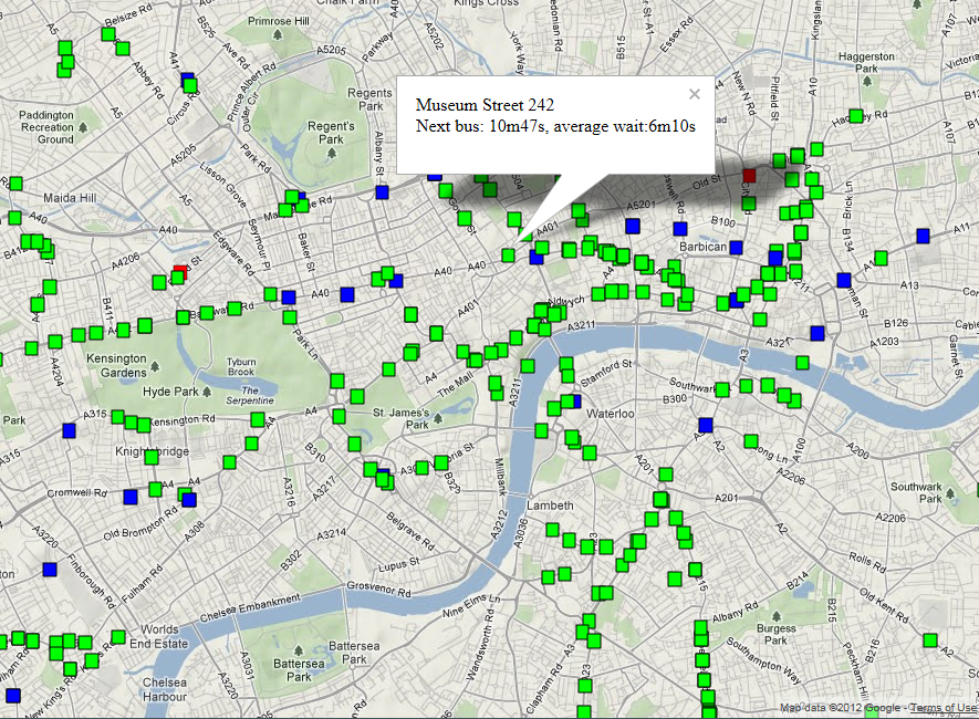
London’s transport system at 13:00 on 8 August 2012 showing details about slow running buses on route 242 at the Museum Street stop
The data shown on the map is as follows:
1. National Rail trains more than 5 minutes late shown as red boxes, positioned at their last reported station.
2. Tube Stations where there is a wait of 20% more than normal, shown as blue boxes.
3. Bus Stops where there is a wait of 50% more than normal, shown as green boxes.
4. Segments of tube lines where the TfL status message indicates that there are problems, shown as red lines (there are none on this map).
The first problem with a system like this is that the data comes from three different sources, all of which are fundamentally different. Trains run to a very specific timetable, so you know it’s the 08:46 Waterloo train at Clapham Junction platform 10 and it’s running 6 minutes late. The map above does show the late trains as red boxes, but the Network Rail API is a stream, so it has to run for a period of time to pick up all the train movement messages. On the plus side though, we are getting information for every train in the country, but it quickly becomes apparent that there are a huge number of late trains, so we have to filter only those that are more than 5 minutes late.
When we get to the buses and tubes things get a bit more interesting as the information we get from the APIs isn’t linked to any timetable. In order to work out the delays, I’ve taken several months’ worth of archive data and computed an average wait time for every bus stop, tube station, platform and hour of day. Then what’s plotted on the map is any bus stop showing a wait more than 50% above average, or any tube station 20% above average for the current hour. In addition to this, if a section of tube line is flagged as having problems in the TfL status message, then this section will be highlighted on the map.
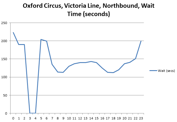
Mean wait time for every hour of the day (x-axis 0-23) computed for Oxford Circus, Northbound Platform, Victoria Line using archive data from November 2011 to July 2012
Looking at the mean wait time for Oxford Circus above, it’s possible to see the daily variation in tube frequency for the morning and evening rush hour (07:00-09:00 and 17:00-19:00), along with the overnight shutdown at 03:00 when the wait time is defaulted to zero.
Essentially, this is a data-mining and feature detection system, comparing what we normally expect to see with what’s happening now to highlight any differences. At the moment it’s using the mean wait time to detect problems, but it should probably use number of standard deviations from the mean. Now that we’ve got a working system we can start to look at the best methods for detecting problems and release this to the public once we’re happy with it.
Also see: the PLACR Transport API Website which does a similar thing for tube station wait times.


