
I’ve been looking at the D3.js library for data visualisation in Javascript. This is the new evolution of Protovis from the Stanford Visualization group, and uses SVG to create dynamic visualisations from raw data.
What interests me is how large archives of geospatial datasets can be searched for relevant information. On MapTube at the moment we have a large amount of Census data, but it’s not particularly accessible as you can only search by keyword. Thinking ahead to the up-coming 2011 Census release, we really need a way of showing how datasets relate to one another. I’ve shown some examples before of how a network graph can be used to show how London data on population links to employment (workplace population), education, index of multiple deprivation and crime. Recently, I’ve been looking at how to use this technique to enhance the search results on MapTube. Using the MapTube database, which currently contains 715 maps, I create a graph where each vertex is one of the 715 maps, which are linked by non-directed edges where maps share a common keyword. The idea is that when the user inputs a search term, for example “population”, then a sub-graph is created of all the maps containing the “population” keyword. The image below shows this example displayed as a force-directed graph using D3:
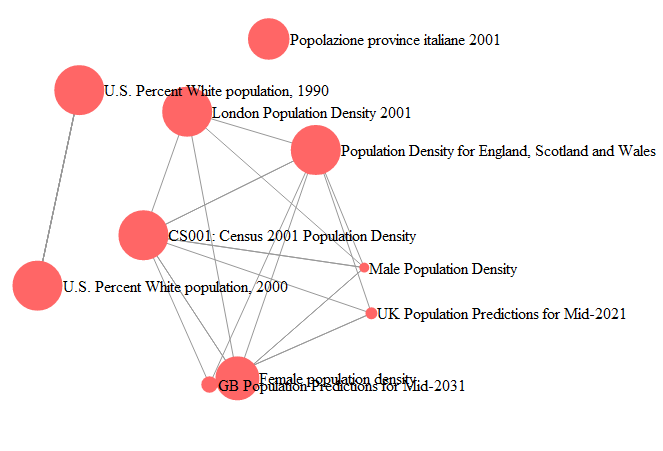
Firstly, I should explain that all the edges labelled “population” have been removed as, otherwise, this would be a fully connected graph as they all contain the search keyword. The size of the red dots is also proportional to the number of hits that map has received, so it’s possible to see the more popular maps very easily. What this method of searching has over the standard list view is that you can see that there are three distinct groupings of results. The two U.S. population maps form their own group on the left, the Italian population map is on its own at the top and everything else forms its own UK based group. One other interesting property is that we can see that the “Female” population density map has received a lot more hits than its equivalent “Male” population density map.
The static image from the web page doesn’t do this example justice, as it’s possible to move the nodes around to investigate the structure further. The following link shows how the nodes can be moved around dynamically on the web page: http://youtu.be/TmRQx-Ogm0E
The example was created using a bespoke C# program to create the graph structure from the MapTube database. This was exported as a JSON file which contained the nodes with the map title and number of hits, along with the links as pairs of node numbers.
The D3 code is relatively simple as it’s just a modification of one of the “force” examples, but with an SVG circle and label node added as children of an “svg:g” parent node so that the maps contain the map title:
[javascript]
var w = 960,
h = 500,
fill = d3.scale.category20();
var vis = d3.select("#chart").append("svg")
.attr("width", w)
.attr("height", h);
d3.json(/*"miserables.json"*/"MapTube.json", function(json) {
var force = d3.layout.force()
.gravity(0.02)
.charge(-120)
.linkDistance(/*30*/200)
.nodes(json.nodes)
.links(json.links)
.size([w, h])
.start();
var link = vis.selectAll("line.link")
.data(json.links)
.enter().append("line")
.attr("class", "link")
.style("stroke-width", function(d) { return Math.sqrt(d.value); })
.attr("x1", function(d) { return d.source.x; })
.attr("y1", function(d) { return d.source.y; })
.attr("x2", function(d) { return d.target.x; })
.attr("y2", function(d) { return d.target.y; });
var node = vis.selectAll("g.node")
.data(json.nodes)
.enter().append("svg:g")
.attr("class", "node")
.call(force.drag);
node.append("svg:circle")
.attr("class","circle")
.attr("r",function(d) { var r=d.hits/4; if (r25) r=25; return r; }); //this is going to be hits
node.append("svg:text")
.attr("class", "nodetext")
.attr("dx", function(d) { var r=d.hits/4; if (r25) r=25; return r; })
.attr("dy", ".35em")
.text(function(d) { return d.name });
force.on("tick", function() {
link.attr("x1", function(d) { return d.source.x; })
.attr("y1", function(d) { return d.source.y; })
.attr("x2", function(d) { return d.target.x; })
.attr("y2", function(d) { return d.target.y; });
node.attr("transform", function(d) { return "translate(" + d.x + "," + d.y + ")"; });
});
});
[/javascript]
This is still only an experiment as the layout rules need some work and I doubt that it will cope very well if there are large numbers of nodes and links, but it’s a different way of looking at search results.
Links: