
This started out as an experiment in how to handle geospatial data published in Internet data stores. The idea was to make an attempt at structuring the data to make searching, comparison and visualisation easier. The London Datastore publish a manifest file which contains links to CSV files that are in the correct format for MapTube to handle, so I wrote a process to make the maps automatically. The results are one thumbnail map for every field in the first hundred datasets on the London Datastore. I stopped the process once I got to a hundred as it was taking a long time. A section of the results are shown as an image below, but the link goes to the full 10,000 pixel image created using the Image Cutter.
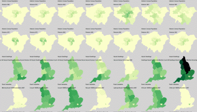
The name of the dataset and name of the column being visualised are shown in the top left of the map, while the colour scale is a Jenks 5 class range between the min and max of the data. This sort of works, but raises more questions than it answers about the data. To start with, one interesting thing that jumps out of the data is that there was a step change in London population around 1939. This comes from the “London Borough Historic Population” dataset, shown on the top two lines of the image above (it’s seven rows from the bottom of the zoomable image). The 1939 image is the third from the right on the top row.