Harnessing Unique Methods of Visualisation

The first time I saw a tube map of London was a long time before I actually ever went there. It was during my one summer living in downtown Toronto with a bunch of crazy girls. One of the saner ones had a poster of the tube on her bedroom wall. It was from the Tate Gallery, where the different tube lines were created with thick lines of paint, which I’ve found again here. At the time, I found this poster really fascinating. If you know anything about the underground in Toronto, it’s pretty uninteresting and wouldn’t make much of a visual object!

Then more recently, I came across a super wacky map of the London Underground made by Franceso Dans, a visitor to UCL from Goldsmiths spending 6 weeks in CASA. You can view his map and his motivation behind this amazing construct on his blog. He’s working on more of these tube maps for different cities as well as an application that will allow you to travel from A to B anywhere in the world without using an airplane. He’s harvesting all the information, e.g. train and bus timetables, from the internet to build the site.

If you’d like to spend some time at CASA working with experts in visualisation, digital media, data harvesting and crowdsourcing, then consider applying for one of our User Fellowships. CASA has developed a number of interesting ways of visualising ‘big data’ that might benefit your organization. Or maybe you have an interest in crowdsourcing and seeing how you can harness the power of the crowd in providing data. Or you’d like to see what analysing twitter feeds might mean for your business. If you are a non-academic and want to work with CASA on a project where you could pick up some visualisation or data analysis skills, then apply for a User Fellowship. The deadline is 21 Sep 2012 and there’s more information on the TALISMAN website.

Picking Up Raster GIS Skills

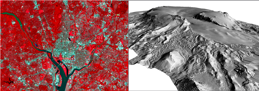
Do you need to work with satellite images or datasets that are gridded? By gridded I mean data that are stored in grid like cells such as heights of the earth (or a digital elevation model), a global land cover map or gridded populations of the world? There are many other gridded datasets available, e.g. climate data, maps of biomass, ecosystem services, etc.

Example of a satellite image on the left and a LIDAR DEM on the right

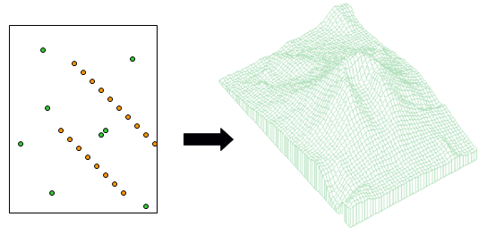
Or have you collected data using a GPS that you need to interpolate to a continuous surface like that shown below:

An example of interpolating points to surfaces

If the answer to any of these questions is yes, or if you’ve suddenly realised this might be useful for your research,  then come and learn more about raster data and how to manipulate these datasets in a Geographic Information System (GIS). On 26-27 July 2012, Dr Steve Carver will teach a 1.5 day course at the University of Leeds on how to work with raster datasets using ArcGIS. This course is open to staff and students at Higher Education institutions in the UK and Ireland.

The course will cover the following topics with practical exercises throughout to gains hands-on experience with the concepts and the software:

  1. Introduction to raster modelling in ArcGIS
  2. Importing and converting raster data
  3. Point-surface interpolation
  4. Digital elevation models and terrain analysis
  5. Cartographic modelling (which allows you chain processes together in a work flow and automate your modelling)

You can register for the course on the TALISMAN website or email Amy O’Neill if you have any questions. Alternatively, if you catch this post after the course has taken place, contact Amy and let her know that you are interested in future courses.