Big Data Masochists must resist the Dominatrix of Social Theory

Here at the AAG in Los Angeles it has been good to witness at first hand the continued vibrancy and diversity of geographical inquiry.  In particular, themes such as Agent-based Modelling, Population Dynamics, and CyberGIS have been well represented alongside sessions on Social Theory, Gender and Cultural and Political Ecology.  At Friday’s sessions on big data and its limits (“More data, more problems”; “the value of small data studies”) I learned, however  that the function of geography is to push back against those who worship at the atheoretical altar of empirical resurrection, while simultaneously getting off on what one delegate branded the ‘fetishisation of numbers’.  The ‘post-positivists’ it seems are far too sophisticated to be seduced by anything so sordid as numerical evidence, while poor old homo quantifactus still can’t quite see past the entrance of his intellectual cave.

Exactly who is being raped here is a moot question however.  ( For those unfamiliar with the reference to the ‘rape of geographia’, see the cartoon here: http://www.quantamike.ca/pdf/94-11_MapDiscipline.pdf).  Speaking as someone who has spent 30 years in the UK working with GIS, simulation and geocomputation, it is hard to escape the conclusion that the dominatrix of social theory has deployed her whips and chains with ruthless efficiency.  Can we therefore be clear on a couple of points.  First, the role of geography (and geographers) is not to push back against specific approaches, but to provide the means for spatial analysis (and theory) which complements other (non-spatial) perspectives.  Second, whether my data is bigger than your data is not the issue, and any argument which couches the debate in terms of ‘the end of theory’ (cf Anderson, 2008 – http://www.wired.com/science/discoveries/magazine/16-07/pb_theory) is missing the point.  New data sources provide immense opportunity for creative approaches to the development of new ‘theories’ of spatial behaviour, and to the testing and refinement of existing theories (which I probably like to call ‘models’, although I’ve not evolved to become a post-positivist yet).

The challenges are tough.  It is possible that some current attempts to navigate the big data maze lack rigour because the sub-discipline is so new, but also after 30 years of chronic under-investment in quantitative geography our community struggles to access the necessary skills.  Far from pushing back against the mathematicians, engineers and other scientists it may be necessary to engage with these constituencies over a long period of time to our mutual benefit.  Observations about what any of us might like to do with numbers in the privacy of our own offices and hotel rooms are a less than helpful contribution to the debate.

Virtual Globes

It’s been very quiet over Easter and I’ve been meaning to look at 3D visualisation of geographic data for a while. The aim is to build a framework for visualising all the real-time data we have for London without using Google Earth, Bing Maps or World Wind. The reason for doing this is to build a custom visualisation that highlights the data rather than being overwhelmed by the textures and form of the city as in Google Earth. Basically, to see how easy it is to build a data visualisation framework.

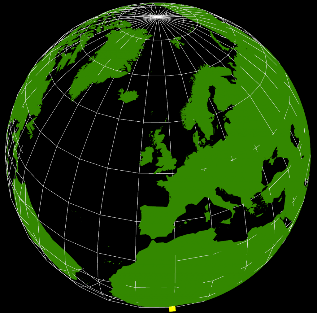
After quite a bit of experimentation, the results are shown below:

VirtualGlobe

The yellow cube at the extreme southern point is marking (0,0) (lat,lon) as a reference. It’s also possible to see right through the Earth as I haven’t put any water in yet, but that’s not immediately apparent in this screenshot. The globe can be rotated and zoomed using the mouse, so it’s possible to see an area in more detail.

The way this has been constructed is as a WebGL application using THREE.JS running in Chrome. Originally, I started looking at using WebGL directly as I wanted to be able to create custom shaders, but in the end decided that programming at the higher level of abstraction using THREE.JS and a scene graph was going to be a lot faster to develop.

Where I got stuck was with the countries of the World geometry, and what you see in the graphic above still isn’t correct. I’ve seen a lot of 3D visualisations where the geometry sits on a flat plane, and this is how the 3D tubes visualisation that I did for the XBox last year worked. Having got into lots of problems with spatial data not lining up, I knew that the only real way of doing this type of visualisation is to use a spherical model. Incidentally, the Earth that I’m using is a sphere using the WGS84 semi-major axis, rather than the more accurate spheroid. This is the normal practice with data at this scale as the error is too small to notice.

The geometry is loaded from a GeoJSON file (converted from a shapefile) with coordinates in WGS84. I then had to write a GeoJSON loader which builds up the polygons from their outer and inner boundaries as stored in the geometry file. Using the THREE.JS ‘Shape’ object I’m able to construct a 2D shape which is then extruded upwards and converted from the spherical lat/lon coordinates into Cartesian 3D coordinates (ECEF with custom axes to match OpenGL) which form the Earth shown above. This part is wrong as I don’t think that THREE.JS is constructing the complex polygons correctly and I’ve had to remove all the inner holes for this to display correctly. The problem seems to be overlapping edges which are created as part of the tessellation process, so this needs more investigation.

What is interesting about this exercise is the relationship between 3D computer graphics and geographic data. If we want to be able to handle geographic data easily, for example loading GeoJSON files, then we need to be able to tessellate and condition geometry on the fly in the browser. This is required because the geometry specifications for geographic data all use one outer boundary and zero or more inner boundaries to represent shapes. In 3D graphics, this needs to be converted to triangles, edges and faces, which is what the tessellation process does. In something like Google Earth, this has been pre-computed and the system loads conditioned 3D geometry directly. I’m still not clear which approach to take, but it’s essential to get this right to make it easy to fit all our data together. I don’t want to end up in the situation with the 3D Tubes where it was written like a computer game with artwork from different sources that didn’t line up properly.

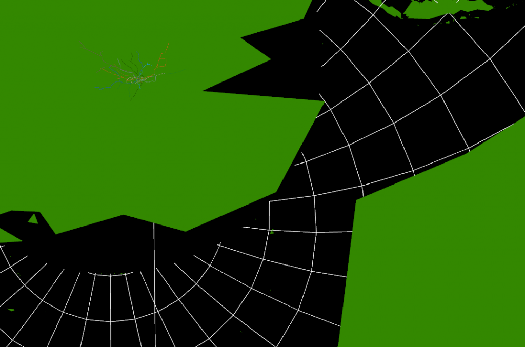
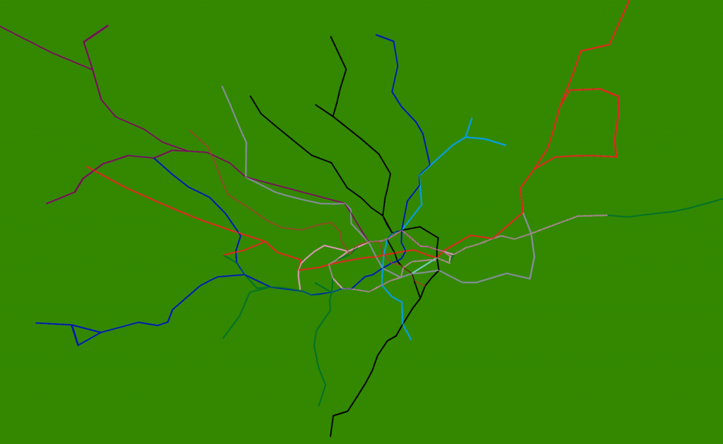
The real reason for building this system is shown below:

VirtualGlobe2

VirtualGlobe3

Strangely enough, adding the 3D tube lines with real-time tubes, buses and trains is easy once the coordinate systems are worked out. The services to provide this information already exist, so it’s just a case of pulling in what is relatively simple geometry. The road network and buildings are available from the OS Free data release, so, with the addition of Lidar data, we could build another (real-time) Virtual London model.

Just for the record, it took about 4 days to get this working using the following tools: Visual Studio 2010 C# and C++, Autodesk 3DS Max 2012 and the FBX exporter, Python 2.6, NetBeans Java and Geotools 8, Quantum GIS, Chrome Developer Tools